Chapter 11 Simple Linear Regression
Consider the data Formaldehyde, which is built into R:
Formaldehyde## carb optden
## 1 0.1 0.086
## 2 0.3 0.269
## 3 0.5 0.446
## 4 0.6 0.538
## 5 0.7 0.626
## 6 0.9 0.782
Rainis Venta. This file is licensed under the Creative Commons Attribution-Share Alike 3.0 Unported license. https://commons.wikimedia.org/wiki/File:Kolorimeetriline_valkude_sisalduse_mõõtmine_Bradford_meetodil..JPG
In this experiment, a container of the carbohydrate formaldehyde of known concentration carb was tested for its optical density optden (a measure of how much light passes through the liquid).
The variable carb is called the explanatory variable, denoted in formulas by \(x\). Explanatory variables are also sometimes called predictor variables or independent variables. The optden variable is the response variable \(y\).
In this data, the experimenters selected the values \(x_1 = 0.1\), \(x_2 = 0.3\), \(x_3 = 0.5\), \(x_4 = 0.6\), \(x_5 = 0.7\), and \(x_6 = 0.9\) and created solutions at those concentrations. They then measured the values \(y_1 = 0.086, \dotsc, y_6 = 0.782\).
A plot of this data (Figure 11.1) shows a nearly linear relationship between the concentration of formaldehyde and the optical density of the solution:
Formaldehyde %>%
  ggplot(aes(x = carb, y = optden)) +
  geom_point()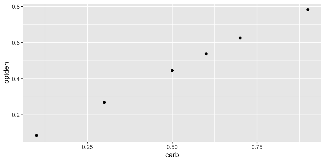
Figure 11.1: The relationship between optical density and formaldehyde concentration is nearly linear.
The goal of simple linear regression is to find a line that fits the data. The resulting line is called the regression line or the best fit line. R calculates this line with the lm command, which stands for linear model:
lm(optden ~ carb, data = Formaldehyde)##
## Call:
## lm(formula = optden ~ carb, data = Formaldehyde)
##
## Coefficients:
## (Intercept) carb
## 0.005086 0.876286In the lm command, the first argument is a formula. Read the tilde character as “explained by,” so that the formula says that optden is explained by carb. The output gives the coefficients of a linear equation
\[ \widehat{\text{optden}} = 0.0050806 + 0.876286\cdot \text{carb}.\]
We put a hat on optden above to indicate that if we plug in a value for carb, we get an estimated value for optden.
The ggplot geom geom_abline can plot a line given an intercept and slope. Figure 11.2 shows the data again with the regression line.
Formaldehyde %>% ggplot(aes(x = carb, y = optden)) +
  geom_point() +
  geom_abline(intercept = 0.005086, slope = 0.876286)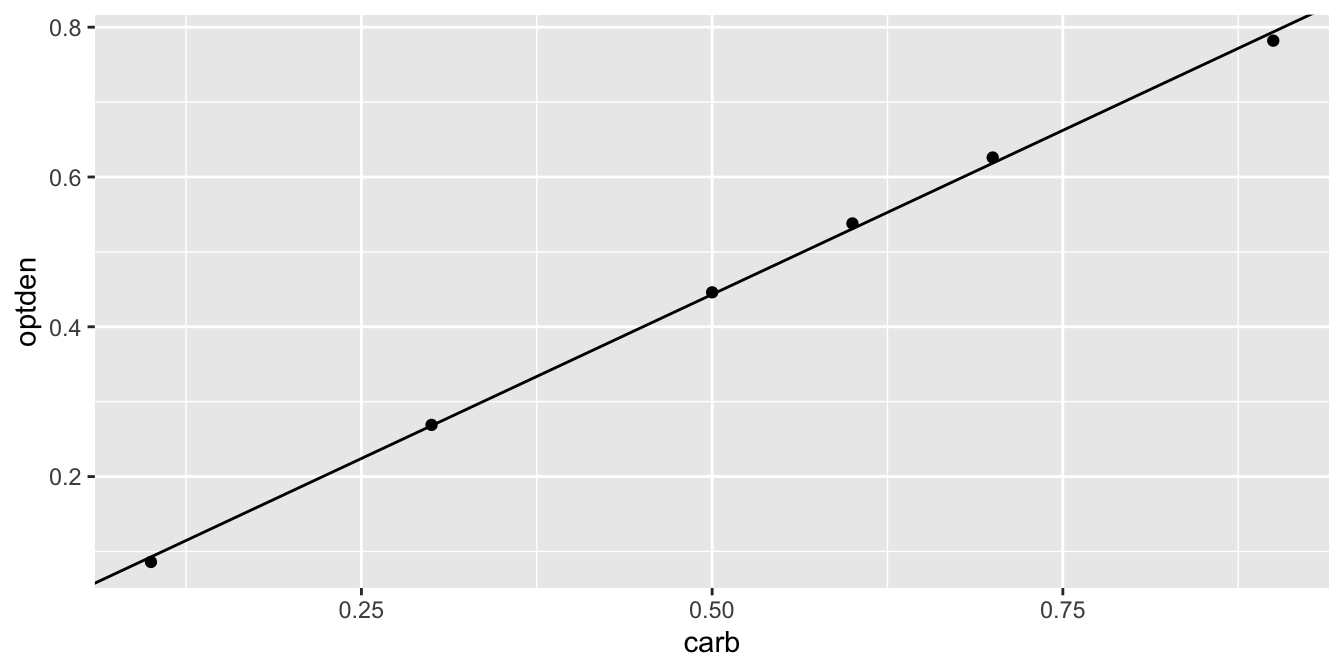
Figure 11.2: Formaldehyde data and the regression line.
11.1 Least squares regression line
Assume data comes in the form of ordered pairs \((x_1, y_1),\ldots,(x_n, y_n)\). Values of the slope \(b_1\) and the intercept \(b_0\) describe a line \(b_0 + b_1 x\). Among all choices of \(b_0\) and \(b_1\), there should be one which comes closest to following the ordered pairs \((x_1, y_1), \ldots, (x_n, y_n)\). In this section, we investigate what that means and we find the optimal choice of slope and intercept for two example data sets. Note that we are not assuming that the underlying data follows a line, or that it is a line up to some error term. We are simply finding the line which best fits the data points.
For each value of \(x_i\), the line with intercept \(b_0\) and slope \(b_1\) goes through the point \(b_0 + b_1 x_i\). The error associated with \(b_0\) and \(b_1\) at \(x_i\) is the difference between the observed value \(y_i\) and the value of the line at \(x_i\), namely \(y_i - (b_0 + b_1 x_i)\). This error is the vertical distance between the actual value of the data \(y_i\) and the value estimated by our line.
The regression line chooses \(b_0\) and \(b_1\) to make the error terms as small as possible in the following sense.
The regression line for points \((x_1, y_1),\ldots,(x_n, y_n)\) is the line which minimizes the sum of squared errors (SSE) \[ SSE(b_0,b_1) = \sum_{i = 1}^n \left(y_i - (b_0 + b_1 x_i)\right)^2. \]
We denote the values of \(b_0\) and \(b_1\) that minimize the SSE by \(\hat \beta_0\) and \(\hat \beta_1\), so the regression line is given by \[ \hat \beta_0 + \hat \beta_1 x. \]
The sum of squared errors is not the only possible way to measure the quality of fit, so sometimes the line is called the least squares regression line. Reasons for minimizing the SSE are that it is reasonably simple, it involves all data points, and it is a smooth function. Using SSE also has a natural geometric interpretation: minimizing SSE is equivalent to minimizing the length of the vector of errors.
The lm command in R returns a data structure which contains the values of \(\hat \beta_0\) and \(\hat \beta_1\). It also contains the errors \(y_i - (\hat \beta_0 + \hat \beta_1 x_i)\), which are called residuals.
Find \(\hat \beta_i\) for the Formaldehyde data, calculate the residuals, and calculate the SSE.
In the notation developed above, the estimated intercept is \(\hat \beta_0 = 0.005086\) and the estimated slope is \(\hat \beta_1 = 0.876286\).
Formaldehyde_model <- lm(optden ~ carb, data = Formaldehyde)
Formaldehyde_model$residuals
## 1 2 3 4 5
## -0.006714286 0.001028571 0.002771429 0.007142857 0.007514286
## 6
## -0.011742857sum(Formaldehyde_model$residuals^2)## [1] 0.0002992In this code, the result of the lm function is stored in a variable we chose to call Formaldehyde_model.
Observe that the first and sixth residuals are negative, since the data points at \(x_1 = 0.1\) and \(x_6 = 0.9\) are both below the regression line. The other residuals are positive since those data points lie above the line.
The SSE for this line is 0.0002992.
If we fit any other line, the SSE will be larger than 0.0002992. For example, using the line \(0 + 0.9 x\) results in a SSE of 0.0008, so it is not the best fit:
optden_hat <- 0.9 * Formaldehyde$carb # fit values
optden_hat - Formaldehyde$optden # compute errors
## [1] 0.004 0.001 0.004 0.002 0.004 0.028sum((optden_hat - Formaldehyde$optden)^2) # compute SSE## [1] 0.000837The penguins data set from the palmerpenguins package will appear in several places in this chapter.
This has measurements of three species of penguins found in Antarctica, and was originally collected by Gorman et al. in 2007-2009.95

Allison Horst. CC0-1.0 Licensed. https://github.com/allisonhorst/palmerpenguins
For now, we focus on the chinstrap species, and investigate the relationship between flipper length and body mass.
We begin with a visualization, using flipper length as the explanatory variable and body mass as the response.
The geometry geom_smooth can fit various lines and curves to a plot.
The argument method = "lm" indicates that we want to use a linear model, the regression line.
penguins <- palmerpenguins::penguins
chinstrap <- filter(palmerpenguins::penguins, species == "Chinstrap")
chinstrap %>%
  ggplot(aes(x = flipper_length_mm, y = body_mass_g)) +
  geom_point() +
  geom_smooth(method = "lm")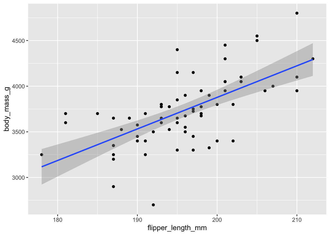
Figure 11.3: Chinstrap penguin body mass as explained by flipper length.
The resulting plot, in Figure 11.3, shows each observation as a point, and the least squares regression line in blue. The upward slope of the line suggests that chinstrap penguins with longer flippers will have greater body mass, on average. Here are the intercept and slope of the regression line:
chinstrap_model <- lm(body_mass_g ~ flipper_length_mm, data = chinstrap)
chinstrap_model$coefficients
## (Intercept) flipper_length_mm
## -3037.19577 34.57339The equation of the regression line is \[ \widehat{\text{mass}} = -3037.19577 + 34.57339 \cdot \text{flipper length}. \]
The estimated slope \(\hat \beta_1 \approx 34.6\) means that for every additional millimeter of flipper length, we expect an additional 34.6 g of body mass. The estimated intercept \(\hat \beta_0 \approx -3037\) has little meaning, because it describes the supposed mass of a penguin with flipper length zero.
The slope of the regression line often has a useful interpretation, while the intercept often does not.
The regression line associates a body mass of \(-3037.19577 + 34.57339 \cdot 200 = 3877\) to a chinstrap penguin with flipper length 200 mm. There is some uncertainty in this estimate, which is expressed in ggplot by a gray band around the regression line. This is the 95% confidence band for the regression line. The regression line shown in the figure depends on the data. Repeating the study would produce new measurements and a new line. To quantify this, we will need to expand our assumptions, see Section 11.5 for details.
The R function predict computes the response associated with the given value of the predictor and the regression line. We will be using it here with two arguments: the object which is the model as returned by lm, and newdata which is a data frame of values for which we want to be making predictions. To find the body mass associated with a penguin with flipper length 200 mm, we would use:
predict(chinstrap_model, newdata = data.frame(flipper_length_mm = 200))## 1
## 3877.483The data set child_tasks is available in the fosdata package:
child_tasks <- fosdata::child_tasksIt contains results from a study96 in which 68 children were tested at a variety of executive function tasks.
The variable stt_cv_trail_b_secs measures the speed at which the child can complete a “connect the dots” task called the “Shape Trail Test (STT),” which you may try yourself using Figure 11.4.
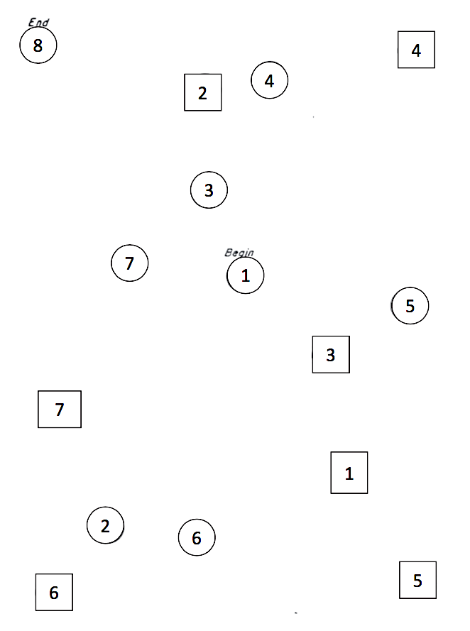
Figure 11.4: STT trail B. Connect the circles in order.
How does a child’s age affect their speed at completing the Shape Trail Test? We choose age_in_months as the explanatory
variable and stt_cv_trail_b_secs as the response variable, as shown in Figure 11.5.
child_tasks <- fosdata::child_tasks
child_tasks %>%
  ggplot(aes(x = age_in_months, y = stt_cv_trail_b_secs)) +
  geom_point() +
  geom_smooth(method = "lm")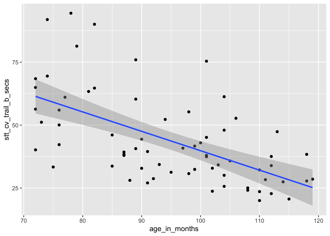
Figure 11.5: Speed of children on Shape Trail Test as explained by age.
stt_model <- lm(stt_cv_trail_b_secs ~ age_in_months, data = child_tasks)
stt_model$coefficients
## (Intercept) age_in_months
## 116.8865146 -0.7706084The regression line is given by the equation \[ \widehat{\text{test time}} = 116.9 - 0.77 \cdot \text{age}. \]
The estimated slope \(\hat \beta_1 = -0.77\) indicates that each additional month of age reduces the mean time for children to complete the STT by 0.77 seconds on average. The estimated intercept \(\hat \beta_0 = 116.9\) is meaningless since it corresponds to a child of age 0, and a newborn child cannot connect dots.
If we wish to find the time to complete the puzzle associated with a child that is 90 months old, we can compute \(116.9 - 0.77 \cdot 90 = 47.6\) seconds, or we can use the predict function as follows:
predict(stt_model, newdata = data.frame(age_in_months = 90))## 1
## 47.5317611.2 Correlation
The correlation \(\rho\) of random variables \(X\) and \(Y\) is a number between -1 and 1 that measures the strength of the linear relationship between \(X\) and \(Y\). It is positive when \(X\) and \(Y\) tend to be large together and small together, and it is negative when large \(X\) values tend to accompany small \(Y\) values and vice versa. A correlation of 0 indicates no linear relationship, and a correlation of \(\pm 1\) is achieved only when \(X\) and \(Y\) have an exact linear relationship.
If \(X\) and \(Y\) have means and standard deviations \(\mu_X\), \(\sigma_X\) and \(\mu_Y\), \(\sigma_Y\) respectively, then \[ \rho_{X,Y} = \frac{E\left[(X-\mu_X)(Y-\mu_Y)\right]}{\sigma_X\sigma_Y} = \frac{{\text{Cov}}(X, Y)}{\sigma_X \sigma_Y}.\]
Many times, we are not able to calculate the exact correlation between two random variables \(X\) and \(Y\), and we will want to estimate it from a random sample. Given a sample \((x_1, y_1),\ldots, (x_n, y_n)\), we define the correlation coefficient \(r\) as follows:
The sample correlation coefficient is \[ r = \frac{1}{n-1} \sum ^n _{i=1} \left( \frac{x_i - \bar{x}}{s_x} \right) \left( \frac{y_i - \bar{y}}{s_y} \right) \]
The \(i^{\text{th}}\) term in the sum for \(r\) will be positive whenever:
- Both \(x_i\) and \(y_i\) are larger than their means \(\bar{x}\) and \(\bar{y}\).
- Both \(x_i\) and \(y_i\) are smaller than their means \(\bar{x}\) and \(\bar{y}\).
It will be negative whenever
- \(x_i\) is larger than \(\bar{x}\) while \(y_i\) is smaller than \(\bar{y}\).
- \(x_i\) is smaller than \(\bar{x}\) while \(y_i\) is larger than \(\bar{y}\).
Since \(r\) is a sum of these terms, \(r\) will tend to be positive when \(x_i\) and \(y_i\) are large and small together, and \(r\) will tend to be negative when large values of \(x_i\) accompany small values of \(y_i\) and vice versa.
For the rest of this chapter, when we refer to the correlation or the sample correlation between two random variables, we will mean the sample correlation coefficient.
The sample correlation coefficient is symmetric in \(x\) and \(y\), and is not dependent on the assignment of explanatory and response to the variables.
The correlation between carb and optden in the Formaldehyde data set is \(r = 0.9995232\), which is quite close to 1. The plot showed these data points were almost perfectly on a line.
cor(Formaldehyde$carb, Formaldehyde$optden)## [1] 0.9995232Figure 11.6 shows the relationship between flipper length and body mass for all three penguin species.
penguins %>%
  ggplot(aes(x = flipper_length_mm, y = body_mass_g, color = species)) +
  geom_point(size = 0.1) +
  facet_wrap(vars(species))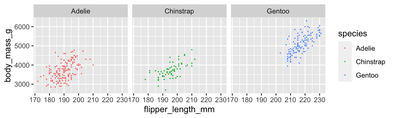
Figure 11.6: Body mass and flipper length for three penguin species.
We compute the sample correlation coefficient \(r\) for each species of penguin.
penguins %>%
  group_by(species) %>%
  summarize(r = cor(flipper_length_mm, body_mass_g, use = "complete.obs"))
## # A tibble: 3 × 2
## species r
## <fct> <dbl>
## 1 Adelie 0.468
## 2 Chinstrap 0.642
## 3 Gentoo 0.703Gentoo penguins have the strongest linear relationship between flipper length and body mass, with \(r = 0.703\). The Adelie penguins have the weakest, with \(r = 0.468\). The difference is visible in the plots, where the points for Adelie penguins have a looser clustering. All three scatterplots do exhibit a clear linear pattern.
In the child tasks study, the sample correlation between child’s age and time on the STT trail B is \(r = -0.593\).
cor(child_tasks$age_in_months, child_tasks$stt_cv_trail_b_secs)## [1] -0.5928128The negative correlation indicates that older children post faster times on the test. This is visible in the scatterplot as a downward trend as you read the plot from left to right.
Note that correlation is a unitless quantity. The term \((x_i - \bar{x})/\sigma_x\) has the same units (for \(x\)) in the numerator and denominator, so they cancel, and the \(y\) term is similar. This means that a linear change of units will not affect the correlation coefficient:
child_tasks$age_in_years <- child_tasks$age_in_months / 12
cor(child_tasks$age_in_years, child_tasks$stt_cv_trail_b_secs)
## [1] -0.5928128It it clear (from experience, not from a statistical point of view) that there is a causal relationship between a child’s age and their ability to connect dots quickly. As children age, they get better at most things. However, correlation is not causation. There are many reasons why two variables might be correlated, and \(x\) causes \(y\) is only one of them.
As a simple example, the size of children’s shoes is correlated with their reading ability. However, you cannot buy a child bigger shoes and expect that to make them a better reader. The correlation between shoe size and reading ability is due to a common cause: age. In this example, age is a lurking variable, important to our understanding of both shoe size and reading ability, but not included in the correlation.
11.3 Geometry of regression
In this section, we establish two geometric facts about the least squares regression line.
We assume data is given as \((x_1,y_1), \dotsc, (x_n,y_n)\), and that the sample means and standard deviations of the data are \(\bar{x}\), \(\bar{y}\), \(s_x\), \(s_y\).
The least squares regression line:
- Passes through the point \((\bar{x},\bar{y})\).
- Has slope \(\hat \beta_1 = r \frac{s_y}{s_x}\).
Before turning to the proof, we illustrate with penguins. Figure 11.7 shows body mass as explained by flipper length for chinstrap penguins. There are vertical dashed lines at \(\bar{x}\) and \(\bar{x} \pm s_x\). Similarly, horizontal dashed lines are at \(\bar{y}\) and \(\bar{y} \pm s_y\). The regression line is thick and blue. The central dashed lines intersect at the point \((\bar{x},\bar{y})\), and this confirms Theorem 11.1, part 1: the regression line passes through the “center of mass” of the data.
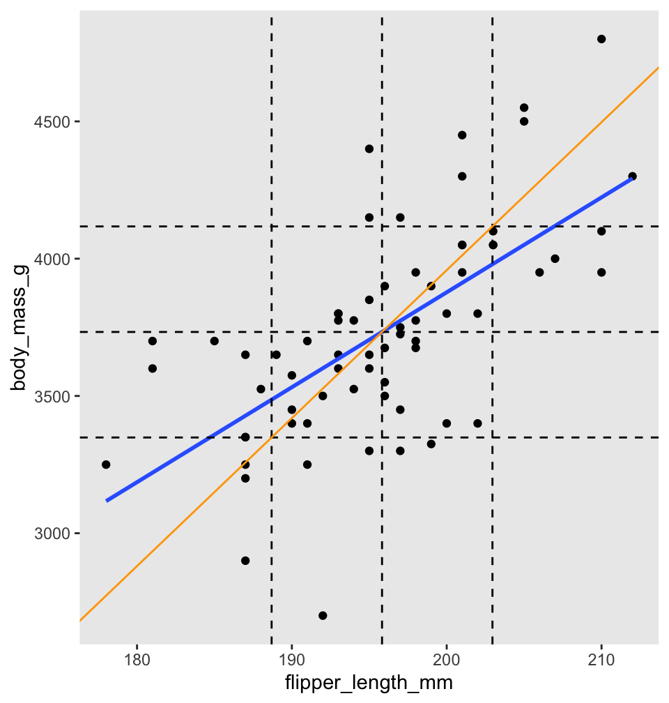
Figure 11.7: Regression line (blue) and standard deviation line (orange) for body mass as described by flipper length for chinstrap penguins.
To better understand Theorem 11.1, part 2, the scale of Figure 11.7 has been adjusted so that one standard deviation is the same distance on both the \(x\)-axis and \(y\)-axis. The diagonal orange line in Figure 11.7 is called the standard deviation line, and it has slope \(\frac{s_y}{s_x}\). Since one SD appears the same length both horizontally and vertically in the plot, the SD line appears at a \(45^\circ\) angle, with apparent slope 1. When looking at scatterplots, the SD line is the visual axis of symmetry of the data. But the SD line is not the regression line. The regression line is always flatter than the SD line. Since the regression line has slope \(r \frac{s_y}{s_x}\), it appears in our scaled figure to have slope \(r\), in this case 0.64. In other words, the correlation coefficient \(r\) describes how much flatter the regression line will be than the diagonal axis of the data.
The regression line is given by \(\hat \beta_0 + \hat \beta_1 x\). The error for each data point is \(y_i - \hat \beta_0 - \hat \beta_1 x_i\). The coefficients \(\hat \beta_0\) and \(\hat \beta_1\) are chosen to minimize the two variable function
\[ SSE(b_0,b_1) = \sum_i \left(y_i - b_0 - b_1 x_i\right)^2 \]
This minimum will occur when both partial derivatives of SSE vanish. That is, the least squares regression line satisfies \[ \frac{\partial SSE}{\partial b_0} = 0 \quad \text{and} \quad \frac{\partial SSE}{\partial b_1} = 0.\]
First, compute the partial derivative with respect to \(b_0\) (keeping in mind that all \(x_i\) and \(y_i\) are constants):
\[ \frac{\partial SSE}{\partial b_0} = -2 \sum_i (y_i - b_0 - b_1 x_i) \]
Setting this equal to zero and dividing by \(n\),
\[ 0 = \frac{1}{n} \sum_i (y_i - b_0 - b_1 x_i) = \bar{y} - b_0 - b_1 \bar{x} \]
Since \(\hat \beta_0\) and \(\hat \beta_1\) satisfy the previous equation, \(\bar{y} = \hat \beta_0 + \hat \beta_1 \bar{x}\). In other words, the point \((\bar{x}, \bar{y})\) lies on the regression line.
This proves part 1 of the theorem. For part 2, observe that the slope of the regression line won’t change if we shift all data points along either the \(x\)-axis or \(y\)-axis. So from here on, we assume that both \(\bar{x}\) and \(\bar{y}\) are zero. In that case, we manipulate the formulas for \(s_x\) and the correlation coefficient \(r\) as follows:
\[ s_x = \sqrt{\frac{\sum(x_i-\bar{x})^2}{n-1}} \implies \sum_i x_i^2 = (n-1)s_x^2 \] \[ r = \frac{1}{n-1}\sum\left(\frac{x_i-\bar{x}}{s_x}\right)\left(\frac{y_i-\bar{y}}{s_y}\right) \implies \sum_i x_i y_i = (n-1)s_x s_y r \]
Now compute the partial derivative of SSE with respect to \(b_1\):
\[ \frac{\partial SSE}{\partial b_1} = -2 \sum_i (y_i - b_0 - b_1 x_i)x_i \]
Setting this to zero, we find:
\[ 0 = \sum_i x_i y_i - b_0 \sum_i x_i - b_1 \sum_i x_i^2 \]
Since \(\bar{x} = 0\) the middle sum vanishes, and we have \[ 0 = (n-1)s_x s_y r - b_1 (n-1)s_x^2 \]
Finally, solve for \(b_1\) to get \(\hat \beta_1 = r\frac{s_y}{s_x}\), which is part 2 of the theorem.
11.4 Residual analysis
Up until this point, we have not assumed anything about the nature of the data \((x_1, y_1), \ldots, (x_n, y_n)\). However, in order to quantify the uncertainty in our estimates for the slope and intercept of the least squares regression line, as well as to perform inference in other ways, we will need to make some additional assumptions.
In a simple linear regression model, there are two random variables \(X\) and \(Y\) and two values \(\beta_0\) and \(\beta_1\) such that the following hold.
- Given that \(X = x\), assume \(Y = \beta_0 + \beta_1 x + \epsilon\), where \(\epsilon\) is a random variable.
- The random variable \(\epsilon\) is a normal rv with mean 0 and standard deviation \(\sigma\).
- The mean and standard deviation of \(\epsilon\) do not depend on \(x\).
- \(\epsilon\) is independent across observations.
Names for \(\beta_0\) and \(\beta_1\) include parameters, constants, and the true values of the intercept and slope. The notation \(\hat \beta_0\) and \(\hat \beta_1\) refers to estimates of the true intercept and slope.
We will write as a shorthand either \(Y = \beta_0 + \beta_1 X + \epsilon\) or \(y_i = \beta_0 + \beta_1 x_i + \epsilon_i\), depending on whether we are thinking of the process of obtaining responses from predictors in general (the first equation) or the process of obtaining responses from particular predictors (the second case). However, we consider the two formulations to be equivalent, and shorthand for the full assumptions given in Assumptions 11.1.
When performing inference using a linear model, it is essential to investigate whether or not the model actually makes sense, and is a reasonable description of the generative process. In this section, we will focus on five common problems that can occur with linear models:
- The relationship between the explanatory and response variables is not linear.
- The variance of \(\epsilon\) is not constant across the \(x\) values.
- \(\epsilon\) is not normally distributed.
- There are outliers that adversely affect the model.
- \(\epsilon\) is not independent across observations.
For each of the five common problems, we provide at least one data set which exhibits the listed problem.
The most straightforward way to assess problems with a model is by visual inspection of the residuals. This is more of an art than a science, and in the end it is up to the investigator to decide whether a model is accurate enough to act on the results.
Recall that the residuals are the vertical distances between the regression line and the data points. Figure 11.8 shows the residuals as vertical line segments. Black points are the penguin data, and the fitted points \((x_i,\hat{y_i})\) are shown as open circles. The residuals are the lengths of the segments between the actual and fitted points.
## Warning: Using `size` aesthetic for lines was deprecated in ggplot2 3.4.0.
## ℹ Please use `linewidth` instead.
## This warning is displayed once every 8 hours.
## Call `lifecycle::last_lifecycle_warnings()` to see where this warning was generated.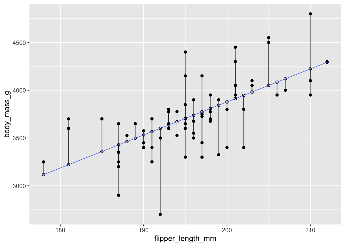
Figure 11.8: Residuals shown as vertical segments for body mass as described by flipper length in chinstrap pengions.
The simplest way to visualize the residuals for a linear model is to apply the base R function plot to the linear model. The plot function produces four diagnostic plots, and when used interactively it shows the four graphs one at a time, prompting the user to hit return between graphs. In RStudio, the Plots panel has arrow icons that allow the user to view older plots, which is often helpful after displaying all four.
As an example, we plot the residuals for the chinstrap penguin data. All four resulting plots are shown in Figure 11.9.
plot(chinstrap_model)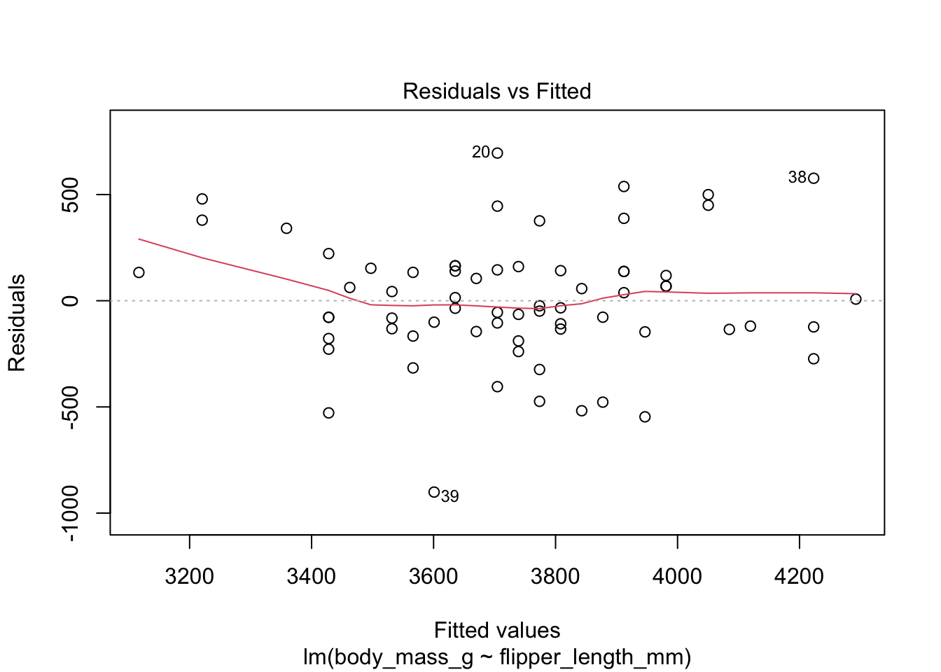
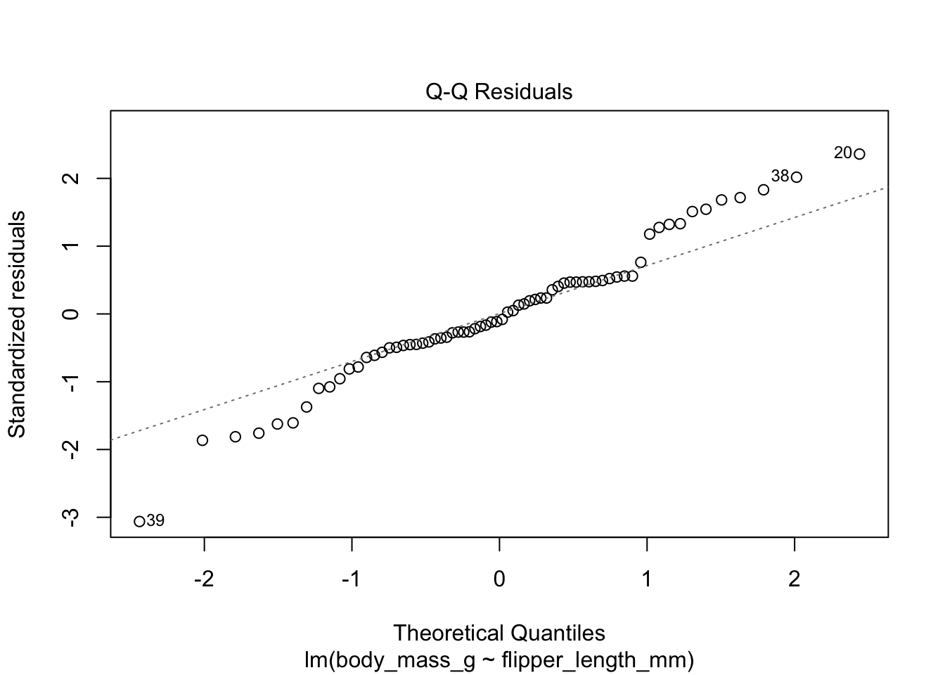
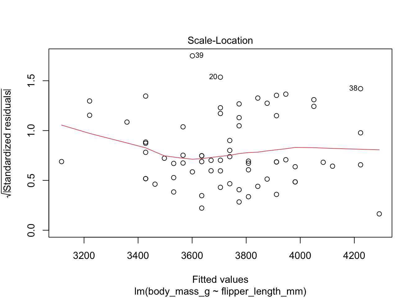
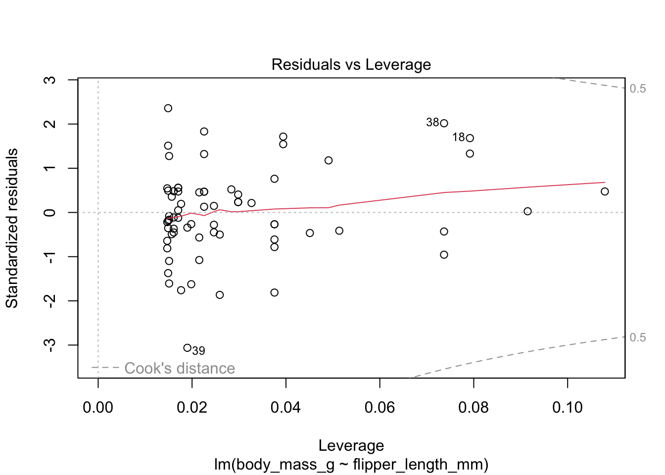
Figure 11.9: Residual plots for chinstrap penguins model of body weight on flipper length.
The “Residuals vs Fitted” plot shows the residuals versus the fitted values \(\hat{y_i}\). It might seem more natural to plot residuals against the explanatory variables \(x_i\), and in fact for simple linear regression it does make sense to do that. However, \(\hat{y_i}\) is a linear function of \(x_i\), so the plot produced by plot looks the same as a plot of residuals against \(x_i\), just with a different scale on the \(x\)-axis. The advantage of using fitted values comes with multiple regression, where it allows for a two-dimensional plot.
The regression line is chosen to minimize the SSE of the residuals. This implies that the residuals themselves have mean zero, since a non-zero mean would allow a better fit by raising or lowering the fit line vertically. The “Residuals vs Fitted” plot shows the mean of zero as a horizontal dashed line. In the “Residuals vs Fitted” plot, ideal residuals are spread uniformly across this line.
A pattern such as a U-shape is evidence of a lurking variable that we have not taken into account. A lurking variable could be information related to the data that we did not collect, or it could be that our model should include a quadratic term. The red curve is fitted to the residuals to make patterns in the residuals more visible.
The second plot is a normal qq plot of the residuals, as discussed in Section 7.2.5. Ideally, the points would fall more or less along the diagonal dotted line shown in the plot.
The “Scale Location” plot shows standardized residuals versus the fitted values. It is perhaps counterintuitive that the variance of residuals associated with predictors that are close to the mean of all predictors is generally larger than the variance of residuals associated with predictors far from the mean of all predictors, see Exercise 11.35. Standardizing the residuals takes this difference into account, so that by making them positive and taking the square root, the visual height of the dots should be equal on average when the variance of the errors is constant, which is a crucial assumption for inference. Ideally the vertical spread of dots will be constant across the plot. The red fitted curve helps to visualize the variance, and we are looking to see that the red line is more or less flat.
The last plot is an analysis of outliers and leverage. Outliers are points that fit the model worse than the rest of the data. Outliers with \(x\)-coordinates in the middle of the data tend to have less of an impact on the final model than outliers toward the edge of the \(x\)-coordinates. Data that falls outside the red dashed lines are high-leverage outliers, meaning that they (may) have a large effect on the final model.
The linear model for the chinstrap penguin data is a good fit, satisfies the assumptions of regression, and does not have high leverage outliers.
11.4.1 Linearity
In order to apply a linear model to data, the relationship between the explanatory and response variable should be linear. If the relationship is not linear, sometimes transforming the data can create new variables that do have a linear relationship. Alternatively, a more complicated non-linear model or multiple regression may be required.
As part of a study to map developmental skull geometry, Li et al.97
recorded the age and skull circumference of 56 young children. The data is in the skull_geometry data set in the fosdata package.
The correlation between age and skull circumference is 0.8, suggesting a strong relationship, but is it linear?
Here is a plot:
skull_geometry <- fosdata::skull_geometry
ggplot(skull_geometry, aes(x = age_mos, y = circumference_cm)) +
  geom_point() +
  geom_smooth(method = "lm") +
  labs(
    title = "Age vs. skull circumference in young children",
    subtitle = "The linear model is a poor fit"
  )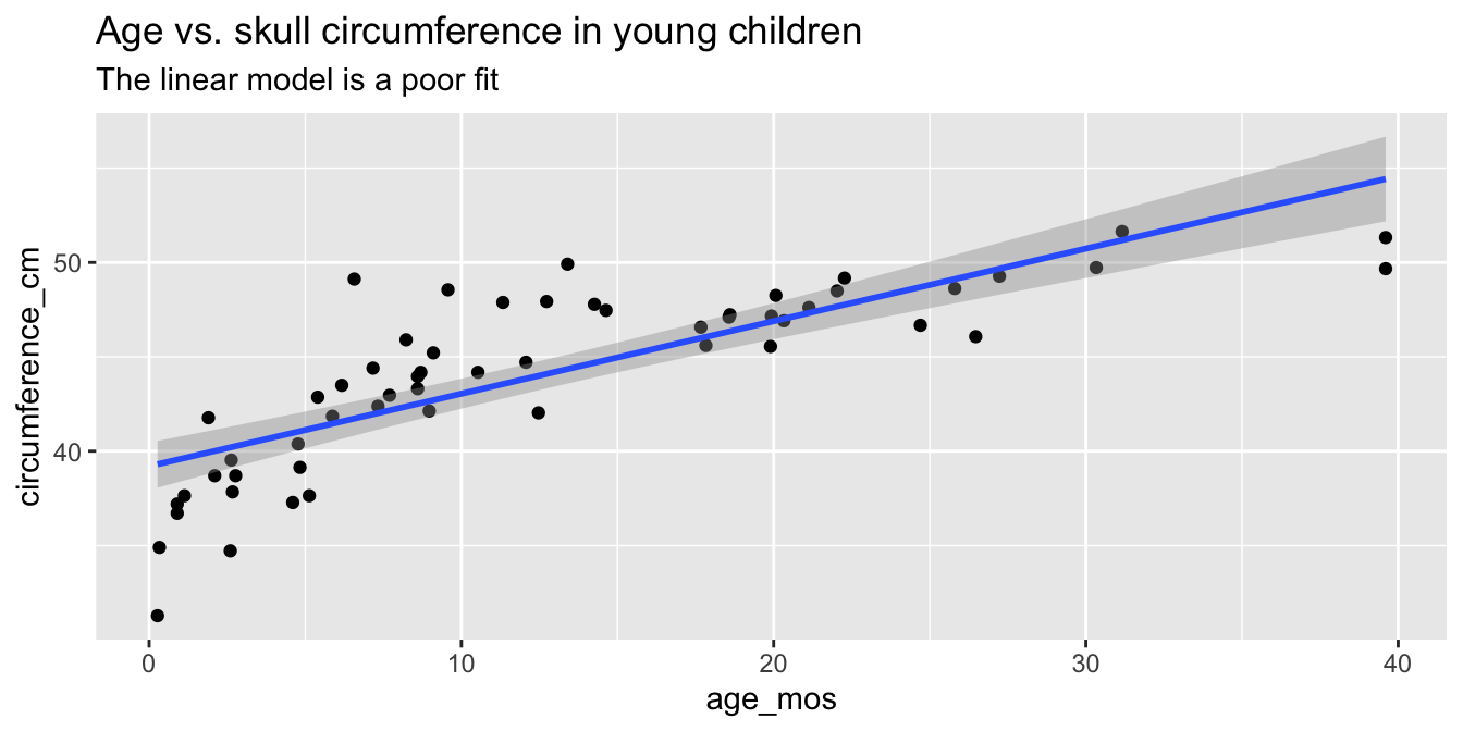
Observe that most of the younger and older children have skulls smaller than the line predicts, while children from 5 to 20 months have larger skulls. This U-shaped pattern suggests that the line is not a good fit for this data. The residual plot (Figure 11.10) makes the U-shape even more visible.
skull_model <- lm(circumference_cm ~ age_mos, data = skull_geometry)
plot(skull_model, which = 1)
# which=1 selects the first of the four plots for display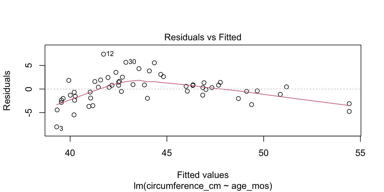
Figure 11.10: Visible U-shape for residuals of the skull geometry model.
A good growth chart for skull circumference would fit a curve to this data, for example by using geom_smooth(method = "loess").
11.4.2 Heteroscedasticity
A key assumption for inference with linear models is that the residuals have constant variance. This is called homoscedasticity. Its failure is called heteroscedasticity, and this is one of the most common problems with linear regression.
Heteroscedastic residuals display changing variance across the fitted values, often with variance increasing from left to right as the size of the response increases:

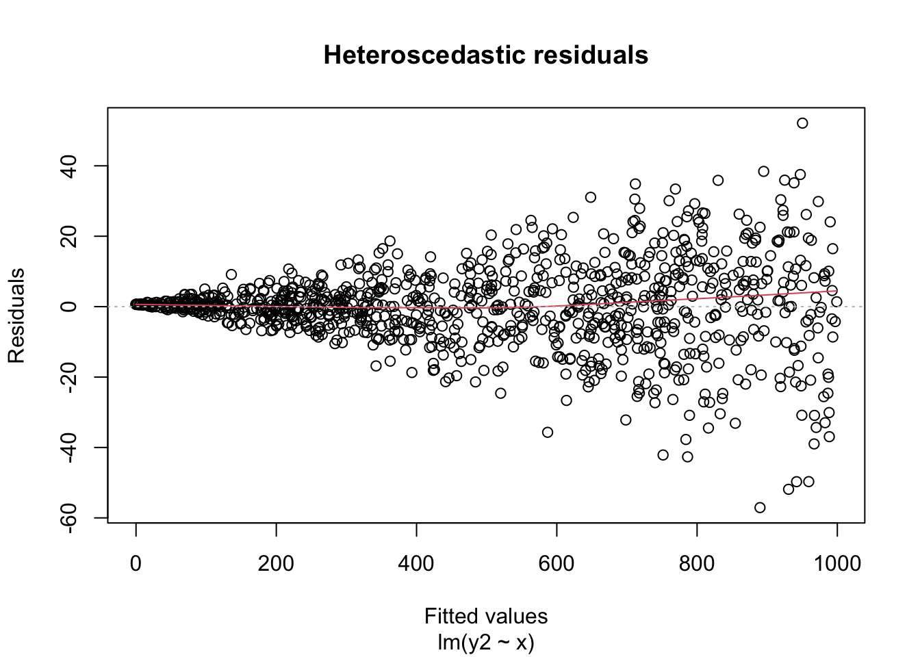
Heteroscedasticity frequently occurs because the true errors are a percentage of the data values, rather than an additive error. For example, many expenditures related to household income are heteroscedastic, since households spend a percentage of their income rather than a fixed amount.
Consider the leg_strength data set in the fosdata package.
Loss of leg strength is a predictor of falls in elderly adults, but measuring leg strength requires expensive laboratory equipment.
Researchers98 built a simple setup using a Nintendo Wii Balance Board
and compared measurements using the Wii to measurements using
the laboratory stationary isometric muscle apparatus (SID).
leg_strength <- fosdata::leg_strength
leg_strength %>%
  ggplot(aes(x = mean_wii, y = mean_sid)) +
  geom_point() +
  geom_smooth(method = "lm", se = FALSE) +
  labs(
    x = "SID", y = "WII",
    title = "Mean leg strength as measured by WII Balance Board vs SID"
  )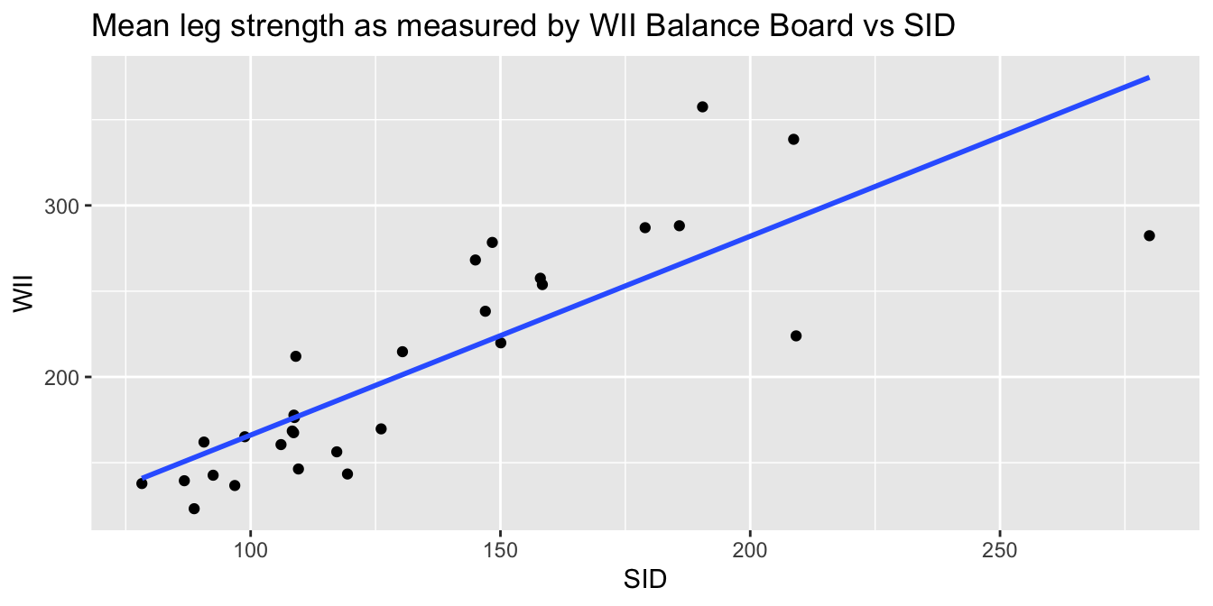
The goal of the experiment is to replace the accurate SID measurement with the inexpensive Wii measurement. The graph makes it clear that the Wii works less well for stronger legs. The “Residuals vs. Fitted” plot shows this heteroscedasticity as well, but the best view comes from the third of the diagnostic plots, shown in Figure 11.11.
wii_model <- lm(mean_sid ~ mean_wii, data = leg_strength)
plot(wii_model, which = 3)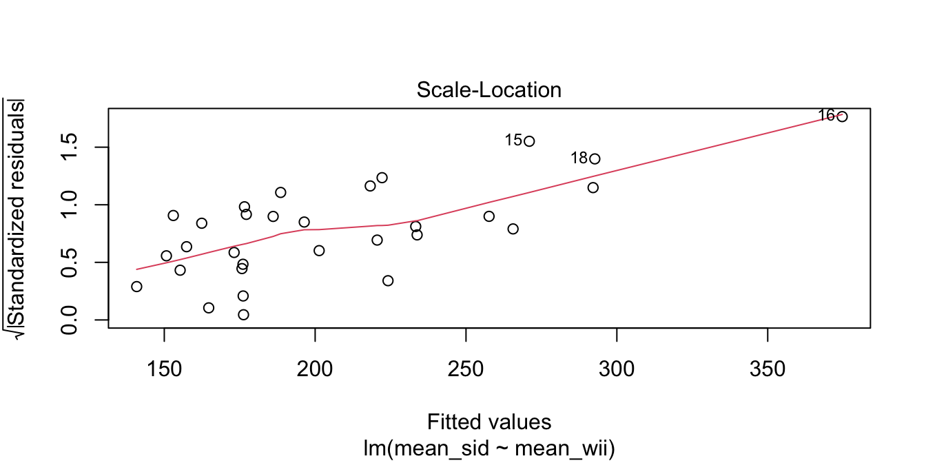
Figure 11.11: Heteroscedasticity of residuals in the leg strength model.
There is a clear upward slant to the points in Figure 11.11, emphasized by the red line. This data is heteroscedastic. Using the linear model for inference would be questionable. You could still use the regression line to convert Wii balance readings to SID values, but you would need to be aware that higher Wii readings would have higher variance.
Right-skewed variables are common. When variables are right-skewed, it means they contain a large number of small values and a small number of large values. For such variables, we are more interested in the order of magnitude of the values: is the value in the 10’s, 1000’s, millions? Working with right-skewed variables often results in heteroscedasticity.
In this example, we look at Instagram posts by gold medal winning athletes in the 2016 Rio Olympic Games, which is in the rio_instagram data frame in the fosdata package. This data contains some duplicated values for athletes
who won more than one gold medal. We remove those duplicates with distinct.
rio_clean <- distinct(fosdata::rio_instagram, name, .keep_all = TRUE)For each athlete, we plot in Figure 11.12 the number of Instagram followers and the maximum number of “likes” for any of their posts during the Olympics.
rio_clean %>%
  filter(!is.na(n_follower)) %>%
  ggplot(aes(x = n_follower, y = max_like)) +
  geom_point()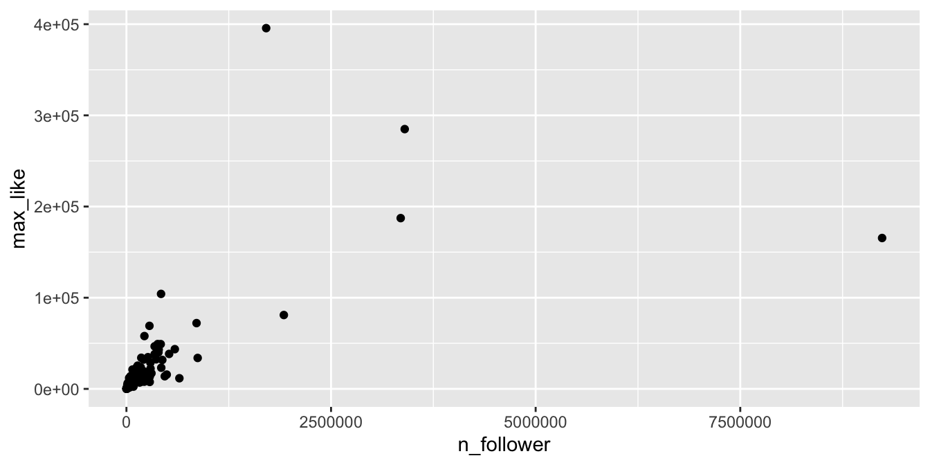
Figure 11.12: Right-skewed variables in the Rio Instagram data set.
The vast majority of the athletes had small (less than 10000) followings, while a few (Usain Bolt, Simone Biles, and Michael Phelps) had over 2.5 million. Even if we filter out the large followings, the graph (Figure 11.13) is still badly heteroscedastic.
rio_clean %>%
  filter(!is.na(n_follower)) %>%
  filter(n_follower < 1000000) %>%
  ggplot(aes(x = n_follower, y = max_like)) +
  geom_point()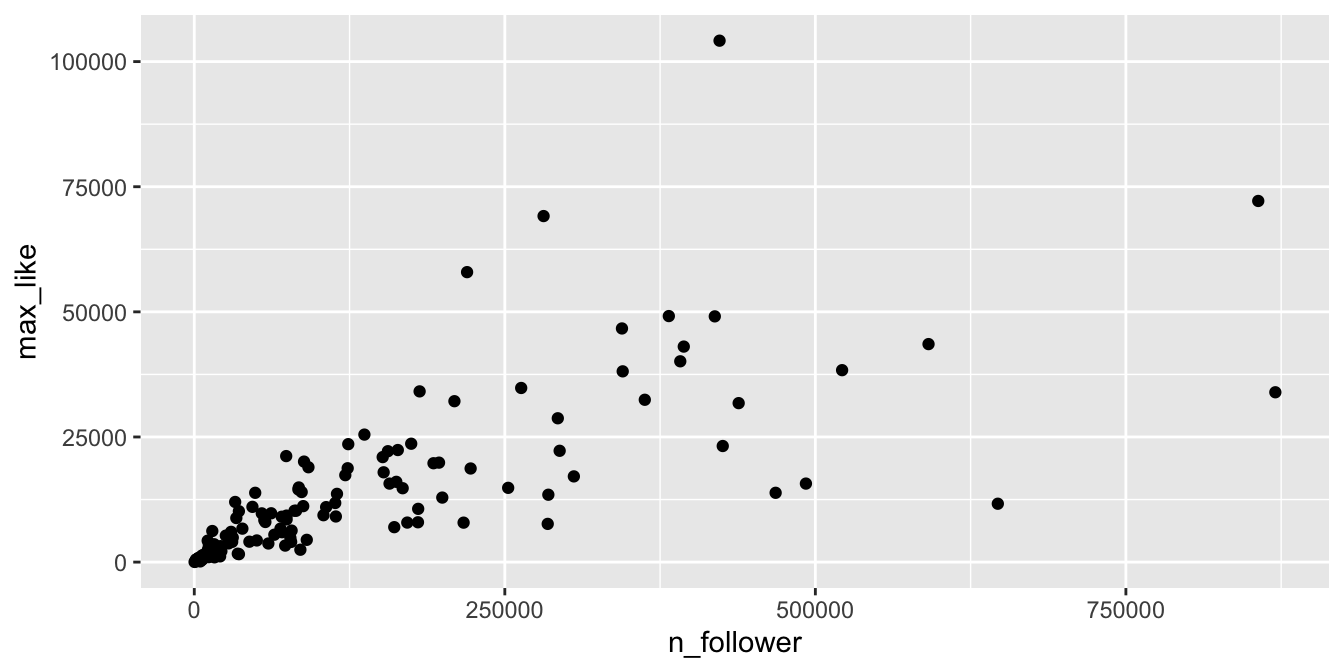
Figure 11.13: Heteroscedasticity in the Rio Instagram data set.
The solution is to transform the data with a
logarithmic transformation.
In R, the function log computes natural logarithms (base \(e\)).
It is not important whether we use base 10 or natural logarithms, since they are linearly related
(i.e., \(\log_e (x) = 2.303 \log_{10}(x)\)).
Figure 11.14 shows the Rio Instagram data after applying a log transformation.
rio_clean %>%
  filter(!is.na(n_follower)) %>%
  ggplot(aes(x = log(n_follower), y = log(max_like))) +
  geom_point() +
  geom_smooth(method = "lm")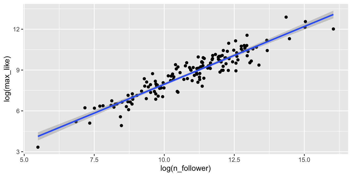
Figure 11.14: Rio Instagram data after a log transformation.
The relationship between log followers and log likes is now visibly linear. Figure 11.15 shows the residual Scale-Location plot, and the residuals are homoscedastic.
rio_model <- lm(log(max_like) ~ log(n_follower), data = rio_clean)
plot(rio_model, which = 3)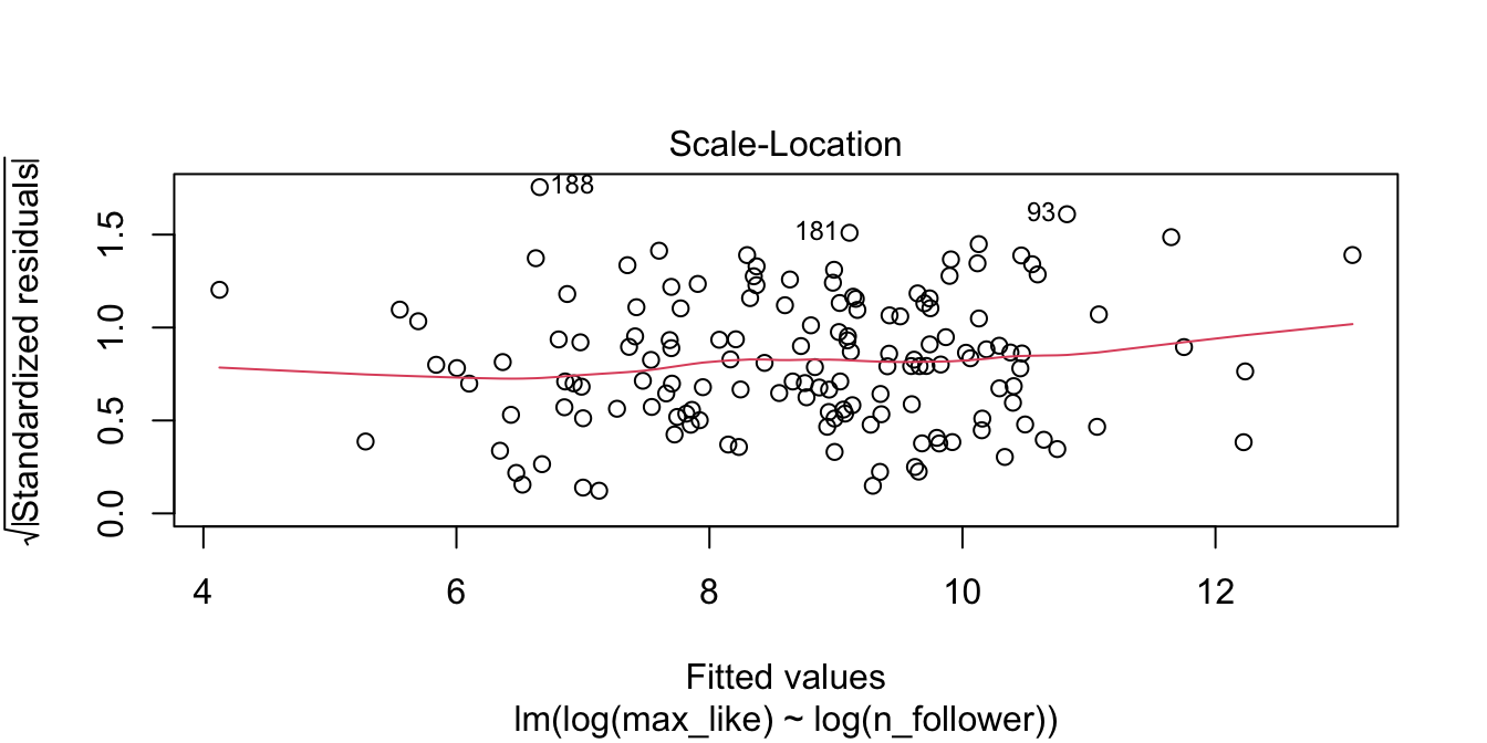
Figure 11.15: Rio Instagram residuals after the log transformation are homoscedastic.
Our linear model now involves the log variables. We compute the coefficients:
rio_model$coefficients## (Intercept) log(n_follower)
## -0.5322455 0.8489013The regression line is \[ \widehat{\log(\text{Max.Likes})} = -0.532 + 0.849 \cdot \log(\text{N.follower}) \]
We can use this model to make predictions and estimates, after converting to and from log scales. Or, we can exponentiate the regression equation to get the following relationship:
\[ \widehat{\text{Max.Likes}} = 0.587 \cdot \text{N.follower}^{0.849} \]
11.4.3 Normality
Assumption 2 in our model is that the error terms are normally distributed. We saw in Section 7.2 how to use qq plots to visualize whether a sample likely comes from a specified distribution. In this section, we see how to examine qq plots of residuals.
The barnacles data set in the fosdata package describes the number of barnacles found on coral reefs.
We model the density of barnacles (the number of barnacles per square meter) on the percentage of coral cover on the reef.
barnacles <- fosdata::barnacles
ggplot(barnacles, aes(x = coral_cover, y = barnacle_density)) +
  geom_point() +
  geom_smooth(method = "lm")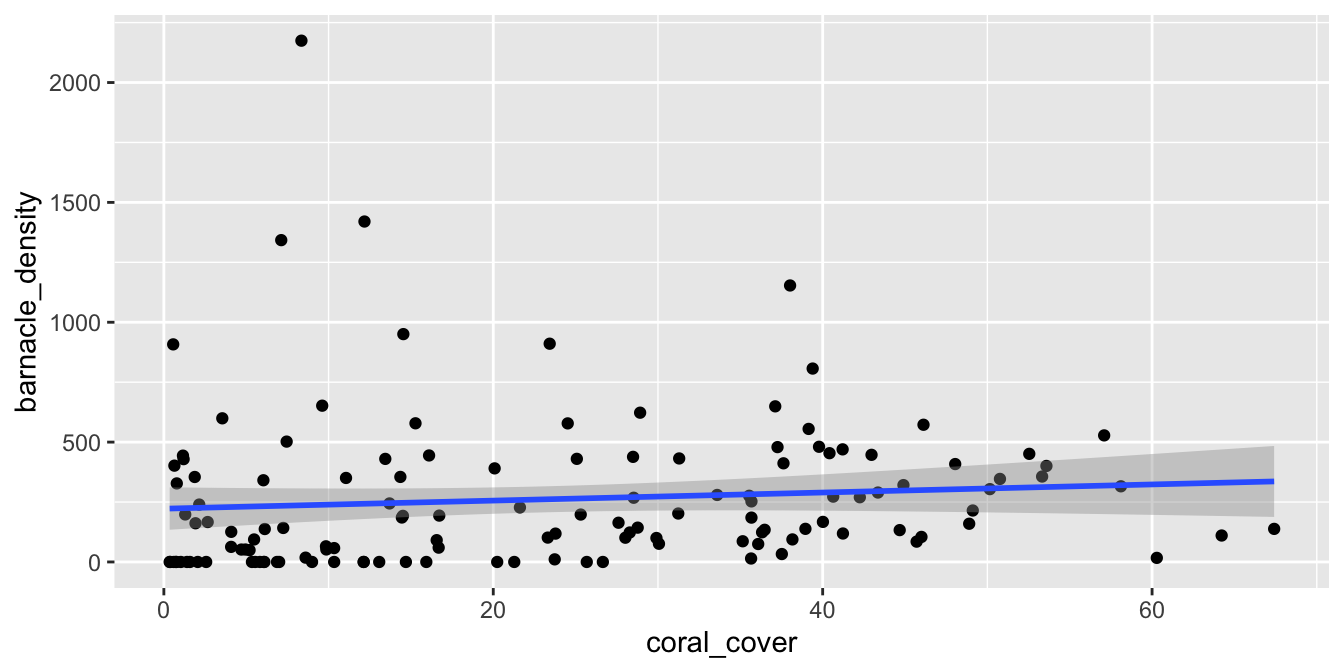
Figure 11.16: Barnacle data with non-normal (right-skewed) residuals.
We see from Figure 11.16 that there doesn’t appear to be a strong linear relationship between the predictor and response. If you look carefully, you will see that the errors appear to be right-skewed. Let’s look at the normal qq plot of the residuals.
barn_mod <- lm(barnacle_density ~ coral_cover, data = barnacles)
plot(barn_mod, which = 2)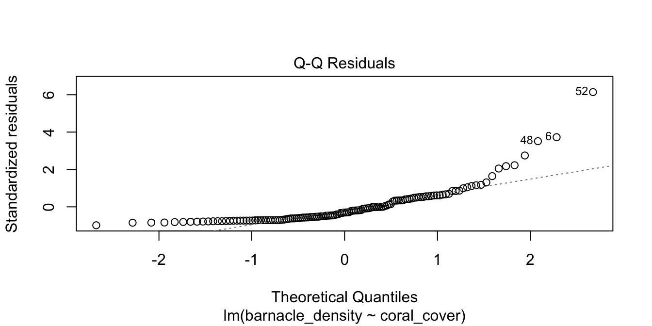
Figure 11.17: Right-skewed residuals in the diagnostic qq plot.
Figure 11.17 has a U-shape, which is an indicator of skewness. This data does not follow our model.
Filter out reefs with no barnacles (a count of zero) and then model the log of barnacle density on the coral cover. Do the residuals appear approximately normal?
11.4.4 Outliers and leverage
Linear regression minimizes the SSE of the residuals. If one data point is far from the others, the residual for that point could have a major effect on the SSE and therefore the regression line. A data point which is distant from the rest of the data is called an outlier.
Outliers can pull the regression line toward themselves. The regression line always goes through the center of mass of the data, the point \((\bar{x},\bar{y})\). If the outlier’s \(x\)-coordinate is far from the other \(x\)-coordinates in the data, then a small pivot of the line about the center of mass will make a large difference to the residual for the outlier. Because the outlier contributes the largest residual, it can have an outsized effect on the slope of the line. This phenomenon is called leverage.
Figure 11.18 shows a cloud of uncorrelated points, with two labeled \(A\) and \(B\). Point \(A\) has an \(x\)-coordinate close to the mean \(x\)-coordinate of all points, so changing its \(y\) value has a small effect on the regression line. This is shown in the second picture. Point \(B\) has an \(x\)-coordinate that is extreme, and the third picture shows that changing its \(y\) value makes a large difference to the slope of the line. Point \(A\) has low leverage, point \(B\) has high leverage.
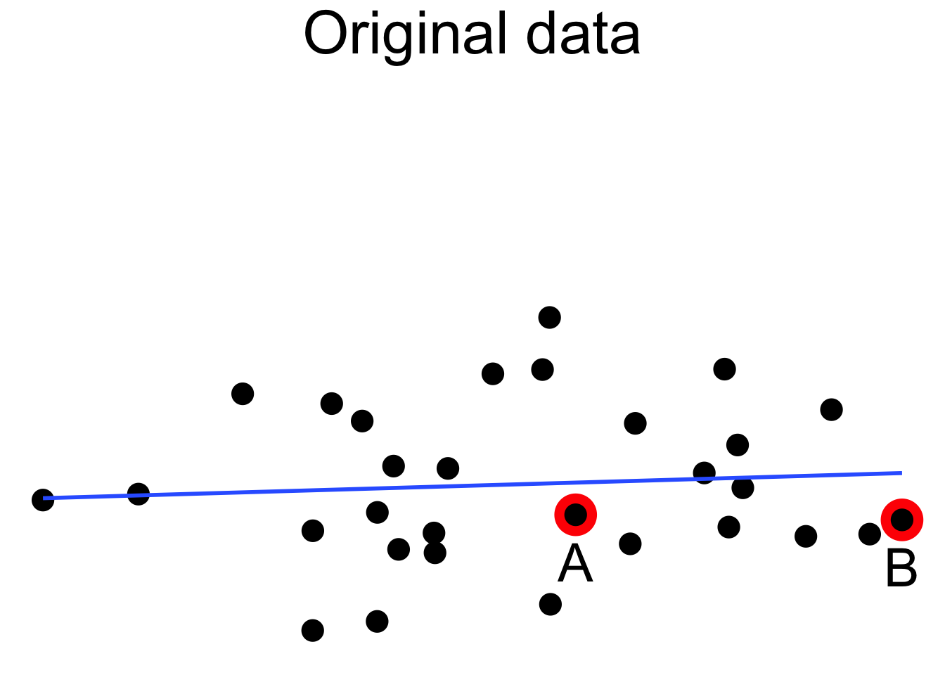
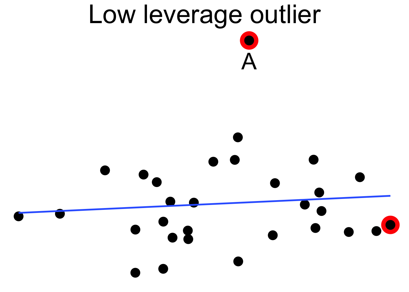
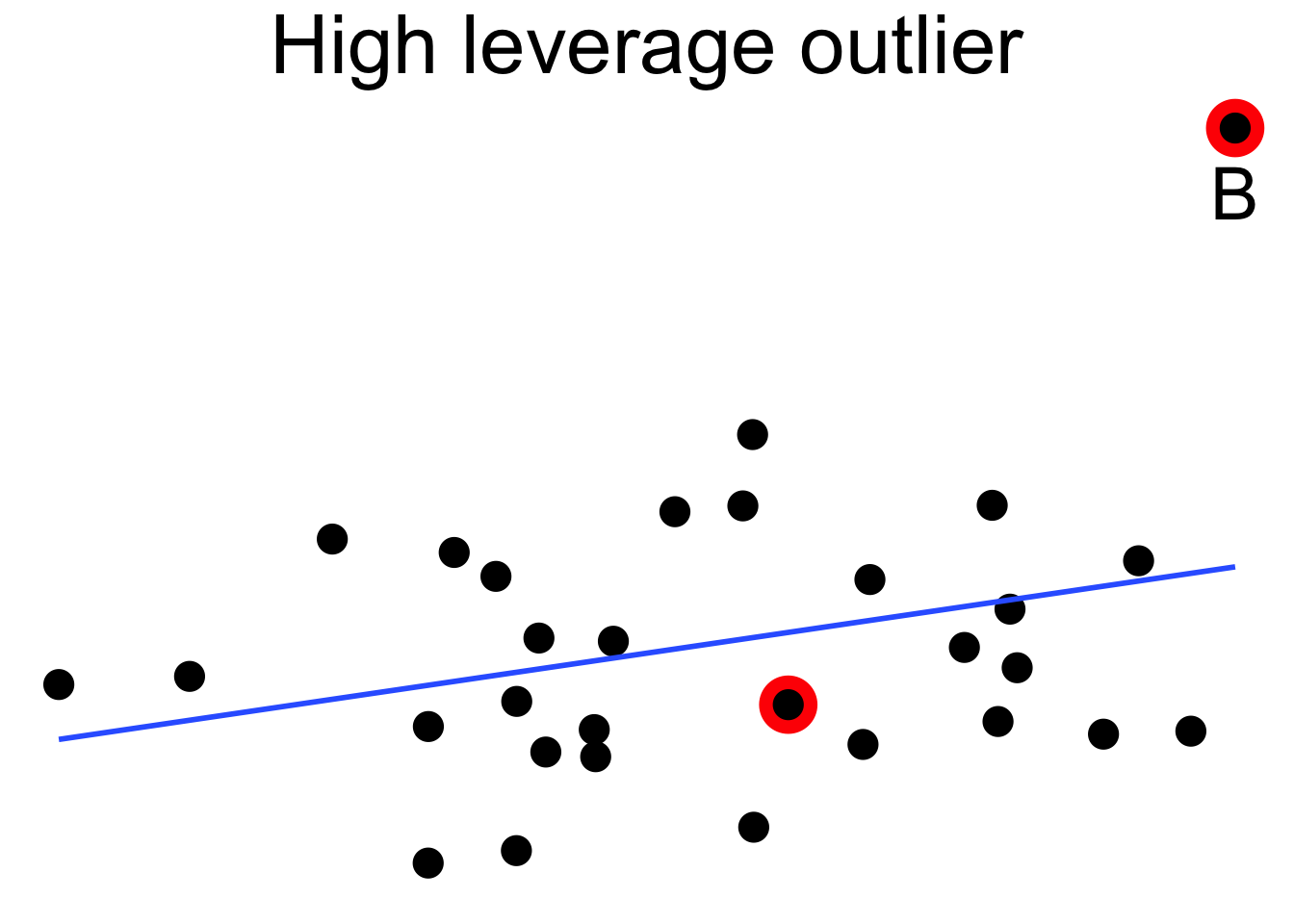
Figure 11.18: High leverage point B has a relatively large effect on the regression line.
Dealing with high leverage outliers is a challenge. Usually it is a good idea to run the analysis both with and without the outliers, to see how large of an effect they have on the conclusions. A more sophisticated approach is to use robust methods. Robust methods for regression are analogous to rank based tests in that both are resistant to outliers. For more information on robust regression, see Venables and Ripley.99
The pulitzer100 data set contains data on the circulation of fifty major U.S. newspapers along with counts of the number of Pulitzer prizes won by each.
Do Pulitzer prizes help newspapers maintain circulation?
In Figure 11.19 we plot the number of Pulitzer prizes won as the explanatory variable, and the percent change in circulation from 2004 to 2013 as the response. The pulitzer data is available in the fivethirtyeight package.
pulitzer <- fivethirtyeight::pulitzer
pulitzer <- rename(pulitzer, pulitzers = num_finals2004_2014)
ggplot(pulitzer, aes(x = pulitzers, y = pctchg_circ)) +
  geom_point() +
  geom_smooth(method = "lm")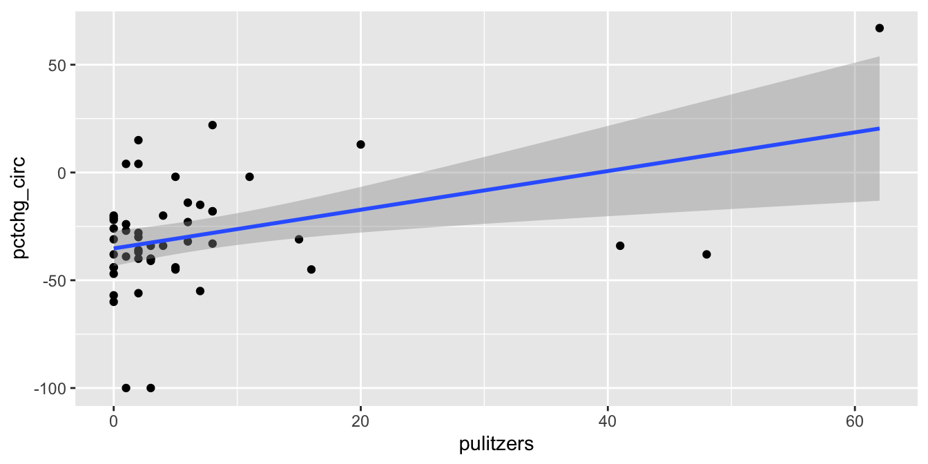
Figure 11.19: The Pulitzer Prize data has high leverage outliers.
The regression line has positive slope, suggesting that more Pulitzer prizes correspond with an increase (or smaller decrease) in circulation. There are some high leverage outliers with a large number of Pulitzers compared to the other newspapers. The high leverage outliers show up in the “Residuals vs Leverage” diagnostic plot, see Figure 11.20.
pulitzer_full_model <- lm(pctchg_circ ~ pulitzers, data = pulitzer)
plot(pulitzer_full_model, which = 5)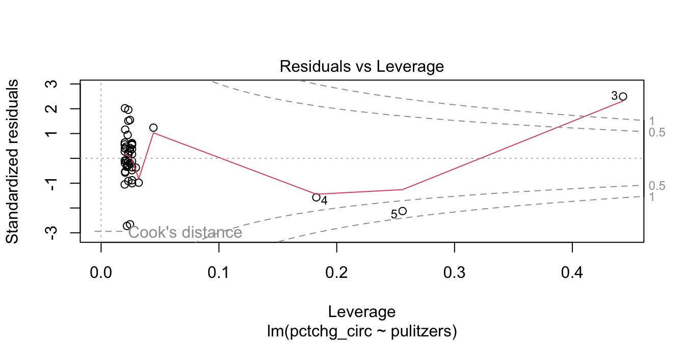
Figure 11.20: Newspaper 3 is high leverage, outside the dashed Cook’s distance lines.
Newspaper 3 is well outside the red “Cook’s distance” lines. What paper is it?
pulitzer$newspaper[3]## [1] "New York Times"It is good practice to perform the regression with and without the outliers, and see if it makes a difference. Figure 11.21 shows the data after removing The New York Times, together with the line of best fit.
pulitzer %>%
  filter(newspaper != "New York Times") %>%
  ggplot(aes(x = pulitzers, y = pctchg_circ)) +
  geom_point() +
  geom_smooth(method = "lm")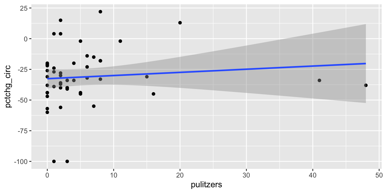
Figure 11.21: Removing The New York Times removes most of the relationship between circulation and prizes.
We see that the line of best fit has changed dramatically with the removal of a single point, and that the apparent correlation in the first plot between Pulitzer Prizes and circulation is almost entirely due to The New York Times. Because most newspapers are struggling and The New York Times is one of the few that are not, it is hard to say if quality (as measured by prizes) does influence circulation. As always, correlation is not causation, and here even the correlation itself is questionable.
11.4.5 Independence
The model for linear regression assumes that the errors are independent. While there are some techniques that we can use to check for independence by looking at the residuals, you will also need to think carefully about the way in which the data was collected. We consider two examples that illustrate different ways that residuals may not be independent.
In this section, we will need to access the residuals of the model directly rather than through plot(mod).
Consider the seoulweather data set in the fosdata package. This data set gives the predicted high temperature (ldaps_tmax_lapse) and the observed high temperature (next_tmax) for summer days at 25 stations in Seoul, along with a lot of other data. Suppose we wish to model the error in the prediction on the current day high temperature (present_tmax). We need to modify our data a bit.
seoul <- fosdata::seoulweather
seoul <- mutate(seoul, temp_error = ldaps_tmax_lapse - next_tmax)
temp_mod <- lm(temp_error ~ present_tmax, data = seoul)Plot the residuals of the model and verify that they do not look too bad, though they are clearly not normal.
We are concerned with correlation among the residuals. It seems very likely that the residuals from one station are correlated with the residuals from the same day for a nearby station. This would be saying that if it is hotter than predicted somewhere, then it is likely also hotter than predicted a half-mile away.
Let’s append the residuals to the original data frame for ease of use.
seoul <- seoul %>%
  mutate(resid = temp_error - predict(temp_mod, newdata = seoul))
Now, let’s see if the residuals associated with station 1 are correlated with the residuals associated with station 2. We filter those two stations and pivot the data so we have two columns of residuals, one for each station.
wide_resid <- seoul %>%
  filter(station %in% c(1, 2)) %>%
  select(station, resid, date) %>%
  tidyr::pivot_wider(
    names_from = "station",
    names_prefix = "station_",
    values_from = resid
  )
Compute the sample correlation coefficient (avoiding NA values):
summarize(wide_resid, cor = cor(station_1, station_2, use = "complete.obs"))## # A tibble: 1 × 1
## cor
## <dbl>
## 1 0.892Figure 11.22 shows a scatterplot of the residuals in station 2 versus the residuals in station 1 on the same day. The correlation coefficient of 0.892 and the linear trend in the plot provide convincing evidence that the residuals are correlated.
ggplot(wide_resid, aes(x = station_1, y = station_2)) +
  geom_point()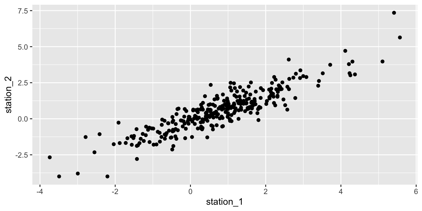
Figure 11.22: Correlation between the residuals of two weather stations in Seoul.
In the next example, we examine another common source of dependence in data sets, which is dependence on time. This is known as serial correlation.
Consider the daily high temperatures in Seoul from June 30 through August 3 at station 1 in 2016.
We wish to model the high temperature on time using a linear model.
The lubridate package helps clean up the dates and calculates the number of days since June 30, which we choose as our explanatory variable.
seoul_2016 <- seoul %>%
  mutate(date = lubridate::ymd(date)) %>%
  mutate(days_since_june30 = date - lubridate::ymd("2016/06/30")) %>%
  filter(station == 1, lubridate::year(date) == 2016)
Figure 11.23 shows the time series of high temperatures over the summer of 2016.
ggplot(seoul_2016, aes(x = date, y = present_tmax)) +
  geom_point() +
  geom_smooth(method = "lm")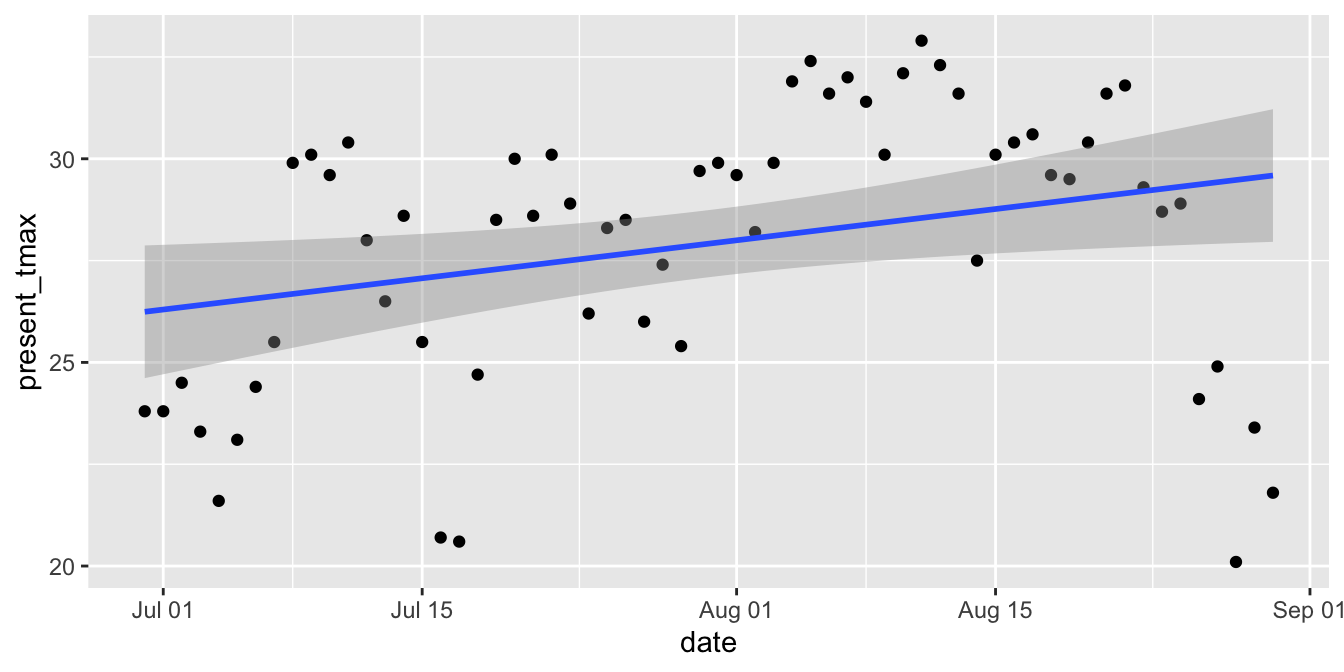
Figure 11.23: Serial correlation of high temperatures in Seoul in 2016.
The upward slope of the line would seem to indicate that the daily high temperature increases throughout the late summer. However, we suspect serial correlation in the residuals: if the temperature is above the mean one day, then it will likely be above the mean the next day. Drawing conclusions based on this model is suspect.
To confirm the serial correlation, we construct the linear model, calculate the residuals, and then plot the residuals of one day versus the residuals of the next day.
The function lag shifts the residual vector by one so the \(y\)-axis in Figure 11.24 gives the “next day” residual.
seoul_mod <- lm(present_tmax ~ days_since_june30, data = seoul_2016)

seoul_2016 <- seoul_2016 %>%
  mutate(resid = present_tmax - predict(seoul_mod, seoul_2016))

seoul_2016 %>% ggplot(aes(x = resid, y = lag(resid))) +
  geom_point() +
  labs(x = "Residual one day", y = "Residual the next day")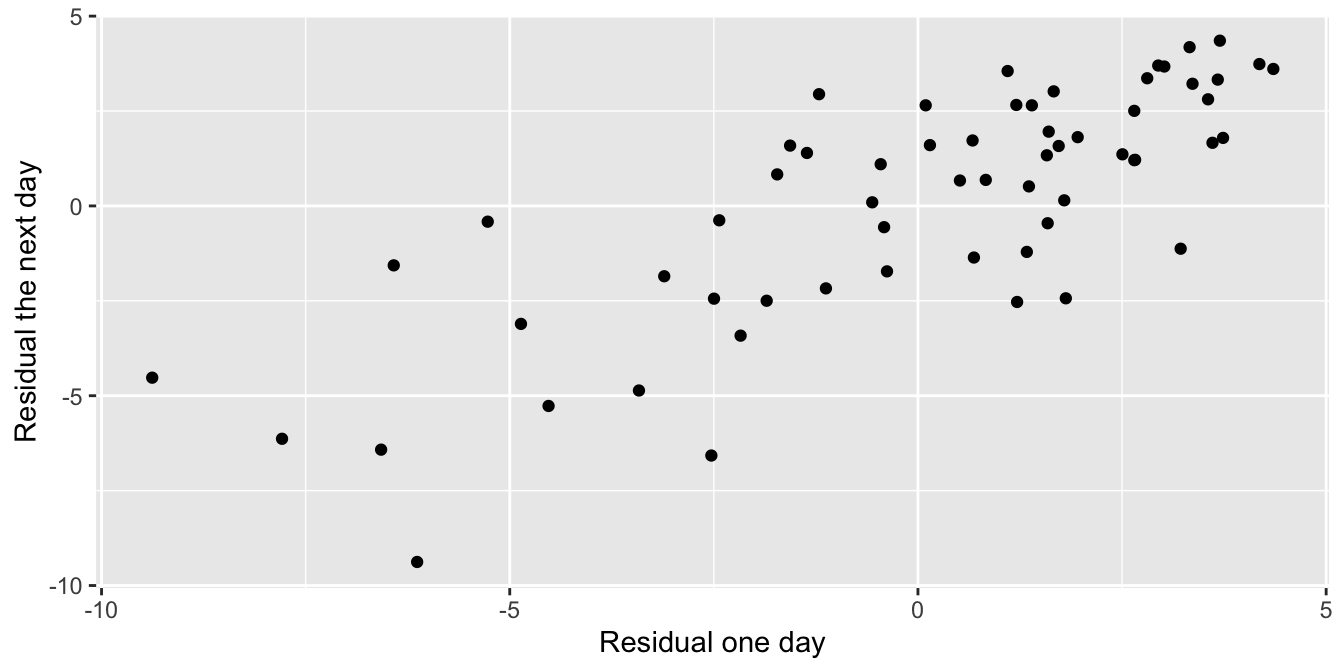
Figure 11.24: Residuals from one day are correlated with those from the next day.
11.5 Inference
How can we detect a relationship between two numeric variables? Given a sample \((x_1,y_1), \dotsc, (x_n,y_n)\), the correlation coefficient \(r\) and the regression line \(\hat y = \hat \beta_0 + \hat \beta_1 x\) both describe a linear relationship between \(X\) and \(Y\). However, the correlation and the regression line both depend on the sample. A different sample would lead to different statistics. How do we decide if the one sample we have available gives evidence of a linear relationship between the two variables? The answer is to use hypothesis testing.
The natural null hypothesis is usually that there is no linear relationship between \(X\) and \(Y\). To make this precise mathematically, observe that under this null hypothesis, the slope of the regression line would be zero. That is, the line would be flat. The hypothesis test then becomes:
\[ H_0 : \beta_1 = 0, \quad H_a : \beta_1 \neq 0 \]
Rejecting \(H_0\) means that there is a linear relationship between \(X\) and \(Y\), or equivalently that \(X\) and \(Y\) are correlated.
To run this test, assume \(H_0\), then observe a sample. Estimate the slope of the regression line from the sample. Then compute the probability of observing such a slope (or an even less likely slope) under the assumption that the true slope is actually 0. This probability is the \(p\)-value for the test.
In R, these computations are done by the summary command applied to
the linear model constructed by lm.
Is there a linear relationship between chinstrap penguin flipper length and body mass? If \(\beta_1\) is the true slope of the regression line, we test the hypotheses \[ H_0 : \beta_1 = 0, \quad H_a : \beta_1 \neq 0 \]
We previously examined residual plots (Figure 11.9) and determined that the assumptions of a linear model are met, so we proceed to inference.
summary(chinstrap_model)##
## Call:
## lm(formula = body_mass_g ~ flipper_length_mm, data = chinstrap)
##
## Residuals:
## Min 1Q Median 3Q Max
## -900.90 -137.45 -28.55 142.59 695.38
##
## Coefficients:
## Estimate Std. Error t value Pr(>|t|)
## (Intercept) -3037.196 997.054 -3.046 0.00333 **
## flipper_length_mm 34.573 5.088 6.795 3.75e-09 ***
## ---
## Signif. codes: 0 '***' 0.001 '**' 0.01 '*' 0.05 '.' 0.1 ' ' 1
##
## Residual standard error: 297 on 66 degrees of freedom
## Multiple R-squared: 0.4116, Adjusted R-squared: 0.4027
## F-statistic: 46.17 on 1 and 66 DF, p-value: 3.748e-09The summary command produces quite a bit of output. Notice the Call is a helpful
reminder of how the model was built – it was quite a ways back in this chapter!
The \(p\)-value we need for this hypothesis test is given in the Coefficients
section, at the end of the flipper_length_mm line.
It is labeled Pr(>|t|).
For this hypothesis test, \(p = 3.75\times 10^{-9}\) and it is significant.
The *** following the value means that the results are significant at the \(\alpha = 0.001\) level.
We reject \(H_0\) and conclude that there is a significant linear relationship between flipper length and body mass for chinstrap penguins.
Lifting weights can build muscle strength. Scientific studies require detailed information about the body during weight lifting, and one important measure is the time under tension (TUT) during muscle contraction. However, TUT is difficult to measure. The best measurement comes from careful human observation of a video recording, which is impractical for a large study. In their 2020 paper101, Viecelli et al. used a smartphone’s accelerometer to estimate the time under tension for various common machine workouts. They also used a video recording of the workout to do the same thing. Could the much simpler and cheaper smartphone method replace the video recording?
The data is available as accelerometer in the fosdata package.
accelerometer <- fosdata::accelerometerIn this example, we focus on the abductor machine during the Rep mode of the contraction. The data set contains observations tagged as outliers, which we remove.
abductor <- accelerometer %>%
  filter(machine == "ABDUCTOR") %>%
  filter(stringr::str_detect(contraction_mode, "Rep")) %>%
  filter(!rater_difference_outlier &
    !smartphone_difference_outlier &
    !video_smartphone_difference_outlier)
Let’s start by looking at a plot. Following the authors of the paper, we will create a Bland-Altman plot. A Bland-Altman plot is used when there are two measurements of the same quantity, especially when one is considered the “gold standard.” We plot the difference of the two measurements versus the mean of the two measurements in Figure 11.25.
abtimediff <- abductor %>%
  mutate(
    difference = smartphones_mean_ms - video_rater_mean_ms,
    mean_time = (video_rater_mean_ms + smartphones_mean_ms) / 2
  )
abtimediff %>%
  ggplot(aes(x = mean_time / 1000, y = difference / 1000)) +
  geom_point() +
  labs(
    x = "Mean time estimate (sec)",
    y = "Difference in Estimates (sec)"
  )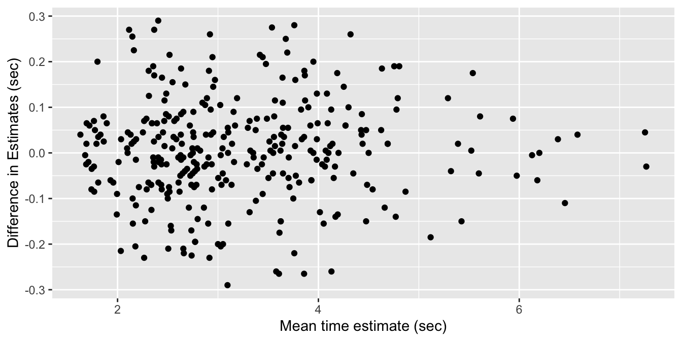
Figure 11.25: Bland-Altman plot of video and smartphone measurements.
If the phone measurement is a good substitute for the video measurement, the difference of the measurements should have small standard deviation, have mean zero, and not depend on the mean of the measurements. We can use linear regression to assess the last two objectives.
The regression line through these points should have a slope and an intercept of 0. Indeed, if the intercept is not zero (but the slope is zero), then that would indicate a bias in the smartphone measurements. If the slope is not zero, then that would indicate that the smartphone estimate is not working consistently through all of the time intervals. So, let’s perform a linear regression and see what we get.
accel_mod <- lm(difference ~ mean_time, data = abtimediff)
summary(accel_mod)$coefficients
## Estimate Std. Error t value Pr(>|t|)
## (Intercept) -6.226185392 20.37164776 -0.3056299 0.7600870
## mean_time 0.003519751 0.00600059 0.5865675 0.5579117Check the residual plots of the model accel_mod and confirm that they are acceptable.
We cannot reject the null hypothesis that the slope is zero (\(p=0.56\)), nor the null hypothesis that the intercept is zero (\(p=0.76\)). It appears that the smartphone accelerometer measurement is a good substitute for video measurement of abductor time under tension, as long as the standard deviation is acceptable.
11.5.1 The summary command
Let’s go through the rest of the output that R produces in the summary of a linear model.
The full output of the command summary(chinstrap_model) is shown in the previous section.
Here, we take it apart.
## Call:
## lm(formula = body_mass_g ~ flipper_length_mm, data = chinstrap)
The Call portion of the output reproduces the
original function call that produced the linear model. Since that call
happened much earlier in this chapter, it is helpful to have it here for review.
## Coefficients:
##                    Estimate Std. Error t value Pr(>|t|)
## (Intercept)       -3037.196    997.054  -3.046  0.00333 **
## flipper_length_mm    34.573      5.088   6.795 3.75e-09 ***
The Coefficients portion describes the coefficients of the regression model in detail.
The Estimate column gives the intercept value and the slope of the regression line, which is
\(\widehat{\text{mass}} = -3037.196 + 34.573 \cdot \text{flipper length}\) as we have seen before.
The standard error column Std. Error is a measure of how accurately we can estimate the coefficient.
We will not describe how this is computed.
The value is always positive, and should be compared to the size of the estimate itself by dividing the estimate by the standard error.
This division produces the \(t\) value, i.e., \(t = 34.573/5.088 = 6.795\) for flipper length.
Under the assumption that the errors are iid Norm(0, \(\sigma\)), the test statistic \(t\) has a
\(t\) distribution,
with \(n-2\) degrees of freedom.
Here, \(n = 68\) is the number of penguins in the chinstrap data.
We subtract 2 because we used the data to estimate two parameters (the slope and the intercept) leaving only 66 degrees of freedom.
The \(p\)-value for the test is the probability that a random \(t\) is more extreme than
the observed value of \(t\), which explains the notation Pr(>|t|) in the last column.
To reproduce the \(p\)-values associated with flipper_length_mm, use
2 * (1 - pt(6.795, df = 66))## [1] 3.743945e-09where we have doubled the value because the test is two-tailed.
The final Coefficients column contains the significance codes, which are not universally loved.
Basically, the more stars, the lower the \(p\)-value in the hypothesis test of the coefficients as described above.
One problem with these codes is that the (Intercept) coefficient is often highly significant, even though it has a dubious interpretation. Nonetheless, it receives three stars in the output, which bothers some people.
## Residual standard error: 297 on 66 degrees of freedom
## Multiple R-squared:  0.4116, Adjusted R-squared:  0.4027
## F-statistic: 46.17 on 1 and 66 DF,  p-value: 3.748e-09
The residual standard error is an estimate of the standard deviation of the error term in the linear model. Recall that we are working with the model \(y_i = \beta_0 + \beta_1 x_i + \epsilon_i\), where \(\epsilon_i\) are assumed to be iid normal random variables with mean 0 and unknown standard deviation \(\sigma\). The residual standard error is an estimate for \(\sigma\).
Multiple R-squared is the square of the correlation coefficient \(r\) for the two variables in the model.
The rest of the output is not interesting for simple linear regression, i.e., only one explanatory variable,
but becomes interesting when we treat multiple explanatory variables in Chapter 13.
For now, notice that the \(p\)-value on the last line is exactly the same as the \(p\)-value for the flipper_length_mm coefficient,
which was the \(p\)-value needed to test for a relationship between flipper length and body weight.
11.5.2 Confidence intervals for parameters
The most likely type of inference on the slope we will make is \(H_0: \beta_1 = 0\) versus \(H_a: \beta_1 \not = 0\). The \(p\)-value for this test is given in the summary of the linear model. However, there are times when we want a confidence interval for the slope, or to test the slope against a value other than 0. We illustrate with the following example.
Consider the data set Davis in the package carData.
The data consists of 200 observations of the variables sex, weight, height, repwt, and repht.
Figure 11.26 shows a plot of patients’ weight versus their reported weight.
Davis <- carData::Davis
ggplot(Davis, aes(x = repwt, y = weight)) +
  geom_point()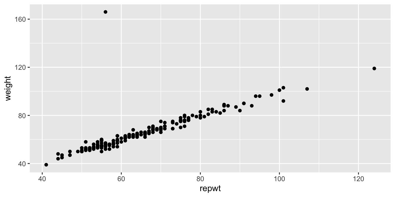
Figure 11.26: Weight versus reported weight for 200 patients.
As we can see, there is a very strong linear trend in the data. There is also one outlier, who has reported weight of 56 and observed weight of 166. Let’s remove that data point:
Davis <- filter(Davis, weight != 166)Create a linear model for weight as explained by repwt and then extract the coefficients:
modDavis <- lm(weight ~ repwt, data = Davis)
summary(modDavis)$coefficients
## Estimate Std. Error t value Pr(>|t|)
## (Intercept) 2.7338020 0.81479433 3.355205 9.672344e-04
## repwt 0.9583743 0.01214273 78.925763 1.385270e-141Check the residual plots of modDavis and confirm that they are acceptable.
In this example, we are not interested in testing the slope of the regression line against zero, since the linear relationship is obvious.
The statement we would like to test is whether people report their weights accurately. Perhaps as people vary further from what is considered a healthy weight, they report their weights toward the healthy side. Underweight people might overstate their weight and overweight people might understate their weight. So, an interesting question here is whether the slope of the regression line is 1.
Let’s estimate the 95% confidence interval for the slope of the regression line. This interval is given by the estimate for the slope plus or minus approximately twice its standard error. From the regression coefficients data, the estimate is 0.95837 and the standard error is 0.01214, giving an interval of roughly \([.93, .98]\).
To get more precise information, we can use the R function confint
confint(modDavis, level = .95)## 2.5 % 97.5 %
## (Intercept) 1.1260247 4.3415792
## repwt 0.9344139 0.9823347We are 95% confident that the true slope is in the interval \([0.934, 0.982]\).
The corresponding hypothesis test is \(H_0: \beta_1 = 1\) against \(H_a: \beta_1 \neq 1\). Since the 95% confidence interval for the slope does not contain the value 1, we can reject \(H_0\) in favor of \(H_a\) at the \(\alpha = .05\) level. We conclude that the slope is significantly different from 1, and that the population covered by this study does tend to report weights with a bias toward the mean weight.
11.5.3 Prediction intervals for response
Suppose we have found the line of best fit given the data, and it is represented by \(\hat y = \hat \beta_0 + \hat \beta_1 x\). We would like to be able to predict what happens if we collect new data, possibly at \(x\) values that weren’t in the original sample. Ideally, we would like to provide an expected value as well as some sort of interval in which subsequent data will likely be.
Notationally, we will call \(x_\star\) the new \(x\) value. The value \(\beta_0 + \beta_1 x_*\) is the true mean value of \(Y\) when \(X = x_\star\), but of course we do not know \(\beta_0\) and \(\beta_1\). We will use our estimates \(\hat \beta_0\) and \(\hat \beta_1\), which introduces one source of uncertainty in our prediction of the response at \(X = x_*\).
Our model \(Y = \beta_0 + \beta_1 x + \epsilon\) assumes that \(\epsilon\) is normal with mean zero, so that values of \(Y\) for a given \(x_\star\) will be normally distributed around the true mean value of \(y\) at \(x_\star\), namely \(\beta_0 + \beta_1 x_\star\). This introduces a second source of uncertainty in our prediction of the response when \(X = x_*\).
The following two examples show how to create a point estimate and a prediction interval for the predicted response when \(X = x_*\).
Suppose you want to predict the body mass of a chinstrap penguin whose flipper length is known to be 204 mm. From the regression line, \[ \widehat{\text{mass}} = -3037.196 + 34.574 \cdot 204 = 4015.9 \] which predicts a body mass of 4015.9 g.
Recall that the predict command in R can perform the same computation, given the model and a data frame containing the \(x\) values you wish to use to make predictions. Needing to wrap the explanatory variable in a data frame is a nuisance for making simple predictions, but will prove essential when using more complicated regression models.
predict(chinstrap_model, data.frame(flipper_length_mm = 204))## 1
## 4015.777A key assumption in the linear model is that the error terms \(\epsilon_i\) are iid, so that they have the same variance for every choice of \(x_i\). This allows estimation of the common variance from the data, and from that an interval estimate for \(Y\).
The predict command can provide a prediction interval using the interval option.102
By default, this option produces a prediction interval that includes 95% of all \(Y\) values for the given \(x\) (we have already confirmed that the residuals for this model are acceptable):
\(\ \\\)
predict(chinstrap_model,
  data.frame(flipper_length_mm = 204),
  interval = "predict"
)
## fit lwr upr
## 1 4015.777 3412.629 4618.925The fit column is the prediction, lwr and upr describe the prediction interval. We are 95% confident that new observations of chinstrap penguins with flipper length 204 mm will have body weights between 3413 and 4619 g.
The choice of explanatory and response variable determines the regression line, and that choice is not reversible. We saw that a 204 mm flipper predicts a 4016 g body mass. Now switch the explanatory and response variables so that we can use body mass to predict flipper length:
reverse_model <- lm(flipper_length_mm ~ body_mass_g, data = chinstrap)
predict(reverse_model, data.frame(body_mass_g = 4015.777))
## 1
## 199.189A 4016 g body mass predicts a 199 mm flipper length, shorter than the 204 mm you might have expected. In turn, a 199 mm flipper length predicts a body mass of 3849 g. Extreme values of flipper length predict extreme values of body mass, but the predicted body mass is relatively closer to the mean body mass. Similarly, extreme values of body mass predict extreme values of flipper length, but the predicted flipper length will be relatively closer to the mean flipper length. This phenomenon is referred to as regression to the mean.
How quickly will 95% of seven-year-old children complete the Shape Trail Test trail B? We construct the model and confirm that the residual plots are acceptable (Figure 11.27).
stt_model <- lm(stt_cv_trail_b_secs ~ age_in_months, data = child_tasks)
plot(stt_model)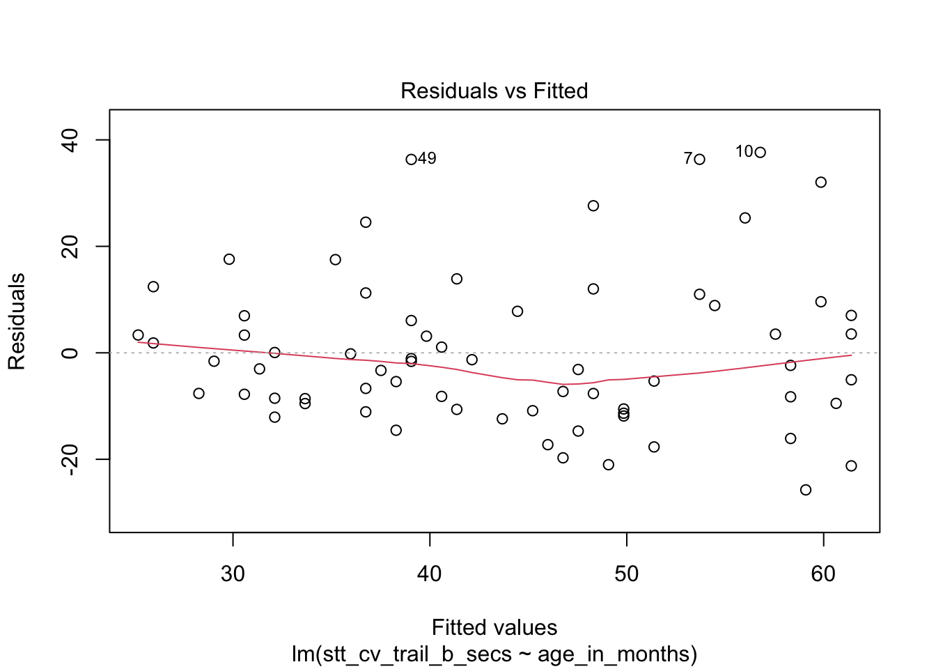
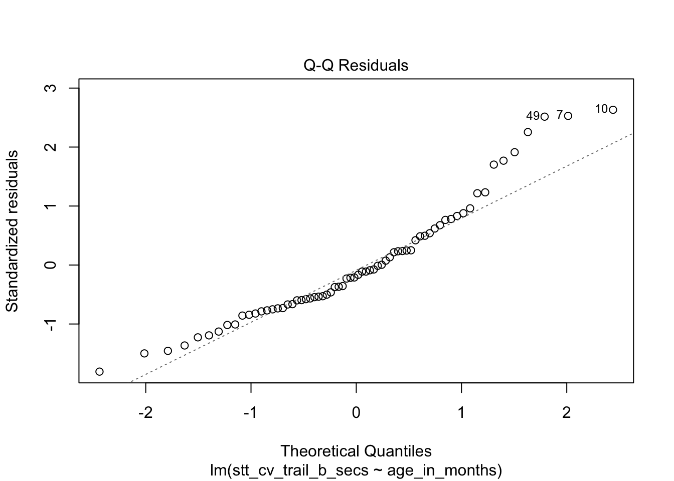
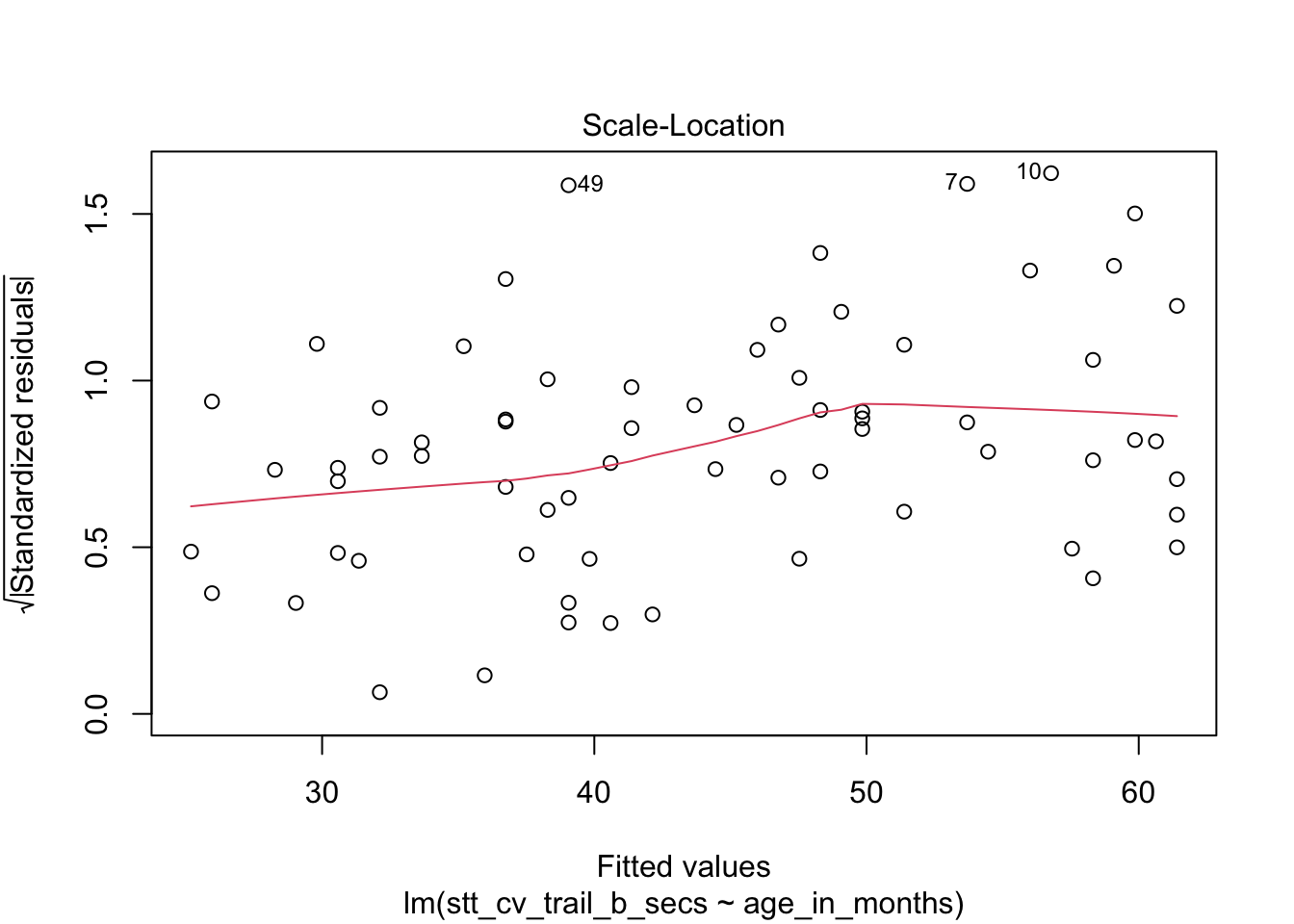
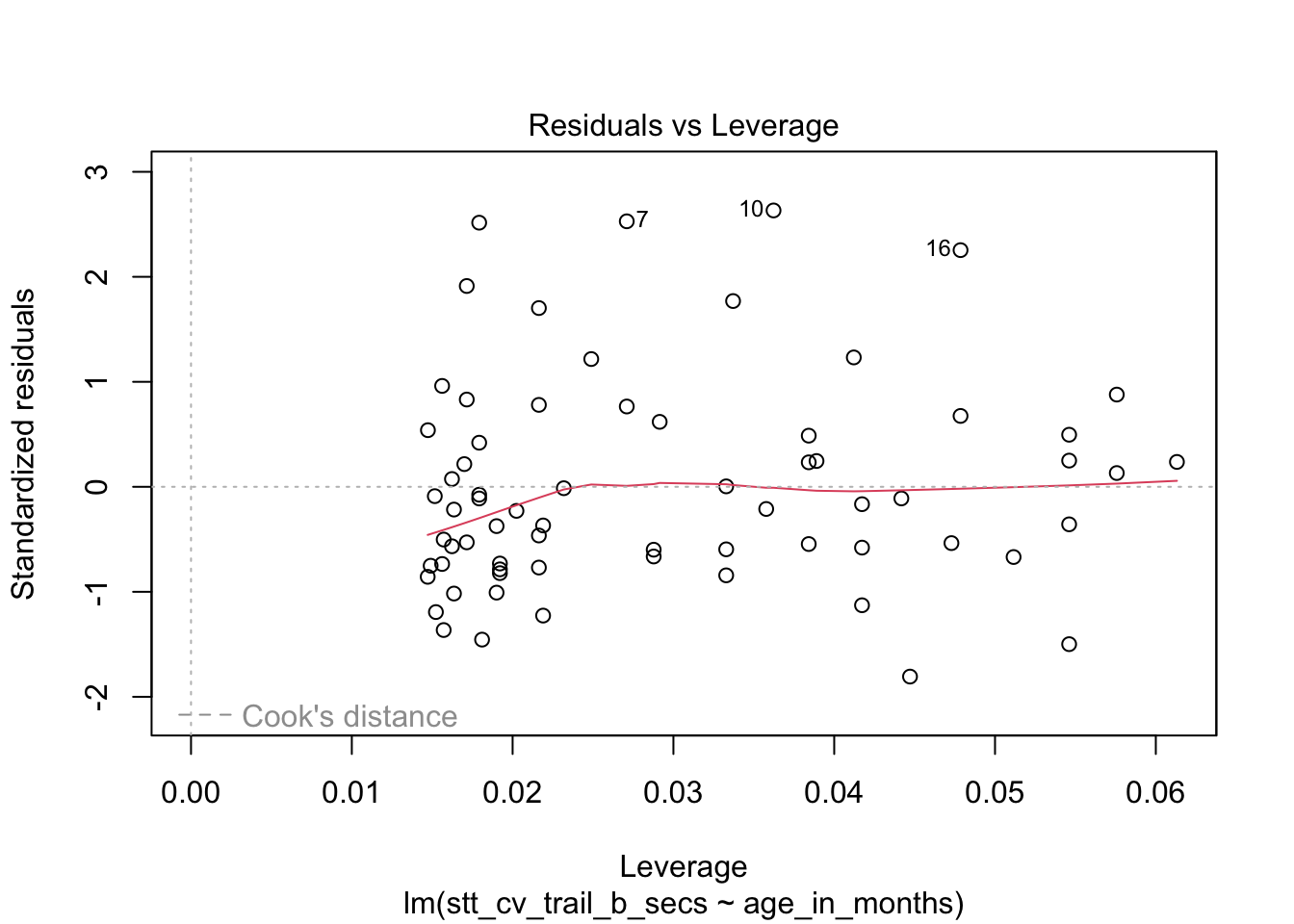
Figure 11.27: Residual plots for the Shape Trail Test. The model assumptions are met.
predict(stt_model, data.frame(age_in_months = 7 * 12), interval = "predict")## fit lwr upr
## 1 52.15541 22.72335 81.58747The prediction interval is \([22.7, 81.6]\) so we are 95% confident that a seven-year-old child will complete trail B between 22.7 and 81.6 seconds.
Making predictions for \(x\) values that are outside the observed range is called extrapolation, and is not recommended. In the child task study, the youngest children observed were six years old and the oldest were ten. Predictions about children outside of this age range would need to be treated with caution. For example, the regression line predicts that a 13-year-old child would complete trail B in negative three seconds, clearly impossible.
11.5.4 Confidence intervals for response
The value \(\hat \beta_0 + \hat \beta_1 x_*\) is the point estimate for the mean of the random variable \(Y\), given \(x_\star\). Confidence intervals for the response give an interval such that we are 95% (say) confident that the true mean of \(Y\) when \(X = x_*\) is within our interval. This is contrasted to the prediction interval, which gives an interval such that we are 95% sure that a subsequent observation of \(Y\) when \(X = x_*\) is within our interval. The confidence interval will always be contained within the prediction interval, because we do not need to take into account the random variation of a single observation; we are only concerned with estimating the mean.
For example, suppose you need to transport a chorus line of 80 chinstrap
penguins, carefully selected to all have flipper length 204 mm.
The average weight for such a penguin is 4016 g, so you expect your squad to weigh 321280 g or about 321 kg. How much will that total mass vary?
The value 4016 g comes from the regression line at \(x_\star=204\). Refer back to the plot of this regression line in Figure 11.3,
which shows the gray error band around the line. The estimated mean value 4016 g varies by the width of the gray band above \(x_\star = 204\).
The predict function can compute the range precisely (we have already checked that the residual plots are acceptable for this model):
predict(chinstrap_model,
  data.frame(flipper_length_mm = 204),
  interval = "confidence"
)
## fit lwr upr
## 1 4015.777 3905.903 4125.65This gives a 95% confidence interval of \([3906,4126]\) for the average mass of chinstrap penguins with flipper length 204 mm. Assuming that the mean of the 80 penguins is approximately the same as the true mean of all penguins of that weight, we can multiply by 80 and then be 95% confident that the 80 penguin dance troupe will weigh between 312.4 kg and 330 kg.
To summarize this section, let’s plot the chinstrap penguin data again.
This is a complicated plot, and it begins by building a new data frame called bounds_data which contains flipper length values from 178 to 212 and both confidence and prediction bounds for each of those \(x\) values. Here we go.
flipper_range <- data.frame(flipper_length_mm = seq(178, 212, 2))

prediction_bounds <- predict(chinstrap_model,
  newdata = flipper_range, interval = "p"
)
colnames(prediction_bounds) <- c("p_fit", "p_lwr", "p_upr")
confidence_bounds <- predict(chinstrap_model,
  newdata = flipper_range, interval = "c"
)
colnames(confidence_bounds) <- c("c_fit", "c_lwr", "c_upr")

bounds_data <- cbind(flipper_range, confidence_bounds, prediction_bounds)

chin_plot <- chinstrap %>%
  ggplot(aes(x = flipper_length_mm, y = body_mass_g)) +
  geom_point() +
  geom_smooth(method = "lm") +
  labs(title = "Chinstrap penguin flipper length and body mass")

chin_plot <- chin_plot +
  geom_line(data = bounds_data, aes(y = c_lwr), linetype = "dashed") +
  geom_line(data = bounds_data, aes(y = c_upr), linetype = "dashed")

chin_plot <- chin_plot +
  geom_line(data = bounds_data, aes(y = p_lwr), color = "orange") +
  geom_line(data = bounds_data, aes(y = p_upr), color = "orange")

chin_plot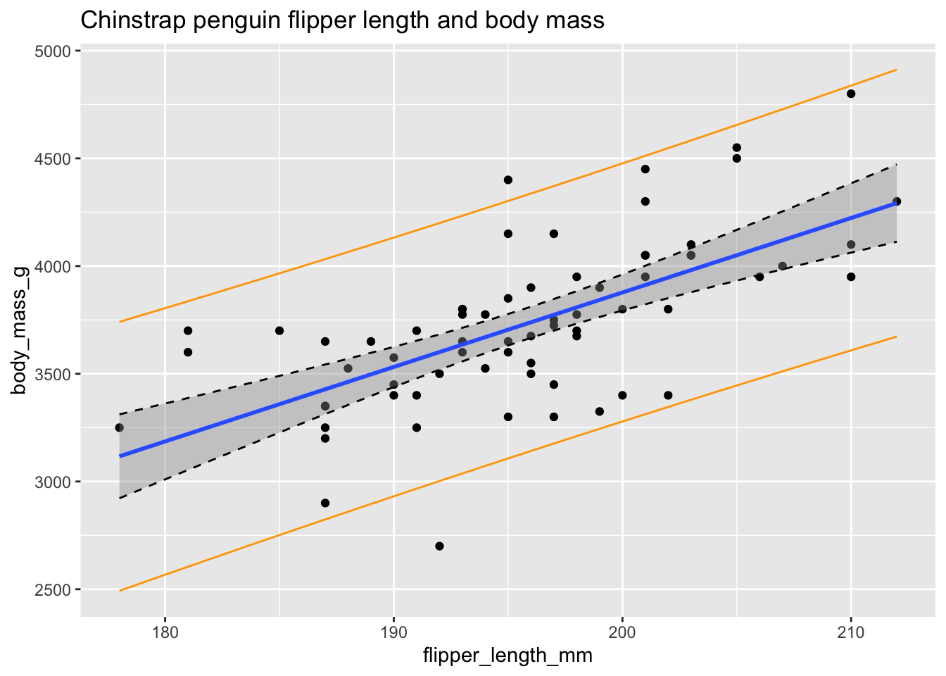
Figure 11.28: Confidence bounds (dashed) and prediction bounds (orange).
In Figure 11.28 the confidence interval about the regression line is shown in gray as usual and is also outlined with dashed lines. The prediction interval is shown in orange.
Some things to notice are as follows:
- Roughly 95% of the data falls within the orange prediction interval. While prediction intervals are predictions of future samples, it is often the case that the original data also falls in the prediction interval roughly 95% of the time.
- We are 95% confident that the true population regression line falls in the gray confidence band at any particular \(x_*\).
- The confidence band is narrowest near \((\overline{x}, \overline{y})\) and gets wider away from that central point. This is typical behavior.
- We have confirmed the method that
geom_smoothuses to create the confidence band.
11.6 Simulations for simple linear regression
In this section, we will use simulation for two purposes. The first is to create residual plots that we know follow the assumptions of our model in order to better assess residual plots of data. The second is to understand and confirm the inference of Section 11.5
11.6.1 Residuals
It can be tricky to learn what “good” residuals look like. One of the nice things about simulated data is that you can train your eye to spot departures from the assumptions. Let’s look at two examples: one that satisfies the regression assumptions and one that does not. You should think about other examples you could come up with!
Consider simulated data that follows the model \(y_i = 2 + 3x_i + \epsilon_i\), where \(\epsilon_i\) is iid normal with mean 0 and standard deviation 5. This model satisfies the assumptions required for linear regression, so it is an example of good behavior.
x <- runif(40, 10, 20) # 40 explanatory values between 10 and 20
epsilon <- rnorm(40, 0, 5) # 40 error terms, normally distributed
y <- 2 + 3 * x + epsilon
my_model <- lm(y ~ x)
my_model$coefficients
## (Intercept) x
## 5.77620 2.77251The estimate for the intercept is \({\hat\beta}_0=\) 5.7762 and for the slope it is \({\hat\beta}_1=\) 2.77251. The estimated slope is close to the true value of 3. The estimated intercept is less accurate because the intercept is far from the data, at \(x=0\), and so small changes to the line have a large effect on the intercept.
Printing the full summary of the model gives the residual standard error as 4.17229. The the true standard deviation of the error terms \(\epsilon_i\) was chosen to be 5, so the model’s estimate is good.
data.frame(x, y) %>% ggplot(aes(x = x, y = y)) +
  geom_point() +
  geom_smooth(method = "lm")
plot(my_model, which = 1)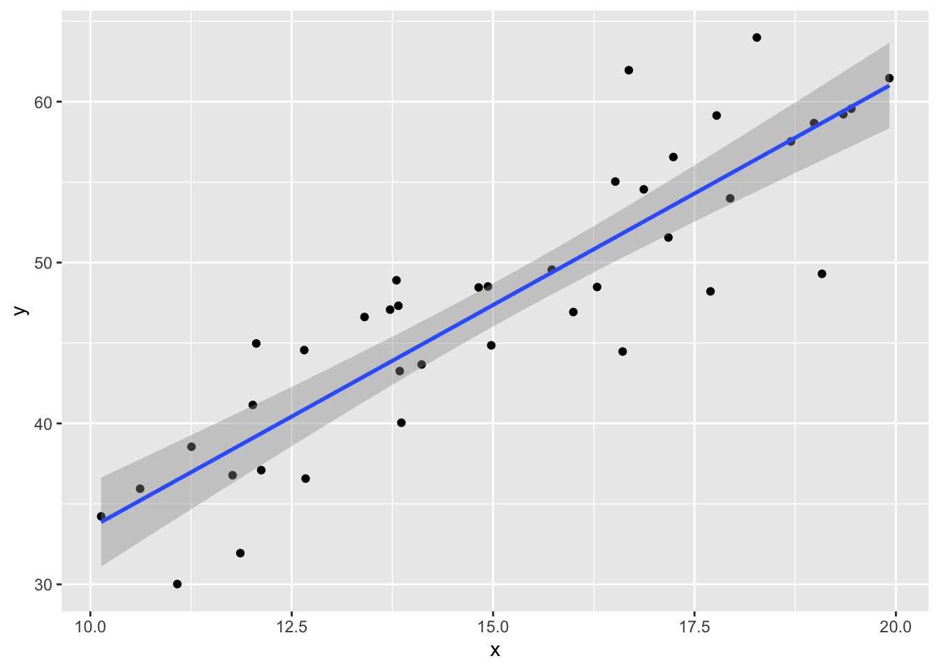
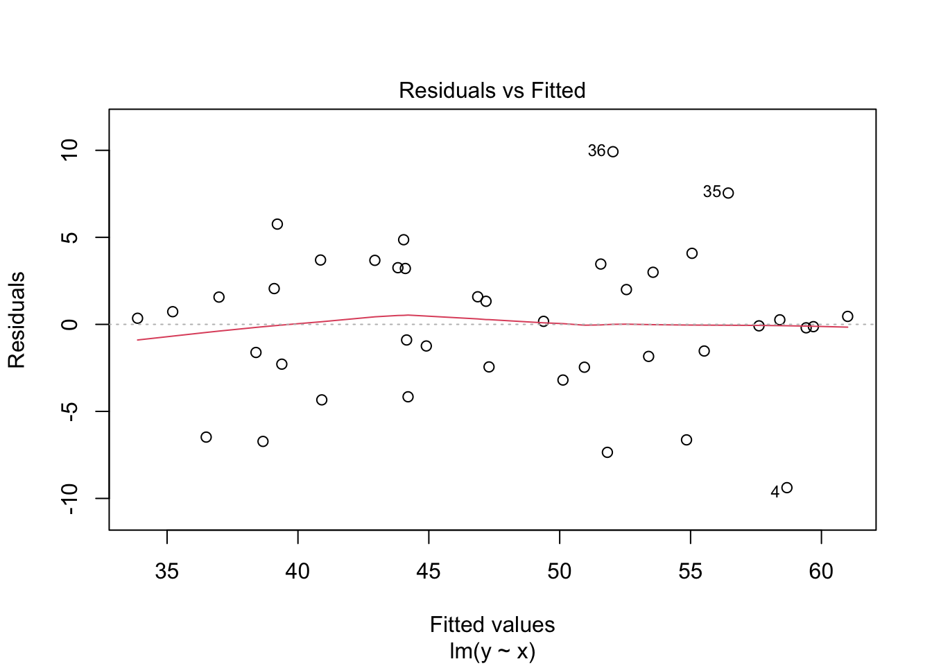
The regression line follows the line of the points and the residuals are more or less symmetric about 0.
What happens if the errors in a regression model are non-normal? The data no longer satisfies the hypothesis needed for regression, but how does that affect the results?
This example shows the effect of skew residuals. As in Example 11.22, \(y_i = 2 + 3x_i + \epsilon_i\) except that we now use iid exponential with rate 1/10 for the error terms \(\epsilon_i\), and subtract 10 so that the error terms still have mean 0.
x <- runif(40, 10, 20) # 40 explanatory values between 10 and 20
epsilon <- rexp(40, 1 / 10) - 10 # 40 error terms, mean 0 and very skew
y <- 2 + 3 * x + epsilon
my_model <- lm(y ~ x)data.frame(x, y) %>% ggplot(aes(x = x, y = y)) +
geom_point() +
geom_smooth(method = "lm")
plot(my_model, which = 1)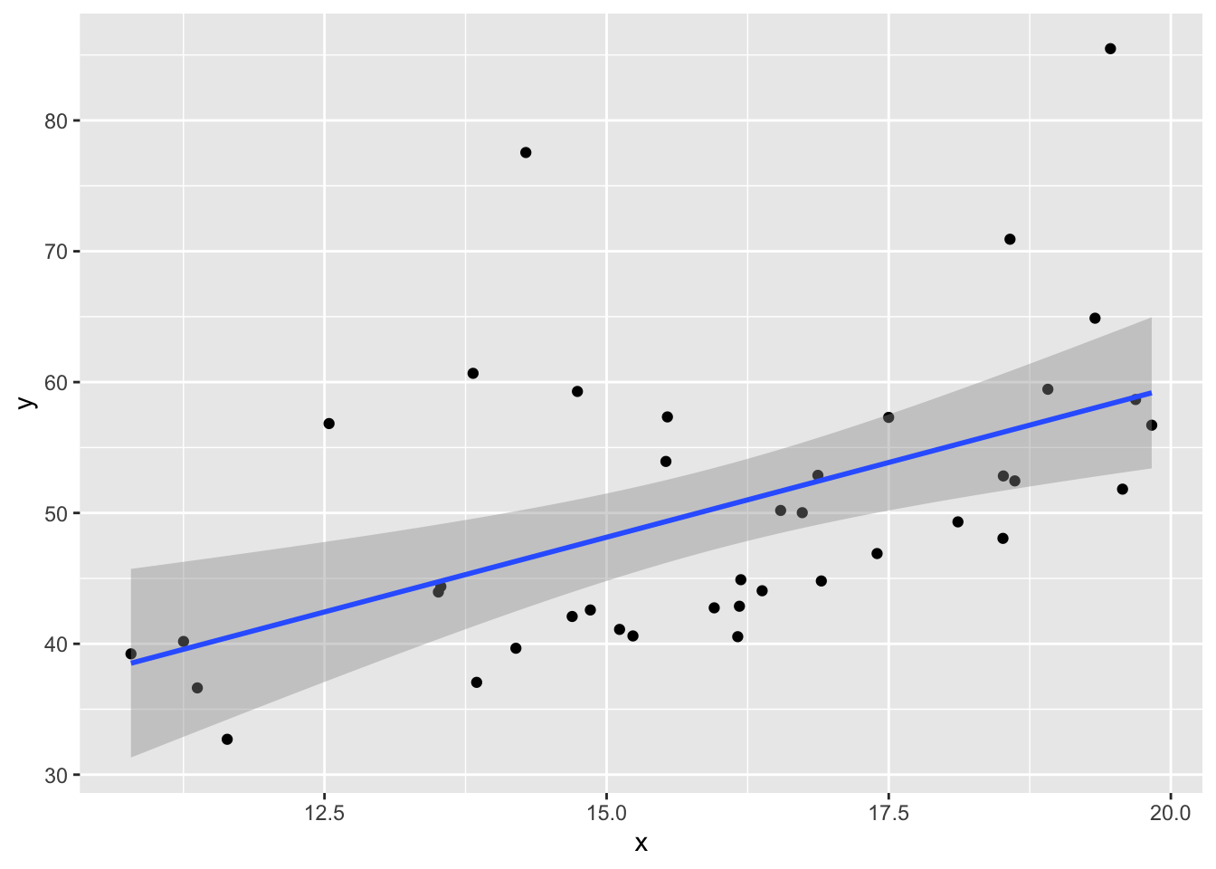
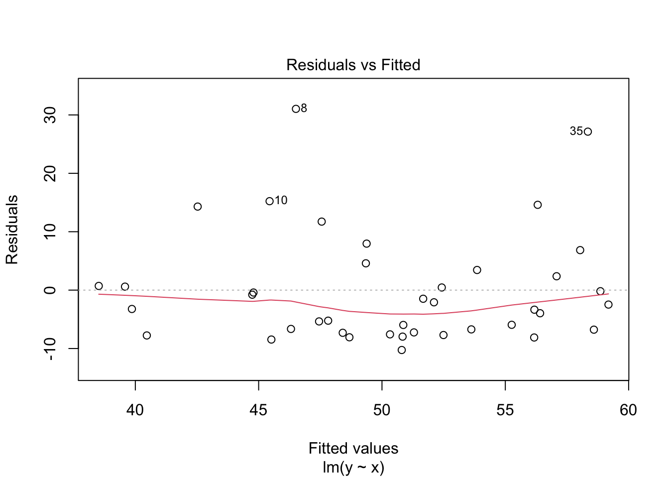
In the residuals plot, the residuals are larger above the zero line than below it, displaying the skewness of the residuals. The skewness is even more apparent in the Normal Q-Q plot as an upward curve:
plot(my_model, which = 2)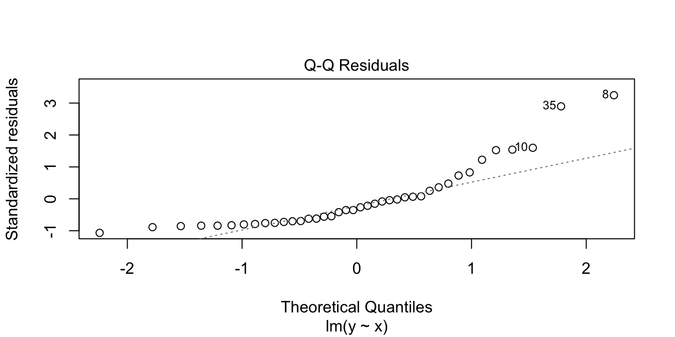
Now, we examine properties of the estimators for the slope and intercept when the errors are exponential rather than normal. Note that our model assumptions are not satisfied, so we are testing via simulation the robustness of our model to this type of departure from assumptions.
We first see whether the mean of the estimates for the slope and intercept are the correct values of 3 and 2; that is, we are seeing whether the estimates for slope and intercept are unbiased.
sim_data <- replicate(10000, {
  epsilon <- rexp(40, 1 / 10) - 10
  y <- 2 + 3 * x + epsilon
  my_model <- lm(y ~ x)
  my_model$coefficients
})
mean(sim_data[2, ]) # expected value of slope
## [1] 2.996852mean(sim_data[1, ]) # expected value of intercept## [1] 2.045073This is pretty strong evidence that the estimates for the slope and intercept are still unbiased even when the errors are not normal.
Now, let’s examine whether 95% confidence intervals for the slope contain the true value 95% of the time, as desired.
sim_data <- replicate(10000, {
  epsilon <- rexp(40, 1 / 10) - 10
  y <- 2 + 3 * x + epsilon
  my_model <- lm(y ~ x)
  confint(my_model)[2, 1] < 3 && confint(my_model)[2, 2] > 3
})
mean(sim_data)
## [1] 0.954If you run the above code several times, you will see that the confidence interval for the slope contains the true value a bit more than 95% of the time. However, it is still working pretty close to advertised.
About what percentage of time does the 95% confidence interval for the intercept contain the true value of the intercept when the error is exponential, as above?
11.6.2 Prediction intervals
In this section, we explore prediction intervals through simulation. We will find that a small error in modeling has minimal effect near the center of our data range, but can lead to large errors near the edge of observed data. Beyond the data’s edge, making predictions is called extrapolation and can be wildly incorrect.
We begin by exploring prediction intervals a bit more. Suppose we have data that comes from the generative process \(Y = 1 + 2X + \epsilon\), where \(\epsilon \sim \text{Norm}(0, \sigma = 3)\). We collect data one time and create a prediction interval for when \(x = 10\). What percentage of responses will fall in the 95% prediction interval? You would probably think 95%, but let’s see what happens.
set.seed(14)
x <- runif(30, 0, 20)
y <- 1 + 2 * x + rnorm(30, 0, 3)
mod <- lm(y ~ x)
predict(mod, newdata = data.frame(x = 10), interval = "pre")
## fit lwr upr
## 1 21.35936 15.76602 26.9527We see that our prediction interval is from 15.76602 to 26.9527. Since \(Y\) is normal with mean 21 and standard deviation 3 when \(x = 10\), the probability that new values will be in the 95% prediction interval is about 93.6%, given by
pnorm(26.9527, 21, 3) - pnorm(15.76602, 21, 3)## [1] 0.935863What’s going on? Why doesn’t a 95% prediction interval contain 95% of future values? Ninety-five percent prediction intervals will contain 95% of future values assuming that the data is recollected and new prediction intervals are constructed each time before a new data point is collected. In terms of simulations, that means that we would have to recreate \(y_i\), recreate our model and prediction interval, then draw one more sample and see whether it is in the prediction interval.
sim_data <- replicate(10000, {
  y <- 1 + 2 * x + rnorm(30, 0, 3)
  mod <- lm(y ~ x)
  new_data <- 1 + 2 * 10 + rnorm(1, 0, 3)
  pred_int <- predict(mod, newdata = data.frame(x = 10), interval = "pre")
  pred_int[2] < new_data && pred_int[3] > new_data
})
mean(sim_data)
## [1] 0.9521Now we get close to the desired value of 95%, and larger simulations will yield closer and closer to 95%
Next, we compare the behavior of prediction intervals for two sets of simulated data:
- Data 1 (linear, assumptions correct): \(y_i = 1 + 2x_i + \epsilon_i\)
- Data 2 (non-linear, assumptions incorrect): \(y = 1 + 2x_i + x^2/20 + \epsilon_i\)
In both sets, the error terms \(\epsilon_i \sim \text{Norm}(0,1)\) and there are 20 \(x\) values uniformly randomly distributed on the interval \((0,10)\).
simdata <- data.frame(x = runif(20, 0, 10), epsilon = rnorm(20))
simdata <- mutate(simdata,
  y1 = 1 + 2 * x + epsilon,
  y2 = 1 + 2 * x + x^2 / 20 + epsilon
)
Data 1 meets the assumptions for linear regression, because the relationship between explanatory and response variables is linear and the error terms are iid normal. Data 2 does not meet the assumptions for linear regression, because the relationship between the variables is non-linear: there is a small quadratic term \(x^2/20\).
Compare the two sets of simulated data visually:
It is easy to believe that the quadratic term in the second set of data might go unnoticed.
Next, compute the 95% prediction intervals for both data sets at \(x = 5\). We use a linear model in both cases, even though the linear model is not correct for the non-linear data.
model1 <- lm(y1 ~ x, data = simdata)
predict(model1, newdata = data.frame(x = 5), interval = "pre")
## fit lwr upr
## 1 11.14539 9.158465 13.13232model2 <- lm(y2 ~ x, data = simdata)
predict(model2, newdata = data.frame(x = 5), interval = "pre")## fit lwr upr
## 1 12.77723 10.7008 14.85366The two prediction intervals are quite similar. In order to test whether the prediction interval is working correctly, we need to repeatedly create sample data, apply lm, create a new data point, and see whether the new data point falls in the prediction interval.
We do this for the linear data first:
trials <- replicate(10000, {
  # generate data
  simdata <- data.frame(x = runif(20, 0, 10), epsilon = rnorm(20))
  simdata <- mutate(simdata, y1 = 1 + 2 * x + epsilon)

  # create a new data point at a random x location
  new_x <- runif(1, 0, 10)
  new_y <- 1 + 2 * new_x + rnorm(1)

  # build the prediction interval at x = new_x
  model1 <- lm(y1 ~ x, data = simdata)
  pred_int <- predict(model1,
    newdata = data.frame(x = new_x), interval = "pre"
  )

  # test if the new data point's y-value lies in the prediction interval
  pred_int[2] < new_y && new_y < pred_int[3]
})
mean(trials)
## [1] 0.9499We find that the 95% prediction interval successfully contained the new point 94.99% of the time. That’s pretty good! Repeating the simulation for the curved data, the 95% prediction interval is successful about 94.8% of the time, which is also quite good.
However, let’s examine things more carefully. Instead of picking our new data point at a random \(x\)-coordinate, let’s always choose \(x = 10\), the edge of our data range.
trials <- replicate(10000, {
  # generate data
  simdata <- data.frame(x = runif(20, 0, 10), epsilon = rnorm(20))
  simdata <- mutate(simdata, y2 = 1 + 2 * x + x^2 / 20 + epsilon)

  # create a new data point at x=10
  new_x <- 10
  new_y <- 1 + 2 * new_x + new_x^2 / 20 + rnorm(1)

  # build the prediction interval at x = 10
  model2 <- lm(y2 ~ x, data = simdata)
  pred_int <- predict(model2,
    newdata = data.frame(x = 10), interval = "pre"
  )

  # test if the new data point's y-value lies in the prediction interval
  pred_int[2] < new_y && new_y < pred_int[3]
})
mean(trials)
## [1] 0.9029The prediction interval is only correct 90.29% of the time. This isn’t working well at all!
For the curved data, the regression assumptions are not met. The prediction intervals are behaving close to as designed for \(x\) values near the mean, but fail twice as often as they should at \(x = 10\).
When making predictions, be careful near the bounds of the observed data. Things get even worse as you move \(x\) further from the known points. A statistician needs strong evidence that a relationship is truly linear to perform extrapolation.
11.7 Cross validation
In this chapter, we introduced descriptive modeling of data sets containing a single predictor and a single response variable. We chose to model the relationship via a straight line, and we minimized the SSE over all choices of slopes and intercepts. Our recurring example is regression line for body mass explained by flipper length for chinstrap penguins. You may be wondering why we didn’t choose a more complicated model to describe the relationship. Indeed, quite a bit of error remained after we modeled the relationship with a line. Should we try to model that error? You may even be wondering why we don’t use a function that goes through all of the data points, so that the SSE is 0. The purpose of this section is to address such concerns through the lens of predictive modeling. Predictive modeling is a big topic that we are only going to scratch the surface of. If you want to learn more after reading this section, we recommend the book by Kuhn and Johnson.103
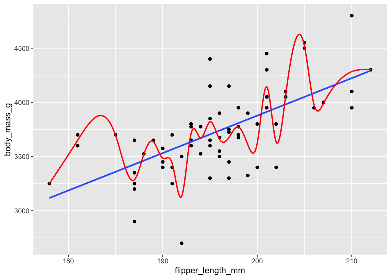
Figure 11.29: Chinstrap penguin dimensions modeled by a linear function and a smooth spline. Which model has more predictive power?
We will consider two models, shown in Figure 11.29. Model one in blue is given by linear regression, the line of best fit. Model two is called a smooth spline, which is a piecewise polynomial, and it apparently follows the data quite well. In fact, the mean squared error for the smooth spline model is 4.5518^{4}, much smaller than the 8.5637^{4} MSE for the linear model. However, your instincts should tell you that the smooth spline model is overfit, and will be less good at predicting new values of penguin measurements.
How might we assess the predictive value of the two models? One way would be to leave out some of the data, and build the models on the data that remains. We can then predict the values for the data that we left out, and see which model has a smaller MSE. This process is called cross validation. The data that we use to build the model is called the training set, and the data that we use to compute the MSE (or otherwise evaluate the model) is called the testing set.
It is very important to make sure that the model is built only using the training data. We do not want information from the test set leaking into the model, as that could make the model unrealistically accurate.
Let’s start by making a train/test split of our data in such a way that there is exactly one observation in the test set. For the moment, we simply choose observation 5.
chinstrap <- palmerpenguins::penguins %>% filter(species == "Chinstrap")
test_obs <- 5
test <- chinstrap[test_obs, ]
train <- chinstrap[-test_obs, ]
In this case, observation 5 is the test set, while the rest of the data is the train set. We now build our line of best fit, predict the body mass of the test penguin and compute the MSE.
mod1 <- lm(body_mass_g ~ flipper_length_mm, data = train)
bm1 <- predict(mod1, newdata = test)
err1 <- bm1 - test$body_mass_g
mean(err1^2)
## [1] 2451.342Next, we do the same thing for the second model.
The R function that computes the smooth spline is smooth.spline and it requires one parameter, the degrees of freedom.
We choose 24 degrees of freedom since that is the largest possible value with 24 distinct flipper length measurements.
The smooth.spline function returns a model which can be used to predict the body mass of the test penguin.
mod2 <- smooth.spline(
  x = train$flipper_length_mm,
  y = train$body_mass_g,
  df = 24
)
bm2 <- predict(mod2, test$flipper_length_mm)$y
err2 <- bm2 - test$body_mass_g
mean(err2^2)
## [1] 3776.056For this test penguin, the linear model had a MSE of 2451 and the smooth spline had a MSE of 3776, so the linear model did a better job of predicting the test penguin’s body mass. We should make this comparison for every penguin in the data set.
Leave one out cross validation (LOOCV) is a procedure in which we systematically remove each observation from the data, build the model on the remaining data, and compute the error in estimation of the test observation. Finally, compute the MSE over all tests.
Here we perform LOOCV on the chinstrap penguins data.
Recall from Section 6.7 that sapply applies a function to all values in a vector.
We define functions called loo_linear and loo_spline that compute the leave one out error for a single test penguin, using the linear and spline models, respectively.
We then apply those functions to each of the 68 observations using sapply.
loo_linear <- function(test_obs) {
  test <- chinstrap[test_obs, ]
  train <- chinstrap[-test_obs, ]
  mod1 <- lm(body_mass_g ~ flipper_length_mm, data = train)
  bm1 <- predict(mod1, newdata = test)
  bm1 - test$body_mass_g
}
err_linear <- sapply(1:68, loo_linear)

loo_spline <- function(test_obs) {
  test <- chinstrap[test_obs, ]
  train <- chinstrap[-test_obs, ]
  mod2 <- smooth.spline(
    x = train$flipper_length_mm,
    y = train$body_mass_g,
    df = 24
  )
  bm2 <- predict(mod2, test$flipper_length_mm)$y
  bm2 - test$body_mass_g
}
err_spline <- sapply(1:68, loo_spline)
Compare the mean squared errors:
mean(err_linear^2)## [1] 91245.43mean(err_spline^2)## [1] 101266The linear model has a lower estimated MSE using LOOCV than the spline model, so it is doing a better job predicting the test penguin measurements.
Another popular approach to cross validation is \(k\)-fold cross validation. In this approach, the data is split into \(k\) roughly equal size groups. Each group gets a turn as the test set. In repeated \(k\)-fold cross validation, this entire process is repeated multiple times.
11.8 Bias-variance tradeoff
Recall the bias-variance decomposition of an estimator \(\hat \theta\) from Section 5.6.3: \[ \mathrm{MSE}(\hat \theta) = E[(\hat \theta - \theta)^2] = \text{Bias}(\hat \theta)^2 + \text{Var}(\hat \theta) \] We saw in that section that we could improve the mean squared error of the sample variance \(S^2 = \frac 1{n - 1}\sum_{k = 1}^n\left(X_i - \overline{X}\right)^2\) as an estimator for \(\sigma^2\) by simultaneously increasing the bias and decreasing the variance of the estimator. A similar paradigm holds for model building. It is often the case that we can improve the MSE of a model by increasing the bias and decreasing the variance of the model.
To make things more precise, suppose data is generated by a process \(y = f(x) + \epsilon\), where \(\epsilon\) is normal with mean 0 and variance \(\sigma^2\). Suppose also that we have a method for modeling the data which includes being able to predict values of \(y\) for values of \(x\). Then,
\[\begin{equation}\label{bvtrade} \mathrm{MSE}(\mathrm{model}) = \sigma^2 + \mathrm{Bias(model)^2} + \mathrm{Var(model)} \end{equation}\]
We examine this equality in the case that the model is only predicting values at one point. The MSE on the left-hand side refers to the MSE of the model for future values at that point. The bias of the model is the difference between the expected value of the predictions from the model and the true expected value \(f(x)\). The variance of the model is the variance of the predictions at the one point.
Let’s suppose that data is generated by \(Y = 1 + X + X^2 + \epsilon\), where \(\epsilon \sim \text{Norm}(0, .25)\). Data is generated over the interval \([0, 1]\), and we model it with \(Y = \beta_0 + \beta_1 X + \epsilon\), which is not the same as the generative process. We are interested in predictions at \(x = 0.9\). The value of \(\sigma^2\) in the formula above is 0.0625, which is normally not known when dealing with actual data. For example, we could have the following.
x <- seq(0, 1, length.out = 20)
y <- 1 + x + x^2 + rnorm(20, 0, .25)
plot(x, y)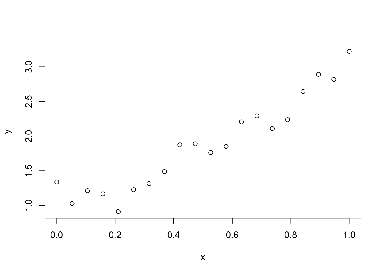
mod <- lm(y ~ x)
predict(mod, newdata = data.frame(x = 0.9))
## 1
## 2.691488We first estimate the bias of our model by comparing the predicted values when \(x = 0.9\) to the true value, which is \(1 + 0.9 + 0.9^2 = 2.71\).
sim_data <- replicate(10000, {
  x <- seq(0, 1, length.out = 20)
  y <- 1 + x + x^2 + rnorm(20, 0, .25)
  mod <- lm(y ~ x)
  predict(mod, newdata = data.frame(x = 0.9))
})
mean(sim_data - 2.71)
## [1] -0.06892062We see that we underestimate the true value by about 0.069.
Now, we estimate the variance of the model. We can do this by computing the variance of predictions from the model.
var(sim_data)## [1] 0.008490911The variance of the model is 0.008491. Finally, the MSE of the model is estimated via:
mean((sim_data - (1 + .9 + .9^2 + rnorm(10000, 0, .25)))^2)## [1] 0.07635764We compare this to the expression on the right-hand side of Equation \(\eqref{bvtrade}\):
0.25^2 + mean(sim_data - 2.71)^2 + var(sim_data)## [1] 0.07574096We see that we get good agreement between the two values.
We next turn to an example that may be counterintuitive. It is possible to decrease the MSE of the estimations coming from a model by ignoring information that is used in the generative process of the data. This will introduce bias, but the resulting reduction in variance can many times make up for the increase in bias.
In this example, we use simulated data to illustrate the bias-variance tradeoff. Our simulated data follows the model \(Y = 1 + 0.1 X + \epsilon\), where \(\epsilon \sim \text{Norm}(0, \sigma = 4)\).
n <- 101
x <- seq(0, 10, length.out = n)
y <- 1 + 0.1 * x + rnorm(n, 0, 4)
We compare two models for this data. The first model is constant: it assumes no dependence on x, and predicts every \(y\) value as \(\overline{y}\). The second model is a linear model with x as a predictor. The data and both models are shown in Figure 11.30.
Figure 11.30: Data with \(y\) increasing slightly as a function of \(x\). Linear model (blue) and constant model (red) are shown.
The constant model is biased, because it will overestimate \(y\) values associated with small \(x\), and underestimate \(y\) values associated with large \(x\).
On the other hand, it should have less variance than the linear model with slope term. Let’s compute the LOOCV error for both models on this simulated data set.
One new twist is that we now have functions that take two arguments (dat, the data frame, and test_obs, the observation to leave out).
The sapply function will apply these functions to each test_obs while providing the data frame containing simulated data.
loo_const <- function(dat, test_obs) {
  test <- dat[test_obs, ]
  train <- dat[-test_obs, ]
  yhat <- mean(train$y)
  yhat - test$y
}
err_const <- sapply(1:n, loo_const, dat = data.frame(x, y))

loo_linear <- function(dat, test_obs) {
  test <- dat[test_obs, ]
  train <- dat[-test_obs, ]
  mod <- lm(y ~ x, data = train)
  yhat <- predict(mod, newdata = test)
  yhat - test$y
}
err_linear <- sapply(1:n, loo_linear, dat = data.frame(x, y))

mean(err_const^2)
## [1] 15.96624mean(err_linear^2)## [1] 16.00987We see in this example, the MSE for the constant model is slightly better, but they are so close that it seems like it could be by chance. Let’s replicate the entire process, generating fresh data repeatedly. For each new set of \(y\) values, we compute the LOOCV mean squared error for each model and then report the difference between them.
mse_diffs <- replicate(500, {
  y <- 1 + 0.1 * x + rnorm(n, 0, 4)
  err_const <- sapply(1:n, loo_const, dat = data.frame(x, y))
  err_linear <- sapply(1:n, loo_linear, dat = data.frame(x, y))
  mean(err_const^2) - mean(err_linear^2)
})
Figure 11.31: Difference in MSE between constant and linear models.
Figure 11.31 shows a histogram of the MSE differences, and it appears that in most trials the difference is negative, meaning that the constant model had smaller mean squared error than the linear model. To be sure, we run a Wilcoxon signed rank test to determine whether this difference is statistically significant.
wilcox.test(mse_diffs, mu = 0)##
## Wilcoxon signed rank test with continuity correction
##
## data: mse_diffs
## V = 30847, p-value < 2.2e-16
## alternative hypothesis: true location is not equal to 0We see that, yes, the “incorrect” model which ignored the slope had a significantly lower LOOCV estimated MSE than the “correct” model, which included the slope. While the differences in this particular example are quite small, it can be the case that small differences are worth a lot. It can also be the case that choosing a biased model will lead to a much more noticeable reduction in MSE.
With 500 samples, a t.test would also be appropriate on the MSE differences, even with this level of skewness. Perform a \(t\)-test on mse_diffs and confirm that it is also statistically significant.
Vignette: Simple logistic regression
Regression is a very large topic, and one can do many, many more things than the simple linear models discussed in this chapter.
One common task is to model the probability of an event occurring based
on one or more predictor variables. For this, we can use logistic regression.
In this vignette, we use the data set malaria104
in the fosdata package to model the probability that a mouse will contract malaria based on the number of sporozoite parasites carried by the mosquito that bit the mouse.
Let \(Y\) be a random variable that takes on the value 1 if the mouse contracts malaria, and 0 if not. Let \(p = P(Y=1)\) be the probability that the mouse contracts malaria. A linear regression model would be \(p = \beta_0 + \beta_1 x\), where \(x\) is the number of sporozoites. This type of model can sometimes be appropriate, but it can also lead to probabilities that are bigger than 1 or less than 0. In logistic regression, we use the model \[ \log \frac{p}{1-p} = \beta_0 + \beta_1 x, \] or equivalently,
\[ p = \frac{e^{\beta_0 + \beta_1 x}}{1 + e^{\beta_0 + \beta_1 x}} .\]
How to interpret this? Well, \(\frac{p}{1-p}\) is the odds of the event occurring, so \(\log \frac{p}{1-p}\) is the log-odds of it occurring. If the log-odds are a big positive number, then it is very likely for the event to occur. If they are zero, then the event is 50-50, and a big negative log-odds corresponds to a very unlikely event. We are modeling these log-odds linearly in terms of the predictor variable.
There are several ways of estimating \(\beta_0\) and \(\beta_1\). However, we will not go over the details except to say that they are implemented in the R function glm. We can find estimates for \(\beta_0\) and \(\beta_1\) via
malaria <- fosdata::malaria
malaria_mod <- glm(malaria ~ sporozoite,
  family = "binomial", data = malaria
)
broom::tidy(malaria_mod)
## # A tibble: 2 × 5
## term estimate std.error statistic p.value
## <chr> <dbl> <dbl> <dbl> <dbl>
## 1 (Intercept) -2.48 0.428 -5.79 7.07e- 9
## 2 sporozoite 0.462 0.0645 7.17 7.74e-13We see that the estimate for \(\beta_0\) is -2.4761526 and the estimate for \(\beta_1\) is 0.4622328. The value for the slope is significant at the \(\alpha = .05\) level. Let’s look at a plot.
ggplot(malaria, aes(x = sporozoite, y = malaria)) +
  geom_jitter(height = 0, width = 0.2) +
  geom_smooth(
    method = "glm",
    method.args = list(family = "binomial"),
    se = FALSE
  )
The blue curve is the estimate of the probability of contracting malaria based on the total number of sporozoites. We can see that when there are zero sporozoites, the model predicts a low probability of contracting malaria. When there are more than 20, then the probability is essentially 1. To estimate the probability of contracting malaria given a certain number of sporozoites more precisely, we can use the predict function. The following code estimates the log odds of contracting malaria when there are 8 sporozoites:
predict(malaria_mod, newdata = data.frame(sporozoite = 8))## 1
## 1.221709If we wish to find the probability of contracting malaria, we use:
predict(malaria_mod, newdata = data.frame(sporozoite = 8), type = "response")## 1
## 0.7723642There is much more to logistic regression than what we have shown in this vignette. We hope this taste of it will encourage you to further study!
Exercises
Exercises 11.1 – 11.4 require material through Section 11.1.
The built-in data set faithful gives data on eruptions of the Old Faithful Geyser in Yellowstone National Park.
Each observation has a length of time the eruption lasted (eruptions) and the length of time until the next eruption (waiting), both in minutes.
- Find the equation of the regression line to explain waiting as a function of eruptions.
- Plot the data and the regression line.
- How long do you expect to wait after a 4.3 minute eruption?
The data set barnacles in the fosdata package has measurements of barnacle density on various coral reefs.
- Find the equation of the regression line to explain barnacle density as a function of reef depth.
- Predict the mean number barnacles per square meter for a 30-meter deep reef.
Consider the juul data set in ISwR.
- Fit a linear model to explain igf1 level by age for people under age 20 who are in tanner puberty group 5.
- Give the equation of the regression line and interpret the slope in terms of age and igf1 level.
- Predict the mean igf1 levels for 16-year-olds who are in tanner puberty group 5.
Consider the penguins data set in the palmerpenguins package.
Suppose we use the line we found for chinstrap penguins to model gentoo penguins instead.
- Restrict to gentoo penguins and find the sum of squared error associated with the line \[ \text{body\_mass\_g} = -3037.2 + 34.6 \cdot \text{flipper\_length\_mm}. \]
- Find the equation of the regression line for
body_mass_gonflipper_length_mmfor gentoo penguins. - Find the sum of squared error for the best fit line you found in part (b) and compare with your answer to part (a).
Exercises 11.5 – 11.8 require material through Section 11.2.
For each of the following four plots, indicate whether the sample correlation coefficient is strongly positive (greater than 0.3), weak (between -0.3 and 0.3), or strongly negative (less than -0.3).
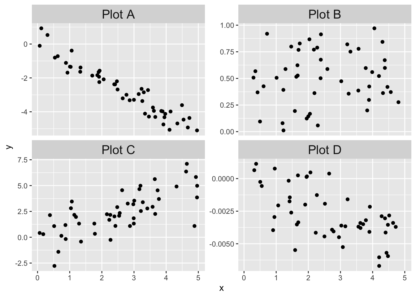
The data frame datasaurus_dozen is part of the datasauRus package.
This data is actually 13 data sets, each one specified by a different value of the dataset variable.
For each of the 13 data sets, compute \(\bar{x}\),\(\bar{y}\),\(s_x\),\(s_y\), and the correlation between \(x\) and \(y\).
What do you observe? Plot a few of the individual data sets (including dino) and describe what you see.
In 2019, researchers105 published a paper in which they found a correlation between arts engagement and mortality. The New York Times reported: “Another Benefit to Going to Museums? You May Live Longer.”106 The published paper accounted for many lurking variables by incorporating them in their statistical model, but still concluded with the statement that “A causal relationship cannot be assumed, and unmeasured confounding factors might be responsible for the association.”
What are some lurking variables that might confound the correlation between museum attendance and mortality?
Let \(X\) be a standard normal random variable.
- The correlation of \(X\) and \(X^2\) is zero. Compute the sample correlation coefficient of \(X\) and \(X^2\) using 100,000 samples to confirm that this is at least approximately the case.
- Are \(X\) and \(X^2\) independent?
Exercises 11.9 – 11.13 require material through Section 11.3.
Suppose you have 100 data points, and \(\overline{x} = 3\), \(s_x = 1\), \(\overline{y} = 2\), \(s_y = 2\), and the correlation coefficient is \(r = 0.7\). Find the equation of the least squares regression line in slope-intercept form.
Theorem 11.1 gives a value for \(\beta_1\) in terms of the data \((x_1,y_1),\ldots,(x_n, y_n)\). Use Theorem 11.1 to compute the value for \(\beta_0\).
Consider the model \(y_i = \beta_0 + x_i + \epsilon_i\). That is, assume that the slope is 1. Find the value of \(\beta_0\) that minimizes the sum-squared error when fitting the line \(y = \beta_0 + x\) to data given by \((x_1,y_1),\ldots,(x_n, y_n)\).
Consider the model \(y_i = \beta_1x_i + \epsilon_i\). That is, assume that the intercept is 0. Find the value of \(\beta_1\) that minimizes the sum-squared error when fitting the line \(y = \beta_1 x\) to data given by \((x_1,y_1),\ldots,(x_n, y_n)\).
Suppose that in Exercise 11.12, instead of minimizing the sums of squares of the vertical error \(\sum (\beta_1 x_i - y_i)^2\), you decide to minimize the sums of squares of the horizontal error. This means that our model is that \(x = \gamma y + \epsilon\) and we wish to minimize \(\sum (x_i - \gamma y_i)^2\) over all choices of \(\gamma\).
- Find a formula for \(\gamma\).
- Find an example where the “best” line determined by minimizing vertical error is different from the “best” line determined by minimizing horizontal error. (Hint: almost any collection of points will do the trick.)
Exercises 11.14 – 11.19 require material through Section 11.4.
For each of the following eight residual plots, indicate whether the residual plot is evidence against the linear model being satisfied or not.
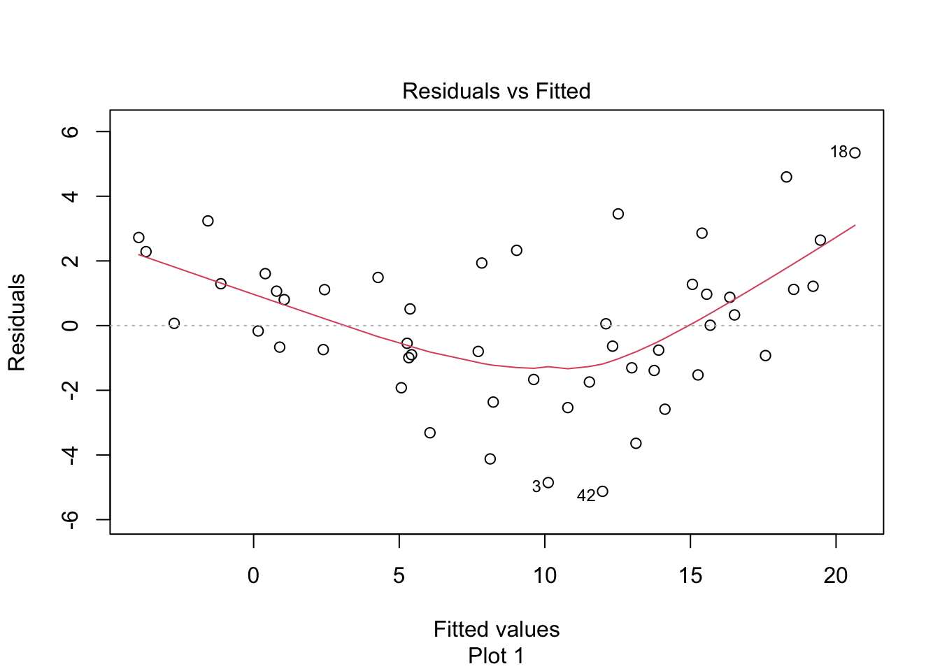
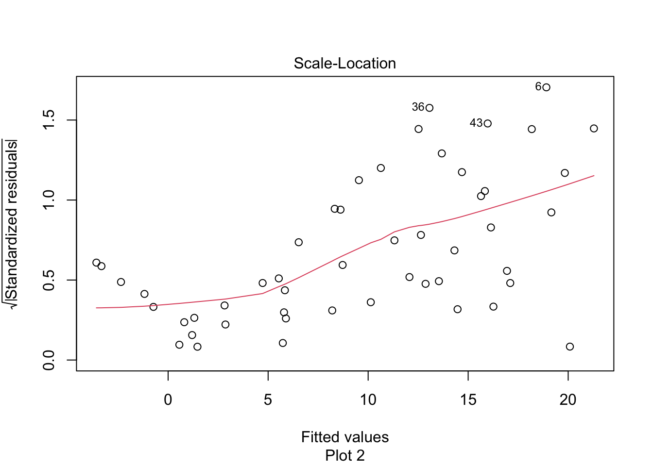
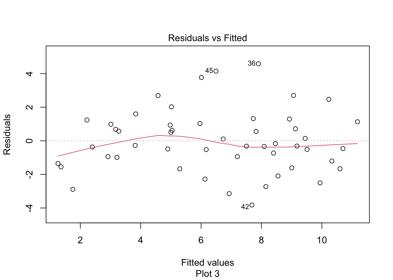
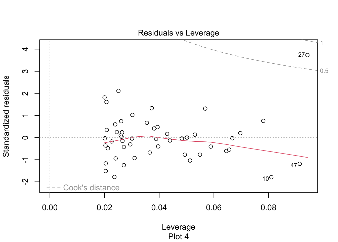

Consider the data set Anscombe, which is in the carData package.
(Note: do not use the data set anscombe, which is preloaded in R.)
The data contains, for each U.S. state, the per capita education expenditures (education) and the number of youth per 1000 people (young).
- Would you expect number of youth and per capita education expenditures to be correlated? Why or why not?
- What is the correlation coefficient between number of youth and per capita education expenditures?
- Model expenditures as a function of number of youth. Interpret the slope of the regression line. Is it significant?
- Examine your data and residuals carefully. Model the data minus the one outlier, and re-interpret your conclusions in light of this.
Consider the cern data set in the fosdata package. This data contains information on social media interactions of CERN.
For the purposes of this problem, restrict to the platform Twitter.
- Create a linear model of
likesonshares, and examine the residuals. - Create a linear model of
log(likes)onlog(shares)and examine the residuals. - Which model seems to better match the assumptions of linear regression?
Consider the data set crit_period in the fosdata package. The critical period hypothesis posits that there is a critical period (young) for first exposure to a second language, and that first exposure past the critical period makes it much more difficult to attain high levels of second language proficiency.
- Consider the North American subjects only, and plot
gjt(scores on the grammaticality judgment test) versusaoa(age of onset of acquisition). - Find the coefficients of the regression line and plot it on top of the scatterplot.
- What does the slope represent in terms of this data?
- Examine the residuals. The critical period hypothesis predicts that there will be an elbow shape or L shape in the residuals versus fitted. Do you see that in your residuals?
Consider the starwars data set in the dplyr package.
- Create a scatterplot of mass versus height of the Star Wars characters.
- Create a linear model of mass as described by height for the Star Wars characters, and write the equation for the line of best fit.
- Examine the residual plots and comment. Which character is the outlier?
- Remove the large outlier and create a new linear model of mass as described by height for the Star Wars characters minus the outlier. Comment on the magnitude of the change of the slope and intercept.
The data set engel contains data on income and food expenditure for 235 working class Belgian households.
To load this data, load the quantreg package and then enter the command data(engel).
- Make a plot of
foodexpas explained byincomeand show the regression line on your plot. - Compute the linear model and plot the residuals.
- The assumptions for linear regression are not satisfied. What is wrong with the residuals?
Exercises 11.20 – 11.30 require material through Section 11.5.
Consider the juul data set in ISwR.
- Fit a linear model to explain igf1 level by age for people under age 20 who are in tanner puberty group 5, see Exercise 11.3.
- Predict the igf1 level with 95 percent prediction bounds for a 16 year old who is in tanner puberty group 5.
Consider the cern data set in the fosdata package.
Create a linear model of log(likes) on log(shares) for interactions in the Twitter platform (see Exercise 11.16). Find 95 percent confidence intervals for the slope and intercept for the model if the residuals are acceptable.
The first Vietnam draft lottery determined the order in which young men would be drafted in 1970 and sent to fight in Vietnam.
Each of 366 possible birthdays were printed on paper, placed in plastic capsules, and drawn by hand from a glass jar (see Figure 11.32).
The results of the lottery are in the data set fosdata::draft.
- Make a scatterplot of
DraftNovs.DayofYear. Does it appear the draft numbers were evenly distributed across the year? - Test for a linear relationship between draft number and day of year. What do you conclude?
Figure 11.32: Representative Alexander Pirnie (R-NY) drawing the first number in the Vietnam draft for 1970. (Source: Library of Congress)
Selective Service System. This work is in the public domain in the United States because it is a work prepared by an officer or employee of the United States Government as part of that person’s official duties under the terms of Title 17, Chapter 1, Section 105 of the US Code. https://commons.wikimedia.org/wiki/File:1969_draft_lottery_photo.jpg
Consider the penguins data set in the palmerpenguins package and restrict to gentoo penguins.
Perform a hypothesis test of \(H_0: \beta_1 = 0\) versus \(H_a: \beta_1 \not= 0\) for the model
\[ \widehat{\text{body\_mass\_g}} = \beta_0 + \beta_1 \cdot \text{flipper\_length\_mm} + \varepsilon \]
at the \(\alpha = .01\) level.
The data set hot_dogs is in the fosdata package. It contains information about various brands of hot dogs as listed in Consumer Reports, 1986.
- Make a scatterplot showing sodium content as a function of calories. Color your points using the hot dog type.
- Remove the Poultry hot dogs (why?) and then construct a linear model to explain sodium content as a function of calories. What is the equation of your regression line?
- How much sodium does your model predict for a 140 calorie Beef or Meat hot dog?
- Give the prediction interval that contains the sodium level for 95% of 140 calorie Beef or Meat hot dogs.
This exercise uses the acorns data from the fosdata package, and follows the analysis in Marcelo and Patterson, 1990107. The authors suggest that
larger acorns allow for greater success in ecological niches, leading to a wider geographic range.
- Define new variables which are the log of
Acorn_sizeand the log ofRange. Check thatAcorn_sizeandRangeare very skewed but the logged variables are reasonably normal, except for one outlier. Remove the one outlier, Quercus tomentella Engelm, which is only found on a few small islands off the western coast. - Build a linear model of the log of Range on the log of acorn size, only for the Atlantic region oaks. Is there a significant relationship?
- Build a linear model of the log of Range on the log of acorn size, only for the California region oaks. Is there a significant relationship?
Consider the Batting data from the Lahman data set.
This problem uses home runs (HR) to explain total runs scored (R) in a baseball season.
- Construct a data frame that has the total number of HR hit and the total number of R scored for each year in the data set.
- Create a scatterplot of the data, with HR as the explanatory variable and R as the response. Use color to show the yearID.
- Notice early years follow a different pattern than more modern years. Restrict the data to the years from 1970 to the present, and create a new scatterplot.
- Fit a linear model to the recent data. How many additional R does the model predict for each additional HR? Is the slope significant?
- Plot the best-fit line and the recent data on the same graph.
- Create a prediction interval for the total number of runs scored in the league if a total of 4000 home runs are hit. Would this be a valid prediction interval if we found new data for 1870 that included HR but not R?
Consider the ex0728 data set in Sleuth2 (note: not in Sleuth3!).
This gives the year of completion, height and number of stories for 60 randomly selected notable tall buildings in North America.
- Create a scatterplot of Height (response) versus Stories (explanatory).
- Which building(s) are unexpectedly tall for their number of stories?
- Is there evidence to suggest that the height per story has changed over time?
Consider the data in ex0823 in Sleuth3.
This data set gives the wine consumption (liters per person per year) and heart disease mortality rates (deaths per 1000) in 18 countries.
- Create a scatterplot of the data, with Wine as the explanatory variable. Does there appear to be a transformation of the data needed?
- Does the data suggest that wine consumption is associated with heart disease?
- Would this study be evidence that the odds of dying from heart disease would change for a person who increases their wine consumption to 75 liters per year?
Data in fosdata::plastics has measurements of plastic particles found in the snow in the Arctic and in Europe.
- Check that
diameteris approximately normally distributed butlengthis very skewed. Create a new variable which is the log oflengthand check that it is approximately normally distributed. - Make a scatterplot of
diameteras explained by the log oflengthand add the regression line to the plot. - Create a linear model of
diameteras explained by the log oflength. Is there evidence of a relationship betweendiameterand the log oflengthat the \(\alpha = 0.05\) level?
The msleep data set in the ggplot2 package has information about 83 species of mammals.
- Make a scatterplot of
sleep_totalonbrainwt. Add the regression line to your plot. - What is the correlation between these two variables? Is the linear relationship significant at the 0.01 level?
- Do the residuals support using the linear model for inference?
Exercises 11.31 – 11.35 are from Section 11.6.
In this exercise, regression assumptions are met perfectly. You will check how often the true mean of \(y\) at a given \(x\) value lies in the 95% confidence interval for that mean.
Follow these steps:
- Create simulated data.
- Choose 30 \(x\) values uniformly on the interval \([0,10]\).
- Create 30 \(y\) values following \(y_i = 1 + 2x_i + \epsilon_i\), where \(\epsilon_i \sim \text{Norm}(0,1)\).
- Use
predictto compute the 95% confidence interval for the mean of \(y\) at \(x = x_1\), where \(x_1\) is simply the first of your generated data values. - Check that the true mean, \(1 + 2x_1\), is in the confidence interval you created.
Now replicate this process at least 1000 times to estimate the probability that the true mean is in the confidence interval.
In this exercise, regression assumptions are met perfectly. You will check how often new data at a given \(x\) lies in the 95% prediction interval for the model at \(x\).
Follow these steps:
- Create simulated data.
- Choose 30 \(x\) values uniformly on the interval \([0,10]\).
- Create 30 \(y\) values following \(y_i = 1 + 2x_i + \epsilon_i\), where \(\epsilon_i \sim \text{Norm}(0,1)\).
- Choose a random value \(x_\star\) uniformly on the interval \([0,10]\) and a new value \(y_\star = 1 + 2x_\star + \epsilon_\star\).
- Use
predictto compute the 95% prediction interval at \(x_\star\). - Check that the new data \(y_\star\) lies in the 95% prediction interval.
Now replicate this process at least 1000 times to estimate the probability that \(y_\star\) is in the prediction interval.
In this exercise, regression assumptions are met perfectly. Follow the steps of Exercise 11.32 except only perform step I one time; do not recreate the data for each new value of \(x_\star\).
Is your answer 95%? Run your simulation a few times to see whether your answer is consistent. Why would you not necessarily expect the answer to be 95% every time?
In this exercise, the data does not follow a linear model, violating a basic assumption of linear regression. You will check how often new data at a given \(x\) lies in the 95% prediction interval for the model at \(x\).
Follow the steps of Exercise 11.32 except use \(y_i = x_i^2 + \epsilon_i\). Rather than choose \(x_\star\) randomly, run the simulation with \(x_\star = 0\). Then repeat when \(x_\star = 5\).
- What percentage of time is new data at \(x_\star = 0\) in the 95% prediction interval at \(x = 0\)?
- What percentage of time is new data at \(x_\star = 5\) in the 95% prediction interval at \(x = 5\)?
In this exercise, we illustrate the fact mentioned in Section 11.4 that the standard deviation of a residual is larger near the mean of all predictors than near the extremes of all predictors.
- Create data \(x_1 = 1, x_2 = 2, \dotsc, x_{19} = 19\) and \(y_i = 1 + 2x_i + \epsilon_i\), where \(\epsilon_i\) is normal with mean 0 and standard deviation 3.
- The mean value of \(x\) is 10. Model \(y\) on \(x\) and compute the residual when \(x = 10\). Replicate this and verify that the standard deviation of the residuals when \(x = 10\) is about 2.9.
- Repeat part (b) for the same model and data, but compute the residual when \(x = 1\) and verify that the standard deviation of the residuals when \(x = 1\) is about 2.7.
Exercises 11.36 – 11.39 are from Section 11.7.
Consider the chinstrap penguins in the palmerpenguins data set. When flipper length is zero, one might reasonably expect the body mass to also be zero. Create a data frame chinstrap containing only the chinstrap penguins and a linear model without intercept of body mass on flipper length using lm(body_mass_g ~ flipper_length_mm + 0, data = chinstrap). Estimate the MSE of the model using leave one out cross validation and compare to the MSE of 91245.43 found for the linear model in Section 11.7.
Section 11.7 computed the LOOCV MSE of a smooth spline model of chinstrap penguin body mass explained by flipper length. Find the LOOCV MSE for the smooth spline using 18, 10, and 3 degrees of freedom. Are any of these models better than the linear model?
Continuing Exercise 11.37, find the LOOCV MSE for the smooth spline using every value of df from 2 to 24. Make a plot showing the MSE as a function of df and add a horizontal line at the linear MSE of 9.1245^{4}. Interpret the results.
Example 11.4 used a regression line to model speed on the “shape trail B” test on age of children, with data from fosdata::child_tasks.
Rather than a linear relationship, an inverse relationship of the form \(\hat{y} = \beta_0 + \frac{\beta_1}{x}\) may be a better model for this data.
You can build the inverse model using the formula stt_cv_trail_b_secs ~ I(1/age_in_months).108
- Compute the MSE for LOOCV of the linear model built in Example 11.4.
- Compute the MSE for LOOCV of the inverse model.
- Which model has more predictive ability as measured by LOOCV?
- Make a plot showing the data, the linear model, and the inverse model. (Hint: use
predicton the inverse model to create predicted \(y\) values for every data point and then plot them withgeom_line.)
Kristen B Gorman, Tony D Williams, and William R Fraser, “Ecological Sexual Dimorphism and Environmental Variability Within a Community of Antarctic Penguins (Genus Pygoscelis).” PLOS One 9, no. 3 (2014): e90081.↩︎
Chan and Morgan, “Assessing Children’s Cognitive Flexibility with the Shape Trail Test.”↩︎
Zhigang Li et al., “A Statistical Skull Geometry Model for Children 0-3 Years Old.” PLOS One 10, no. 5 (2015): e0127322.↩︎
A W Blomkvist et al., “Unilateral Lower Limb Strength Assessed Using the Nintendo Wii Balance Board: A Simple and Reliable Method.” Aging Clinical and Experimental Research 29, no. 5 (October 2017): 1013–20, https://doi.org/10.1007/s40520-016-0692-5.↩︎
W N Venables and B D Ripley, Modern Applied Statistics with S, 4th ed. (Springer, New York, 2002).↩︎
Nate Silver, “Do Pulitzers Help Newspapers Keep Readers?” (FiveThirtyEight, April 15, 2014), https://fivethirtyeight.com/features/do-pulitzers-help-newspapers-keep-readers.↩︎
Claudio Viecelli et al., “Using Smartphone Accelerometer Data to Obtain Scientific Mechanical-Biological Descriptors of Resistance Exercise Training,” PLOS One 15, no. 7 (July 2020): e0235156.↩︎
To find this option with R’s built-in help, use
?predictand then click onpredict.lm, because we are applying predict to an object created by lm.↩︎Kuhn Max and Kjell Johnson, Applied Predictive Modeling (New York, NY: Springer, 2018).↩︎
Thomas S Churcher et al., “Probability of Transmission of Malaria from Mosquito to Human Is Regulated by Mosquito Parasite Density in Naı̈ve and Vaccinated Hosts.” PLOS Pathogens 13, no. 1 (January 2017): e1006108.↩︎
Daisy Fancourt and Andrew Steptoe, “The Art of Life and Death: 14 Year Follow-up Analyses of Associations Between Arts Engagement and Mortality in the English Longitudinal Study of Ageing,” BMJ 367 (2019).↩︎
Maria Cramer, “Another Benefit to Going to Museums? You May Live Longer” (The New York Times, December 22, 2019).↩︎
Marcelo Aizen and William Patterson III, “Acorn Size and Geographical Range in the North American Oaks (Quercus L.),” Journal of Biogeography 17, no. 327 (1990), https://doi.org/10.2307/2845128.↩︎
The
Ioperator tellslmto treat its argument as a mathematical expression.↩︎