Chapter 7 Data Visualization with ggplot
Data visualization is a critical aspect of statistics and data science. Visualization is crucial for communication because it presents the essence of the underlying data in a way that is immediately understandable. Visualization is also a tool for exploration that may provide insights into the data that lead to new discoveries.
This chapter introduces the package ggplot2 to create visualizations that are more expressive and better looking than base R plots.
ggplot2 has a powerful yet simple syntax based on a conceptual framework called the grammar of graphics.
library(ggplot2)Creating visuals often requires transforming, reorganizing or summarizing the data prior to plotting. The ggplot2 package is designed to work well with dplyr, and an understanding of the dplyr tools introduced in Chapter 6 will be assumed throughout this chapter.
7.1 ggplot fundamentals
In this section, we discuss the grammar of graphics. We introduce the scatterplot as a concrete example of how to use the grammar of graphics, and we discuss how the presentation of data is affected by its structure.
7.1.1 The grammar of graphics
The grammar of graphics is a theory describing the creation of data visualizations, developed by Wilkinson.40 Much like the grammar of a language allows the combination of words in ways that express complicated ideas, the grammar of graphics allows the combination of simpler components in ways that express complicated visuals.
The most important aspect of a visualization is the data. Without data, there is nothing to visualize. Wilkinson describes three types of data: empirical, abstract, and meta. Empirical data is data that comes from observations, abstract data comes from formal models, and meta data is data on data. We will be concerned with empirical data in this chapter. So, we assume that we have a collection of observations of variables from some experiment that is stored in a data frame.
Next, we need a mapping from variables in the data to aesthetics. An aesthetic is a graphical property that can be altered to convey information. Common aesthetics are location in terms of \(x\)- or \(y\)-coordinates, size, shape, and color. Scales control the details of how variables are mapped to aesthetics. For example, we may want to transform the coordinates or modify the default color assignment with a scale.
Variables are visualized through the aesthetic mapping and through geometries which are put in layers on a coordinate system. Examples of geometries are points, lines, or areas. A typical coordinate system would be the regular \(x\)-\(y\) plane from mathematics. Statistics of the variables are computed inside the geometries, depending on the type of visualization desired. Some examples of statistics are counting the number of occurrences in a region, tabling the values of a variable, or the identity statistic which does nothing to the variable. Facets divide a single visualization into multiple graphs. Finally, a theme is applied to the overall visualization.
Creating a graph using ggplot2 is an iterative process.
We will start with the data and aesthetics, then add geoms, scales, facets, and a theme, if desired.
The data and aesthetics are typically inherited at each step, with a few exceptions.
One notable exception is a class of annotations, which are layers that do not inherit global settings.
An example might be if we wish to add a reference line whose slope and intercept are not computed from the data.
Don’t worry if some of these words and concepts are unfamiliar to you right now. We will explain them further with examples throughout the text. We recommend returning to the vocabulary of the grammar of graphics introduced in this section after reading through the rest of the chapter.
7.1.2 Basic plot creation
The purpose of this example is to connect the terminology given in the previous section to a visualization. We will go into much more detail on this throughout the chapter.
Consider the built-in data set, CO2, which will be the data in this visualization.
This data set gives the carbon dioxide uptake of six plants from Quebec and six plants from Mississippi. The uptake is measured at different levels of carbon dioxide concentration, and half of the plants of each type were chilled overnight before the experiment was conducted.
We will choose the variables conc, uptake and eventually Type as the variables that we wish to map to aesthetics. We start by mapping conc to the \(x\)-coordinate and uptake to the \(y\)-coordinate. The geometry that we will add is a scatterplot, given by geom_point.
ggplot(CO2, aes(x = conc, y = uptake)) +
  geom_point()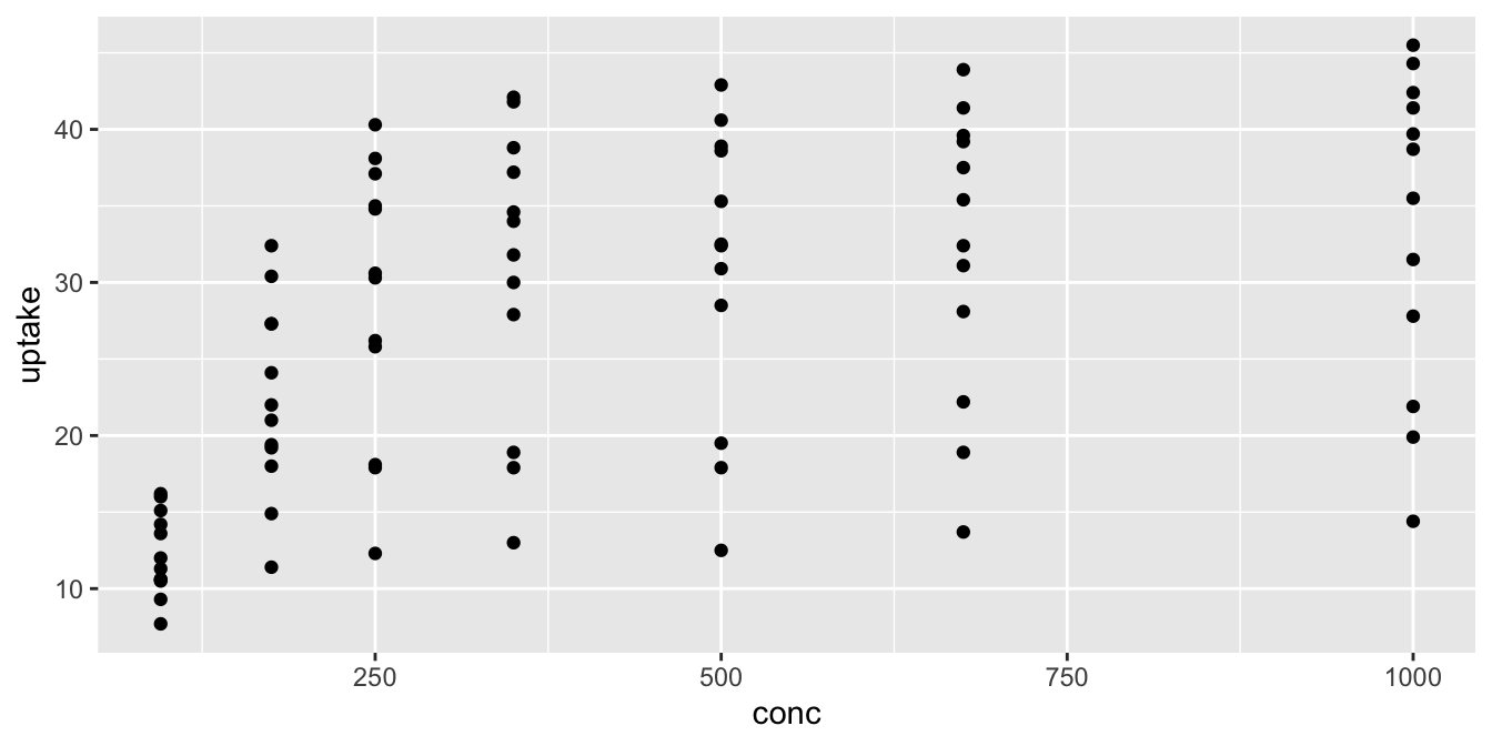
The function ggplot41 takes as its first argument the data frame that we are working with, and as its second argument the aesthetic mappings between variables and visual properties. In this case, we are telling ggplot that the aesthetic “\(x\)-coordinate” is to be associated with the variable conc, and the aesthetic “\(y\)-coordinate” is to be associated with the variable uptake. Let’s see what that command does all by itself:
ggplot(CO2, aes(x = conc, y = uptake))
The ggplot function has set up the \(x\)-coordinates and \(y\)-coordinates for conc and uptake.
Now, we just need to tell it what we want to do with those coordinates.
That’s where geom_point comes in.
The function geom_point() inherits the x- and \(y\)-coordinates from ggplot, and plots them as points.
To display a curve fit to the data, we can use the geometry geom_smooth().
ggplot(CO2, aes(x = conc, y = uptake)) +
  geom_smooth()
## `geom_smooth()` using method = 'loess' and formula = 'y ~ x'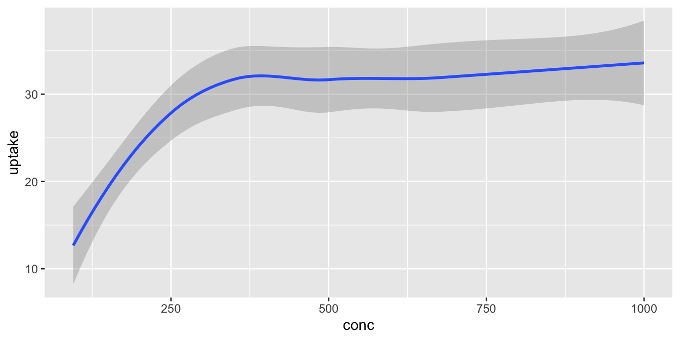
Notice that geom_smooth produced a message describing exactly how it went about smoothing the data. That can be helpful, but this book will suppress those messages from here on.
Each geometry in a plot is a layer. The ‘+’ symbol is used to add new layers to a plot, and allows multiple geometries to appear on the same plot. For example, we might want to see the data points and the fitted curve on the same plot.
ggplot(CO2, aes(x = conc, y = uptake)) +
  geom_point() +
  geom_smooth()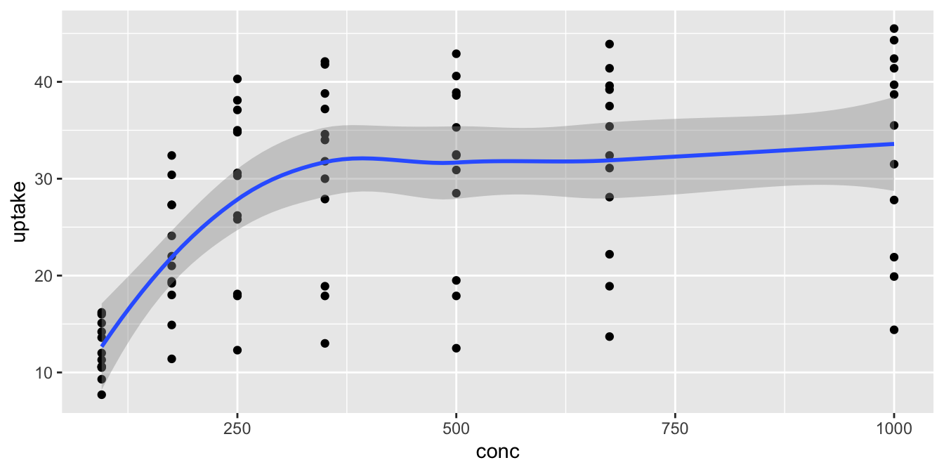
To add more information to the plot, we use aesthetics to map additional variables to visual properties of the graph. Different geometries support different aesthetics. geom_point requires both x and y and supports these:
- x
- \(x\) position
- y
- \(y\) position
- alpha
- transparency
- color
- color, or outline color
- fill
- fill color
- group
- grouping variable for fitting lines and curves
- shape
- point shape
- size
- point size
- stroke
- outline thickness
Let’s use color to display the Type variable in the CO2 data set, which shows whether readings are from Mississippi or Quebec. Both
the color aesthetic and the group aesthetic assign groups to the data, which affect the results of geometries like geom_smooth, producing a smoothed curve for each group.
ggplot(CO2, aes(x = conc, y = uptake, color = Type)) +
  geom_point() +
  geom_smooth()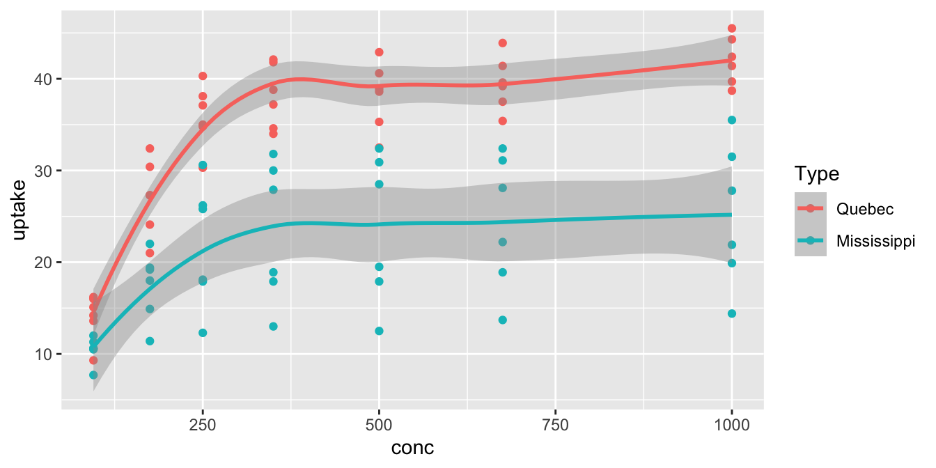
That plot is very useful! We see that the Quebecois plants have a larger uptake of at each concentration level than do the Mississippians.
Experiment with different aesthetics to display the other variables in the CO2 data set.
The ggplot command produces a ggplot object, which is normally displayed immediately. It is also possible to store the ggplot object in a variable and then continue to modify that variable until the plot is ready for display. This technique is useful for building complicated plots in stages.
# store the plot without displaying it
co2plot <- ggplot(CO2, aes(x = conc, y = uptake, color = Type)) +
  geom_point() +
  geom_smooth()
Let’s complete this plot by adding better labels, a scale to customize the colors assigned to Type,
and a theme that will change the overall look and feel of the plot. See Figure 7.1.
co2plot <- co2plot +
  labs(
    title = "Carbon Dioxide Uptake in Grass Plants",
    caption = "Data from Potvin, Lechowicz, Tardif (1990)",
    x = "Ambient CO2 concentration (mL/L)",
    y = "CO2 uptake rates (umol/m^2 sec)",
    color = "Origin"
  )
co2plot <- co2plot +
  scale_color_manual(values = c("blue", "red")) +
  theme_minimal()
co2plot # display the completed plot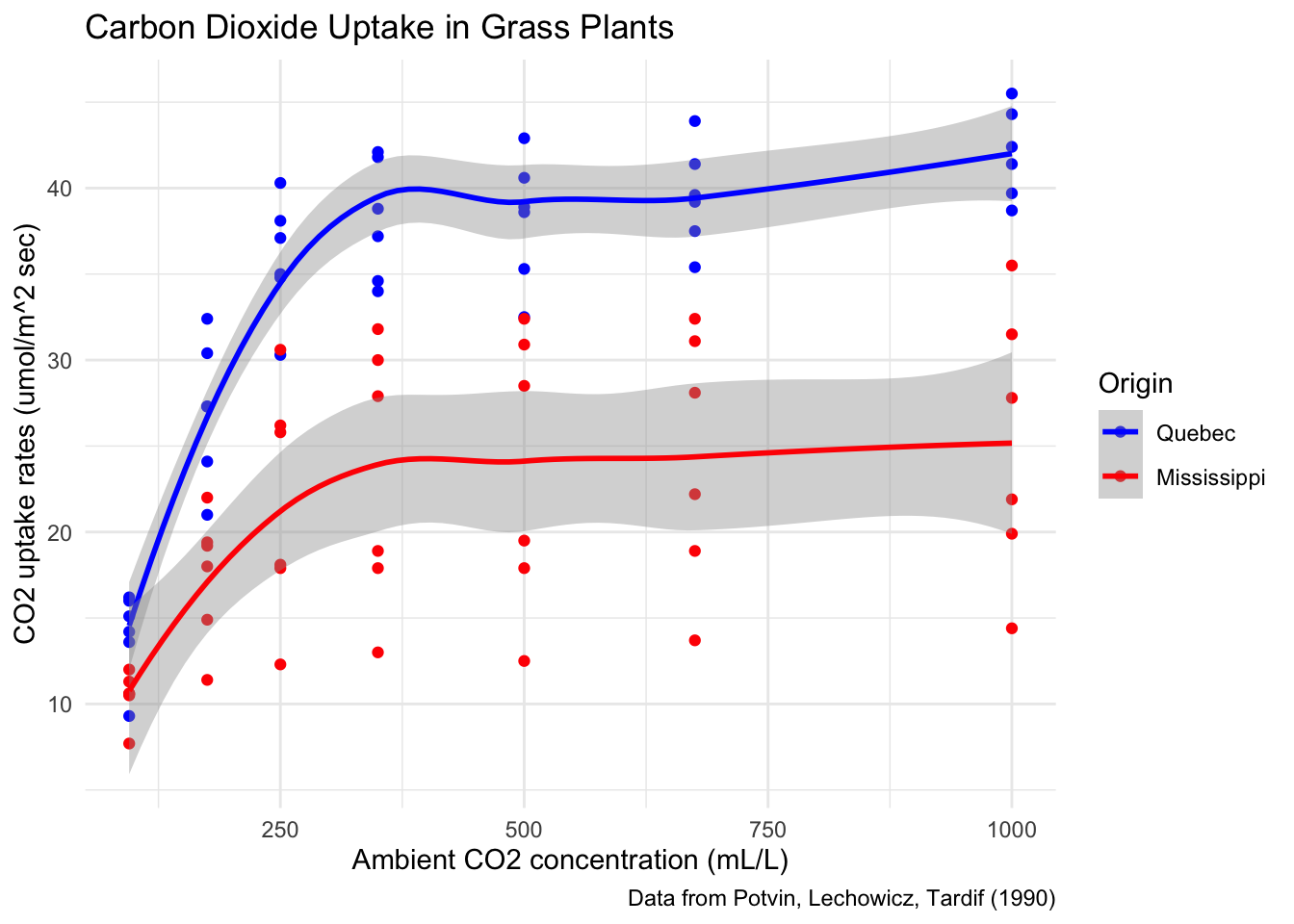
Figure 7.1: A finished plot.
The data in CO2 was obtained from measurements on only six plants total. Each plant was measured at six different concentration levels and chilled/nonchilled. Map Plant to the color aesthetic and create a scatterplot of uptake versus concentration.
7.1.3 Structured data
Plotting with ggplot requires you to provide clean, tidy data, with properly typed variables and factors in order. Many traditional plotting programs (such as spreadsheets) will happily generate charts from unstructured data. This contrast in philosophy can be summed up:
- To change how data is presented by a spreadsheet, you adjust the chart.
- To change how data is presented by ggplot, you adjust the structure of the data.
The advantage to the ggplot approach is that it forces you to reckon with the structure of your data, and understand how that structure is represented directly in the visualization. Visualizations with ggplot are reproducible, which means that new or changed data is easily dealt with, and chart designs can be consistently applied to different data sets.
With the spreadsheet approach, adjusting a chart after creating it requires the user to click through menus and dialog boxes. This method is not reproducible, and frequently leads to tedious repetition of effort. However, if you are used to editing charts in a spreadsheet, then the ggplot philosophy takes some getting used to.
The data manipulation tools from Chapter 6 are well suited to work with ggplot. The first argument to any ggplot command is the data, which means that ggplot can be placed at the end of a dplyr pipeline.
For example, you may want to visualize something that isn’t directly represented as a variable in the data frame.
We can use mutate to create the variable that we want to visualize, and then use ggplot to visualize it.
Consider the houses data set in the fosdata package.
This data set gives the house prices and characteristics of houses sold in King County (home of Seattle) from May 2014 through May 2015.
Suppose we want to get a scatterplot of price per square foot versus the log of the lot size for houses in zip code 98001. The variables price, sqft_living, and sqft_lot are given in the data frame, but we will need to compute the price per square foot and take the log of the square footage of the lot ourselves.42 We will also need to filter the data frame so that only houses in zip code 98001 appear. We do this using dplyr tools, and then we can pipe directly into ggplot2 without saving the modified data frame.
fosdata::houses %>%
  filter(zipcode == 98001) %>%
  mutate(
    price_per_sf = price / sqft_living,
    log_lot_size = log(sqft_lot)
  ) %>%
  ggplot(aes(x = log_lot_size, y = price_per_sf)) +
  geom_point() +
  labs(title = "Home prices in zip code 98001")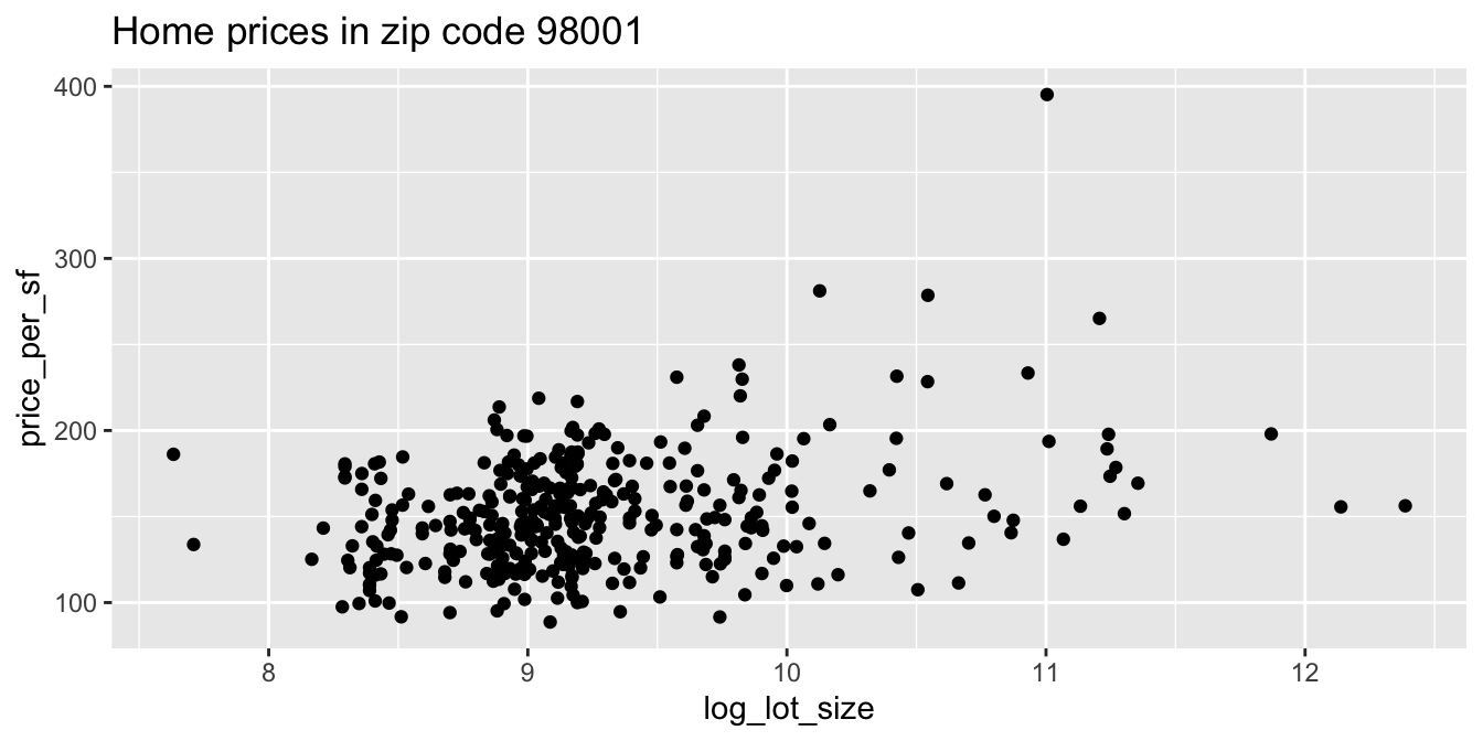
It appears as though an increase in the logarithm of the lot size is associated with an increase in the price per square foot of houses in the 98001 zip code.
Data for ggplot must be stored as a data frame (or equivalent structure, such as a tibble), and usually needs to be tidy. A common issue is when a data set contains multiple columns of data that you would like to deal with in the same way.
The weight_estimate data in fosdata comes
from an experiment where children watched actors lift objects of various weights. We would like to plot the actual
weight of the object on the \(x\)-axis and the child’s estimate on the \(y\)-axis. However, the actual weights are stored in the names of the four column variables
mean100, mean200, mean300, and mean400:
head(fosdata::weight_estimate)## id height mean100 mean200 mean300 mean400 age
## 1 6YO_S1 124 150 240 270 380 6
## 2 6YO_S2 118 240 280 330 400 6
## 3 6YO_S3 121 170 370 360 380 6
## 4 6YO_S4 122 160 140 250 390 6
## 5 6YO_S5 116 170 300 360 310 6
## 6 6YO_S6 118 210 230 300 320 6We use pivot_longer to tidy the data.
weight_tidy <- fosdata::weight_estimate %>%
  tidyr::pivot_longer(
    cols = matches("^mean"),
    names_to = "actual_weight",
    names_prefix = "mean",
    values_to = "estimated_weight"
  )
head(weight_tidy)
## # A tibble: 6 × 5
## id height age actual_weight estimated_weight
## <chr> <int> <fct> <chr> <dbl>
## 1 6YO_S1 124 6 100 150
## 2 6YO_S1 124 6 200 240
## 3 6YO_S1 124 6 300 270
## 4 6YO_S1 124 6 400 380
## 5 6YO_S2 118 6 100 240
## 6 6YO_S2 118 6 200 280Now we can provide the actual weight as a variable for plotting:
ggplot(weight_tidy, aes(x = actual_weight, y = estimated_weight)) +
  geom_point() +
  labs(title = "Child estimates of weights lifted by actors")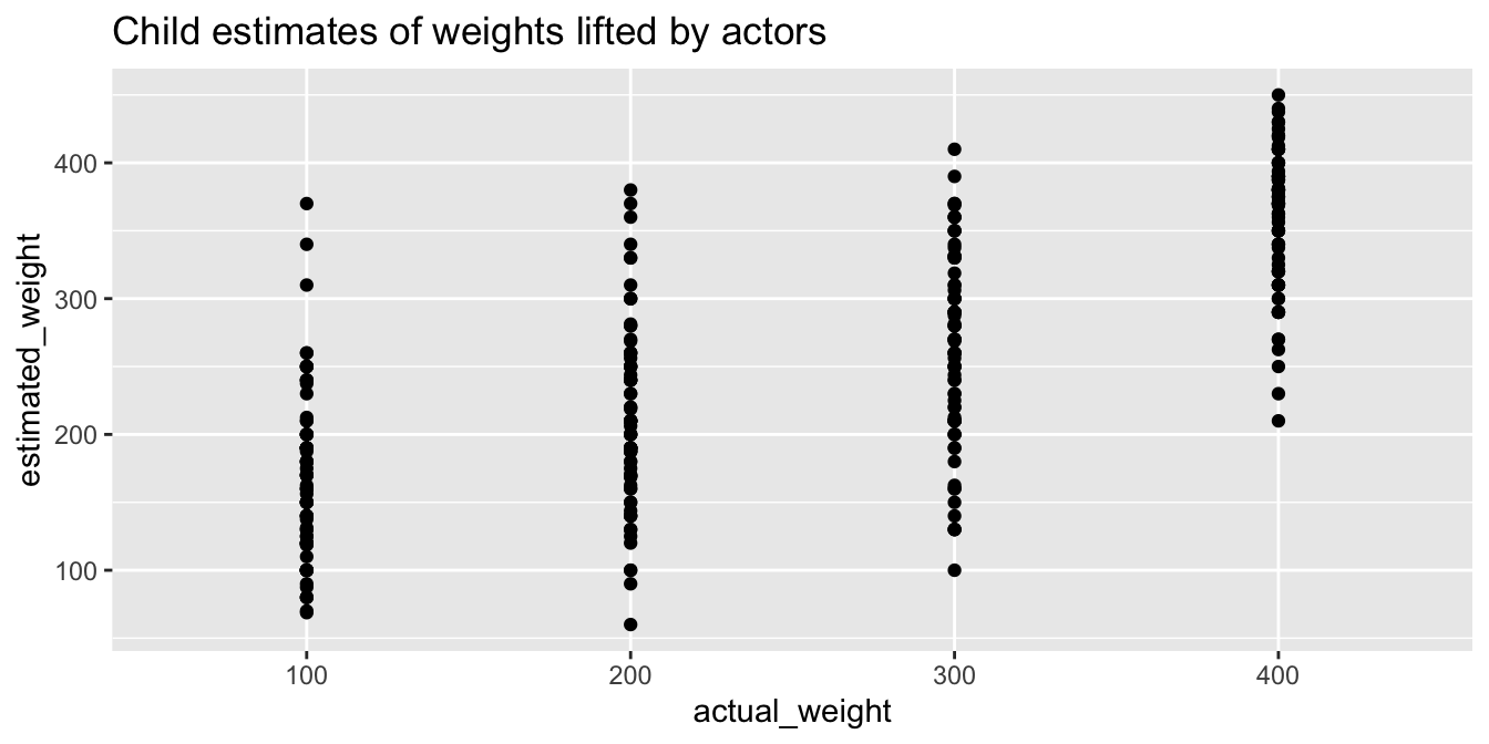
Another common issue when plotting with ggplot is the ordering of factor type variables. When ggplot deals with a character or factor type variable, it will revert to alphabetic order unless the variable is a factor with appropriately set levels.
The ecars data from fosdata gives information about electric cars
charging at workplace charging stations.
Let’s make a barplot showing the number of charges for each day of the week.
ecars <- fosdata::ecars
ggplot(ecars, aes(x = weekday)) +
  geom_bar()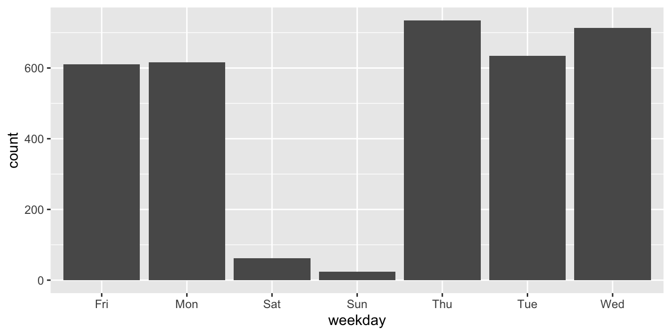
Observe that the days of the week are in alphabetical order, which is not helpful.
To correct the chart, we need to correct the data. We do this by making the weekday
variable into a factor with the correct order of levels.43
After that, the plot shows the bars in the correct order.
days <- c("Sun", "Mon", "Tue", "Wed", "Thu", "Fri", "Sat")
ecars <- mutate(ecars, weekday = factor(weekday, levels = days))
ggplot(ecars, aes(x = weekday)) +
  geom_bar()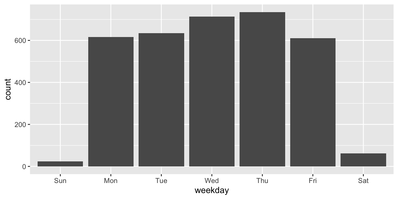
7.2 Visualizing a single variable
In this section, we present several ways of visualizing data that is contained in a single numeric or categorical variable. We have already seen three ways of doing this in Chapter 5, namely histograms, barplots, and density plots. We will see how to do these three types of plots using ggplot2, and we will also introduce qq plots and boxplots.
7.2.1 Histograms
A histogram displays the distribution of numerical data. Data is divided into equal-width ranges called bins that cover the full range of the variable. The histogram geometry draws rectangles whose bases are the bins and whose heights represent the number of data points falling into that bin. This representation assigns equal area to each point in the data set.
The Bechdel test44 is a simple measure of the representation of women in fiction. A movie passes the Bechdel test when it has two female characters who have a conversation about something other than a man.
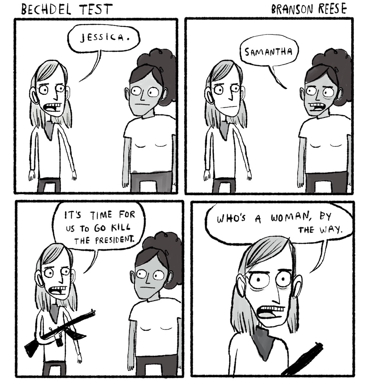
Branson Reese. Used by permission. https://www.branson-reese.com/comics
The bechdel data set in the fosdata package contains information about 1794 movies, their budgets, and whether or not they passed the Bechdel test. This data set was used in the FiveThirtyEight article, “The Dollar-And-Cents Case Against Hollywood’s Exclusion of Women.”45
You can load the data via
bechdel <- fosdata::bechdelThe variable binary is FAIL/PASS as to whether the movie passes the Bechdel test.
Let’s see how many movies failed the Bechdel test.
summary(bechdel$binary)## FAIL PASS
## 991 803In 991 out of the 1794 movies, there was no conversation between two women about something other than a man. There are several interesting things that one could do here, and some of them are explored in the exercises. For now, let’s look at a histogram of the budgets of all movies in 2013 dollars. The geometry geom_histogram has required aesthetics of x and y, but y is computed within the function itself and does not need to be supplied.
ggplot(bechdel, aes(x = budget_2013)) +
  geom_histogram()
## `stat_bin()` using `bins = 30`. Pick better value with `binwidth`.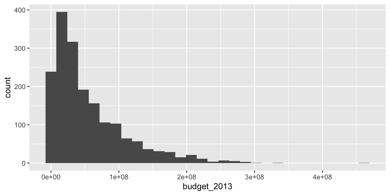
The function geom_histogram always uses 30 bins in its default setting and produces a message about it.
In contrast, the hist command in base R has an algorithm that tries to provide a default number of bins
that will work well for your data.
With ggplot, adjust the binwidth or number of bins to see how those impact the general shape of the distribution.
We will not show the message indicating that the number of bins is 30 further in this text.
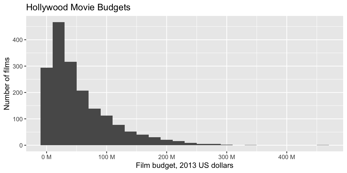
ggplot(bechdel, aes(x = budget_2013)) +
  geom_histogram(bins = 15) # 15 bins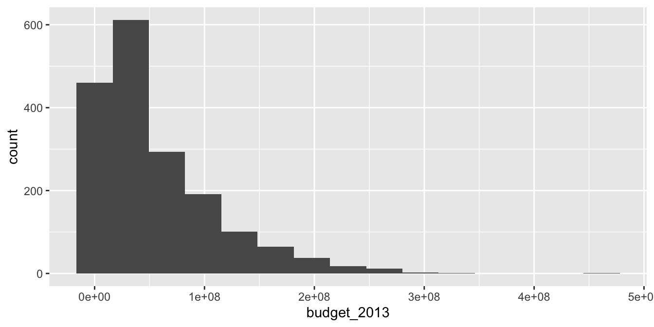
ggplot(bechdel, aes(x = budget_2013)) +
  geom_histogram(binwidth = 20e+6) + # binwidth of 20 million dollars
  scale_x_continuous(
    labels =
      scales::unit_format(unit = "M", scale = 1e-6)
  ) +
  labs(
    title = "Hollywood Movie Budgets",
    x = "Film budget, 2013 US dollars",
    y = "Number of films"
  )
7.2.2 Barplots
Barplots are similar to histograms in appearance, but do not perform any binning. A barplot simply counts the number of occurrences at each level (resp. value) of a categorical (resp. integer) variable. It plots the count along the \(y\)-axis and the levels of the variable along the \(x\)-axis. It works best when the number of different levels in the variable is small.
The ggplot2 geometry for creating barplots is geom_bar, which has required aesthetics x and y, but again the y value is computed from the data by default so is not always included in the aesthetic mapping.
In the bechdel data set, the variable clean_test contains the
levels ‘ok’, ‘dubious’, ‘nowomen’, ‘notalk’, ‘men’.
The values ‘ok’ and ‘dubious’ are for movies that pass the Bechdel test,
while the other values describe how a movie failed the test.
Create a barplot that displays the number of movies that fall into each level of clean_test.
ggplot(bechdel, aes(x = clean_test)) +
  geom_bar()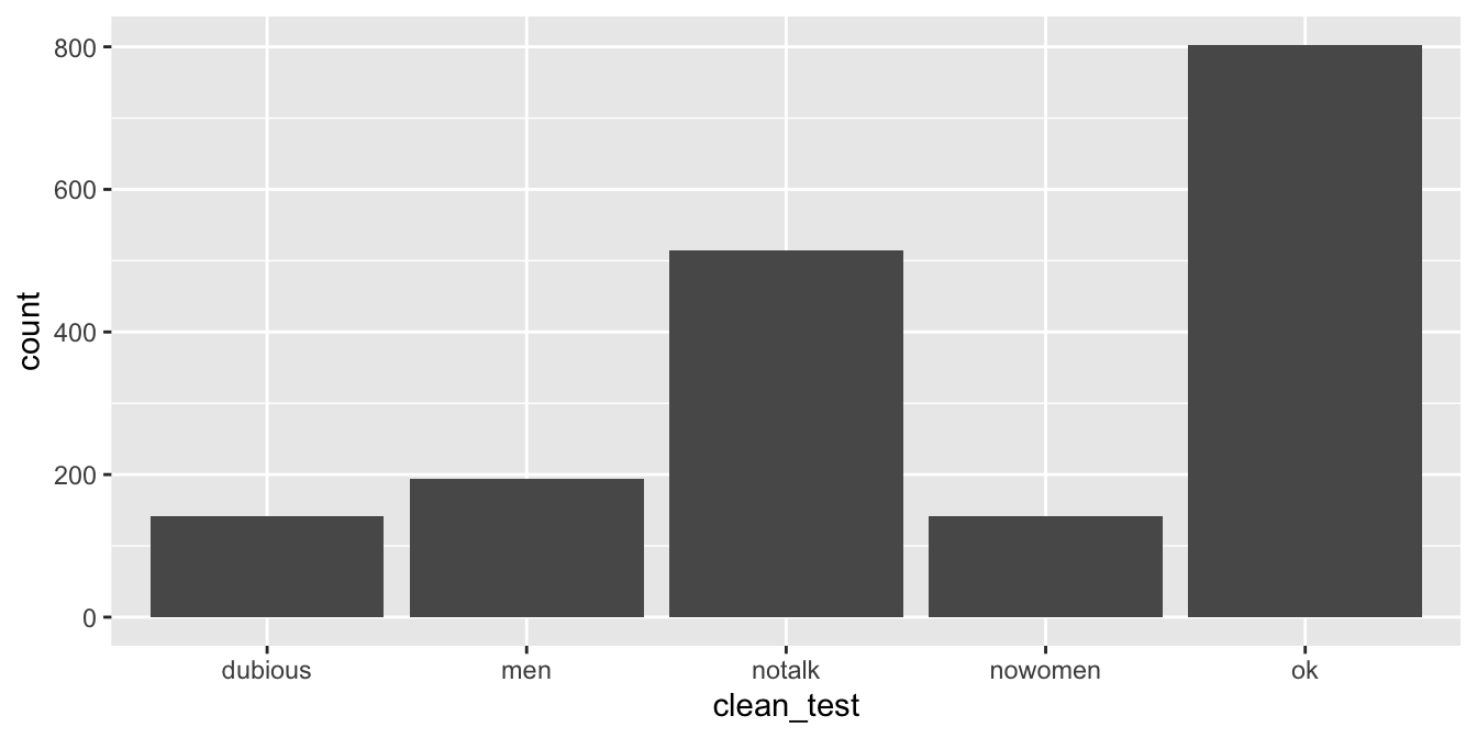
This visualization leaves something to be desired, as it fails to show the natural grouping of ok with dubious, and then men, notalk and nowomen in another group. See Section 7.4.1 for a better visualization.
We can also use geom_bar when the variable in question is integer valued rather than categorical.
Consider the austen data set in the fosdata package.
This data set contains the complete texts of Emma and Pride and Prejudice,
by Jane Austen.
The format is that each observation is a word, together with sentence, chapter, novel, length, and sentiment score information about the word.
Create a barplot showing the number of words of each length (in the two novels combined).
austen <- fosdata::austen
ggplot(austen, aes(x = word_length)) +
  geom_bar() +
  labs(title = "Length of words in Emma and Pride and Prejudice")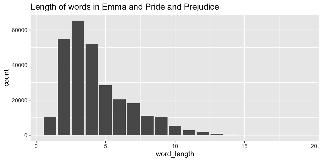
Sometimes, we wish to create a barplot where the \(y\) values are something other than the number of occurrences of a variable. In this case, we provide the y aesthetic and use geom_col instead of geom_bar.
In the austen data set, plot the mean sentiment score of words in Pride and Prejudice versus the chapter the words appear in using a barplot. We will need to do some manipulation to the data before piping it into ggplot.
austen %>%
  filter(novel == "Pride and Prejudice") %>%
  group_by(chapter) %>%
  summarize(mean_sentiment = mean(sentiment_score)) %>%
  ggplot(aes(x = chapter, y = mean_sentiment)) +
  geom_col() +
  labs(title = "Sentiment by chapter in Pride and Prejudice")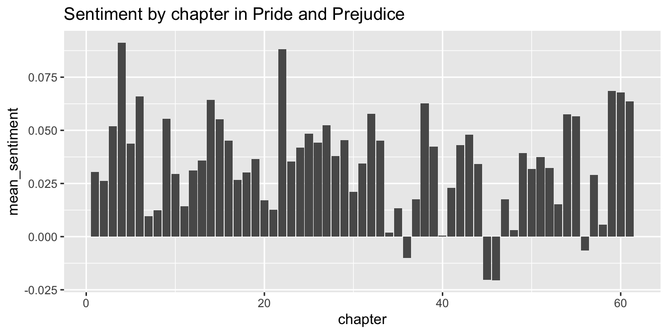
Figure 7.2: Using geom_col to plot bars with heights set by a y aesthetic.
The resulting plot is in Figure 7.2.
7.2.3 Density plots
Density plots display the distribution of a continuous random variable. Rather than binning, as histograms do, a density plot shows a curve whose height is the mean of the pdfs of normal random variables centered at the data points. The standard deviations are controlled by the bandwidth in much the same way that binwidth controls width of histogram bins. Density plots work best when values of the variable we are plotting aren’t spread out too far. It can be a good idea to try a few different bandwidths in order to see the effect that it has on the density estimation.
In base R, we used plot(density(data)) to produce a density plot of data. In ggplot2, we use the geom_density geometry. As in the other geoms we have seen so far, geom_density requires x and y as aesthetics, but will compute the y values if they are not provided.
Consider the chimps data set in the fosdata package.
The amount of grey in a chimpanzee’s hair was rated by 158 humans, and the mean value of their rankings is stored in the variable grey_score_avg. Plot the density of the average grey hair score for chimpanzees.
chimps <- fosdata::chimps
chimps %>%
  ggplot(aes(x = grey_score_avg)) +
  geom_density()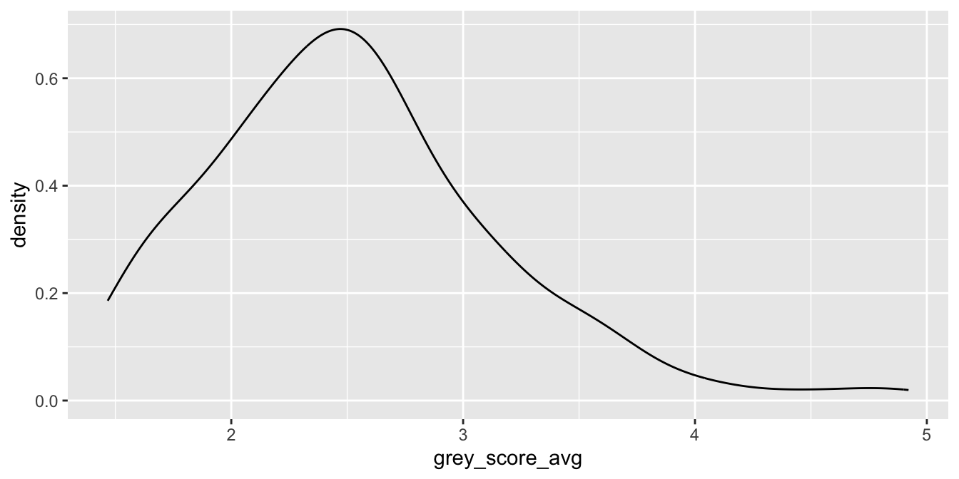
We interpret this plot as an estimate of the plot of the pdf of the random variable grey_score_avg. For example, the most likely outcome is that the mean grey score will be about 2.5.
7.2.4 Boxplots
Boxplots are commonly used visualizations to get a feel for the median and spread of a variable.
In ggplot2 the geom_boxplot geometry creates boxplots.
A boxplot displays the median of the data as a dark line. The range from the 25th to the 75th percentile is called the interquartile range or IQR, and is shown as a box or “hinges.” Vertical lines called “whiskers” extend 1.5 times the IQR, or are truncated if the whisker reaches the last data point. Points that fall outside the whiskers are plotted individually. Boxplots may include notches, which give a rough error estimate for the median of the distribution (we will learn more about error estimates for the mean in Chapter 8).
ggplot(chimps, aes(y = grey_score_avg)) +
  geom_boxplot(notch = TRUE)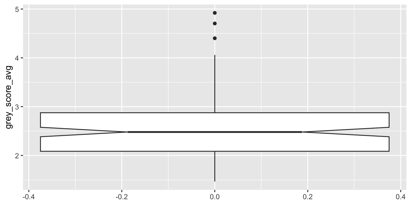
In this boxplot, the median is at 2.5, and the middle 50% of observations fall between about 2.1 and 2.9. The notches show that the true median for all chimps likely falls somewhere between 2.4 and 2.6. The top whisker is exactly 1.5 times as long as the box is tall, and the bottom whisker is truncated because there is no data point below 1.47. Three dots are displayed for observations that fall outside 1.5 IQR, identifying them as possible outliers.
Notice that the \(x\)-axis in our one-box boxplot had a meaningless scale.
Typically, the x aesthetic in geom_boxplot is assigned to a factor variable to compare distributions across groups.
Here are chimpanzee grey scores compared across three habitats:
ggplot(chimps, aes(x = population, y = grey_score_avg)) +
  geom_boxplot()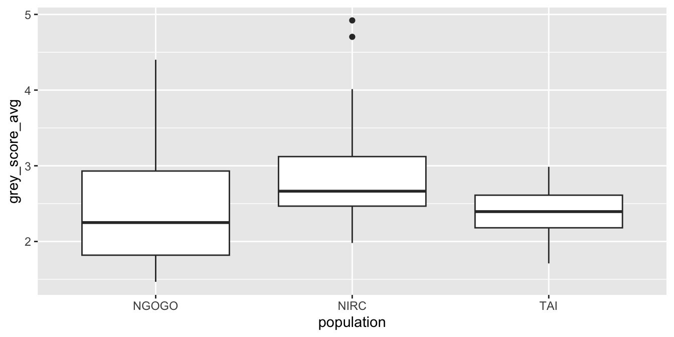
Boxplots intentionally hide features of the data to provide a simple visualization. Compare geom_boxplot to geom_violin, which displays a smooth density of the same data.
7.2.5 QQ plots
Quantile-quantile plots, known as qq plots, are used to compare sample data to a known distribution. In this book, we have often done this by plotting a known distribution as a curve on top of a histogram or density estimation of the data. Overplotting the curve gives a large scale view but won’t show small differences.
Unlike histograms or density plots, qq plots provide more precision and do not require binwidth/bandwidth selection. This book will use qq plots in Section 11.4 to investigate assumptions in regression.
A qq plot works by plotting the values of the data variable on the \(y\)-axis at positions spaced along the \(x\)-axis according to a theoretical distribution. Suppose you have a random sample of size \(N\) from an unknown distribution. Sort the data points from smallest to largest, and rename them \(y_{(1)}, \ldots, y_{(N)}\). Next, compute the expected values of \(N\) points drawn from the theoretical distribution and sorted, \(x_{(1)}, \ldots, x_{(N)}\). For example, to compare with a uniform distribution, the \(x_{(i)}\) would be evenly spaced. To compare with a normal distribution, the \(x_{(i)}\) are widely spaced near the tails and denser near the mean. The specific algorithm that R uses is a bit more sophisticated, but the complications only make a noticeable difference with small data sets.
The qq plot shows the points \[ \left(x_{(1)},y_{(1)}\right), \ldots, \left(x_{(N)},y_{(N)}\right) \] If the sample data comes from a random variable that matches the theoretical distribution, then we would expect the ordered pairs to roughly fall on a straight line. If the sample does not match the theoretical distribution, the points will be far from a straight line.
We use the geom_qq geometry to create qq plots.
geom_qq has one required aesthetic: sample, the variable containing the sample data. The known distribution for comparison is passed as an argument distribution. By default, geom_qq compares to the normal distribution qnorm, but any q + root distribution will work. It is helpful to add a geom_qq_line layer, which displays the line that an idealized data set would follow.
Simulate 50 samples from a uniform \([0,1]\) random variable and draw a qq plot comparing the distribution to that of a uniform \([0,1]\).
dat <- data.frame(sam = runif(50, 0, 1))
ggplot(dat, aes(sample = sam)) +
  geom_qq(distribution = qunif) +
  geom_qq_line(distribution = qunif) +
  labs(title = "QQ Plot of Uniform vs Uniform")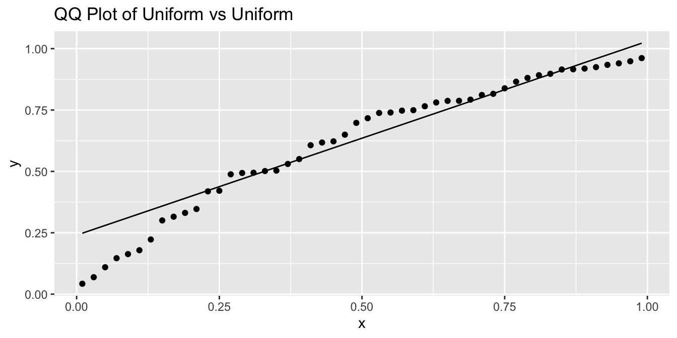
Observe that the \(x\)-coordinates are evenly spaced according to the theoretical distribution, while the \(y\)-coordinates are randomly spaced but overall evenly spread across the interval \([0,1]\) leading to a scatterplot that closely follows a straight line.
We will primarily be using qq plots to plot a sample versus the quantiles of a normal distribution, which is the default for geom_qq. We will be looking to see whether the qq plot is U-shaped, S-shaped, or neither.
Figure 7.3 illustrates how qq plots appear for data distributions with common shapes.
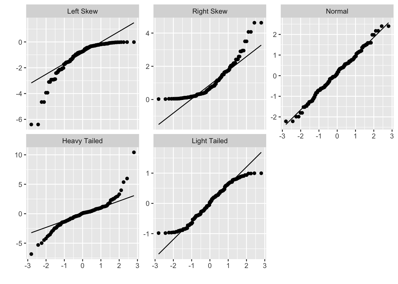
Figure 7.3: Data distribution shapes with qq plots.
S-shaped qq plots indicate heavy or light tails relative to the normal distribution, depending on which direction the S is facing, and U-shaped qq plots indicate skewness.
Consider the budget_2013 variable in the bechdel data set.
Create a qq plot versus a normal distribution and interpret.
ggplot(bechdel, aes(sample = budget_2013)) +
  geom_qq() +
  geom_qq_line()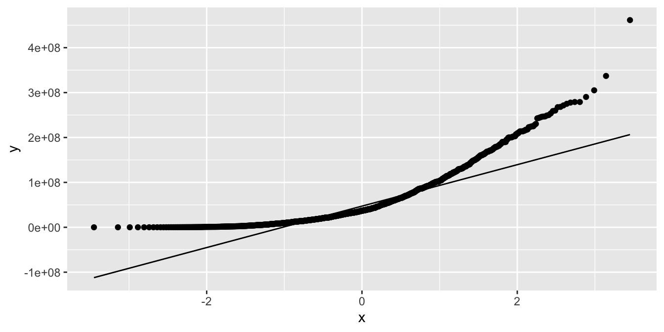
Figure 7.4: A qq plot showing that the distribution of movie budgets is right-skewed.
The qq plot (Figure 7.4) has a very strong U shape, and the data is right-skewed.
7.3 Visualizing two or more variables
7.3.1 Scatterplots
Scatterplots are a natural way to display the interaction between two continuous variables, using the \(x\)- and \(y\)-axes as aesthetics. Typically, one reads a scatterplot with the \(x\) variable as explaining the \(y\) variable, so that \(y\) values are dependent on \(x\) values.
We have already seen examples of scatterplots in Section 7.1: a simple example using the built-in CO2 data set and another example using fosdata::housing.
Scatterplots can be the base geometry for visualizations with even more variables, using aesthetics such as color, size, shape, and alpha that control the appearance of the plotted points.
Explore the relationship between time at the charging station (chargeTimeHrs) and power usage (kwhTotal)
for electric cars in the fosdata::ecars data set.
A first attempt at a scatterplot reveals that there is one data point with a car that charged for 55 hours. All other charge times are much shorter, so we filter out this one outlier and plot:
fosdata::ecars %>%
  filter(chargeTimeHrs < 24) %>%
  ggplot(aes(x = chargeTimeHrs, y = kwhTotal)) +
  geom_point()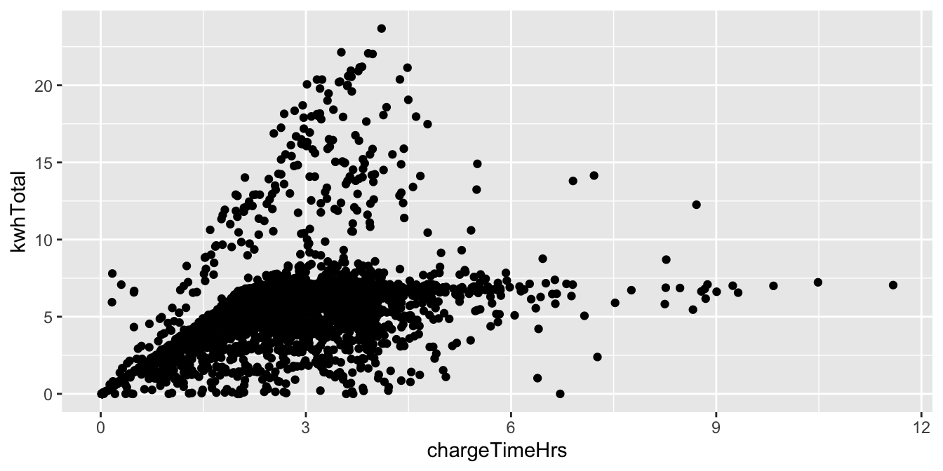
In this plot, we see that many points fall into the lower region bounded by a slanted line and horizontal line. This suggests cars charge at a standard speed, which accounts for the slant, and that after about 7.5 total kwh, most cars are fully charged. There is also a steeper slanted boundary running from the origin to the top of the chart, which suggests that some cars (or charging stations) have a higher maximum charge speed.
Continuing with the ecars data set, let’s explore the distance variable.
Charging stations in this data set are generally workplaces, and the distance variable reports
the distance to the drivers’ home.
Only about 1/3 of the records in ecars contain valid distance data, so we filter for those.
Then, we assign distance to the color aesthetic. The results look cluttered, so we also
assign distance to the alpha aesthetic, which will make shorter distances partially transparent.
fosdata::ecars %>%
  filter(!is.na(distance)) %>%
  ggplot(aes(
    x = chargeTimeHrs, y = kwhTotal,
    color = distance, alpha = distance
  )) +
  geom_point() +
  labs(title = "Charge time, power usage, and distance from home")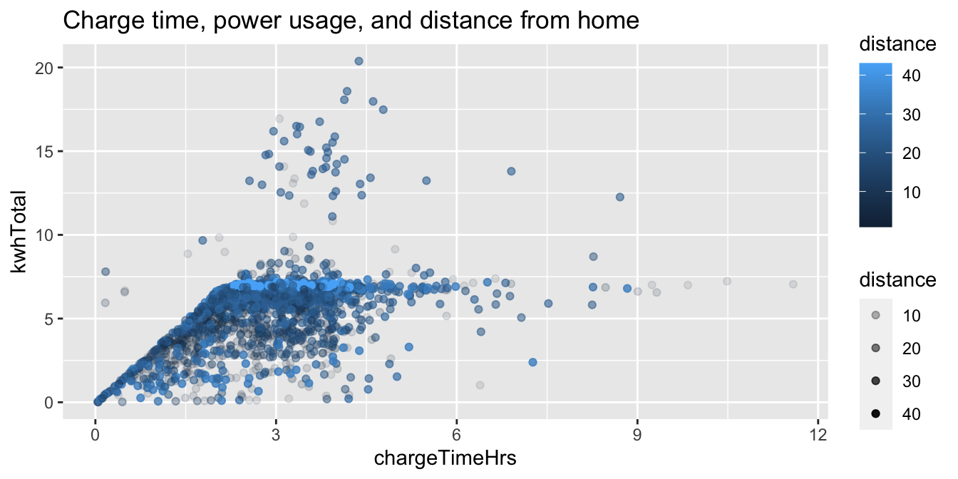
From this chart, we see a bright line at around 7.5 kwh total, which suggests that people who live further from work tend to need a full charge during the day.
How does the plot in Example 7.12 look without filtering away the invalid data? How does it look without alpha transparency?
Let’s compare home sales prices between an urban and a suburban area of King County, Washington.
We select two zip codes from the fosdata::houses data set.
Zip code 98115 is a residential area in the city of Seattle, while 98038 is a suburb
25 miles southeast from Seattle’s downtown.
In this example, multiple aesthetics are used to display a large amount of information in a single plot.
Sale price depends primarily on the size of the house,
so we choose sqft_living as our \(x\)-axis and price as our \(y\)-axis.
We distinguish the two zip codes by color, giving visual contrast even where
the data overlaps. Because the data points do overlap quite a bit, we
set the attribute alpha to 0.8, which makes all points 80% transparent.
The size of a house’s property (lot) is also important to price, so this is displayed
by mapping sqft_lot to the size aesthetic. Notice in the urban zip code there
is little variation in lot size, while in the suburb there is a large
variation in lot size and in particular larger lots sell for higher prices.
Finally, we map the waterfront variable to shape. There is only one waterfront
property in this data set. Can you spot it?
fosdata::houses %>%
  filter(zipcode %in% c("98115", "98038")) %>%
  mutate(
    zipcode = factor(zipcode),
    waterfront = factor(waterfront)
  ) %>%
  ggplot(aes(
    x = sqft_living, y = price, color = zipcode,
    size = sqft_lot, shape = waterfront
  )) +
  geom_point(alpha = 0.8) +
  labs(title = "Housing in urban and suburban Seattle")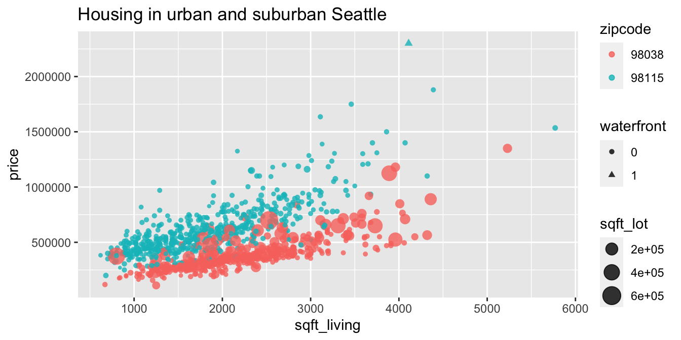
7.3.2 Line graphs and smoothing
When data contains time or some other sequential variable, a natural visualization is to put that variable on the \(x\)-axis. We can then display other variables over time using geom_point to produce dots, geom_line for a line graph, or geom_smooth for a smooth approximation.
Create a line graph of the number of male babies named “Darrin” over time,
using the data in the babynames data set.
The time variable is year and the count of babies is in the variable n.
babynames <- babynames::babynames
babynames %>%
  filter(name == "Darrin", sex == "M") %>%
  ggplot(aes(x = year, y = n)) +
  geom_line()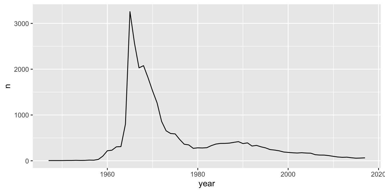
Figure 7.5: Boys named Darrin, over time.
The plot, in Figure 7.5, shows that there was a peak of Darrins in 1965. If you meet someone named Darrin, you might be able to guess their age.
To focus attention on the general trend and remove some of the jagged year-to-year variation, plot a curve fitted to the data.
The geometry geom_smooth46 does this. We also show the data points to assess the fit.
babynames %>%
  filter(name == "Darrin", sex == "M") %>%
  ggplot(aes(x = year, y = n)) +
  geom_point() +
  geom_smooth()
## `geom_smooth()` using method = 'loess' and formula = 'y ~ x'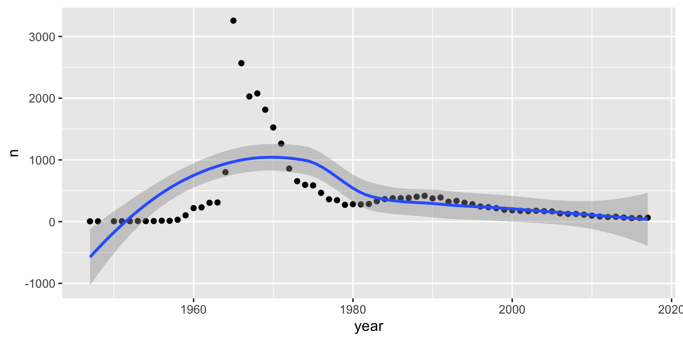
Figure 7.6: Boys named Darrin, over time. A poorly fit curve.
The results, in Figure 7.6, aren’t very good!
Fitting a line to points like this is a bit like binning a histogram in that sometimes we need to play around with the fit until we get one that looks right.
We can do that by changing the span value inside of geom_smooth.
The span parameter is the percentage of points that geom_smooth considers when estimating a smooth curve to fit the data.
The smaller the value of the span, the more the curve will go through the points.
Add geom_smooth(span = 1) and geom_smooth(span = .05) to the above plot. You should see that with span = .05, the smoothed curve follows the points more closely.
After experimenting with some values of span, a value of 0.22 strikes a good compromise between smoothing out the irregularities of the points and following the curve. See Figure 7.7.
babynames %>%
  filter(name == "Darrin", sex == "M") %>%
  ggplot(aes(x = year, y = n)) +
  geom_point() +
  geom_smooth(span = .22)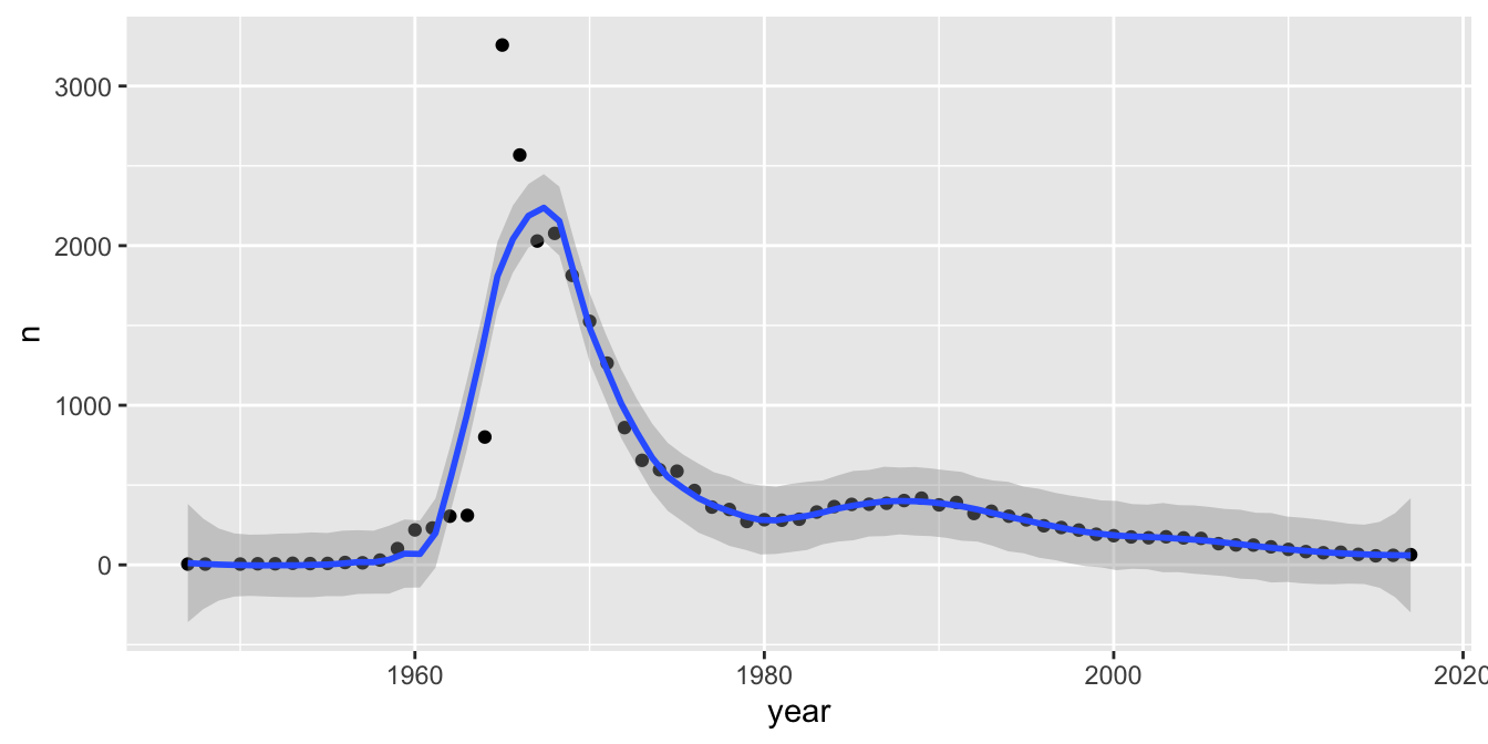
Figure 7.7: Boys named Darrin, over time. Fitting the curve well by selecting a value for span.
We can also plot multiple lines on the same graph. For example, let’s plot the number of babies named “Darrin,” “Darren,” or “Darin” over time.
We map the name variable to the color aesthetic and then remove the error shadows from the fit curves to clean up the plot.
babynames %>%
  filter(name %in% c("Darrin", "Darren", "Darin"), sex == "M") %>%
  ggplot(aes(x = year, y = n, color = name)) +
  geom_point() +
  geom_smooth(span = .22, se = FALSE) +
  labs(x = "Birth year", y = "Number of male babies")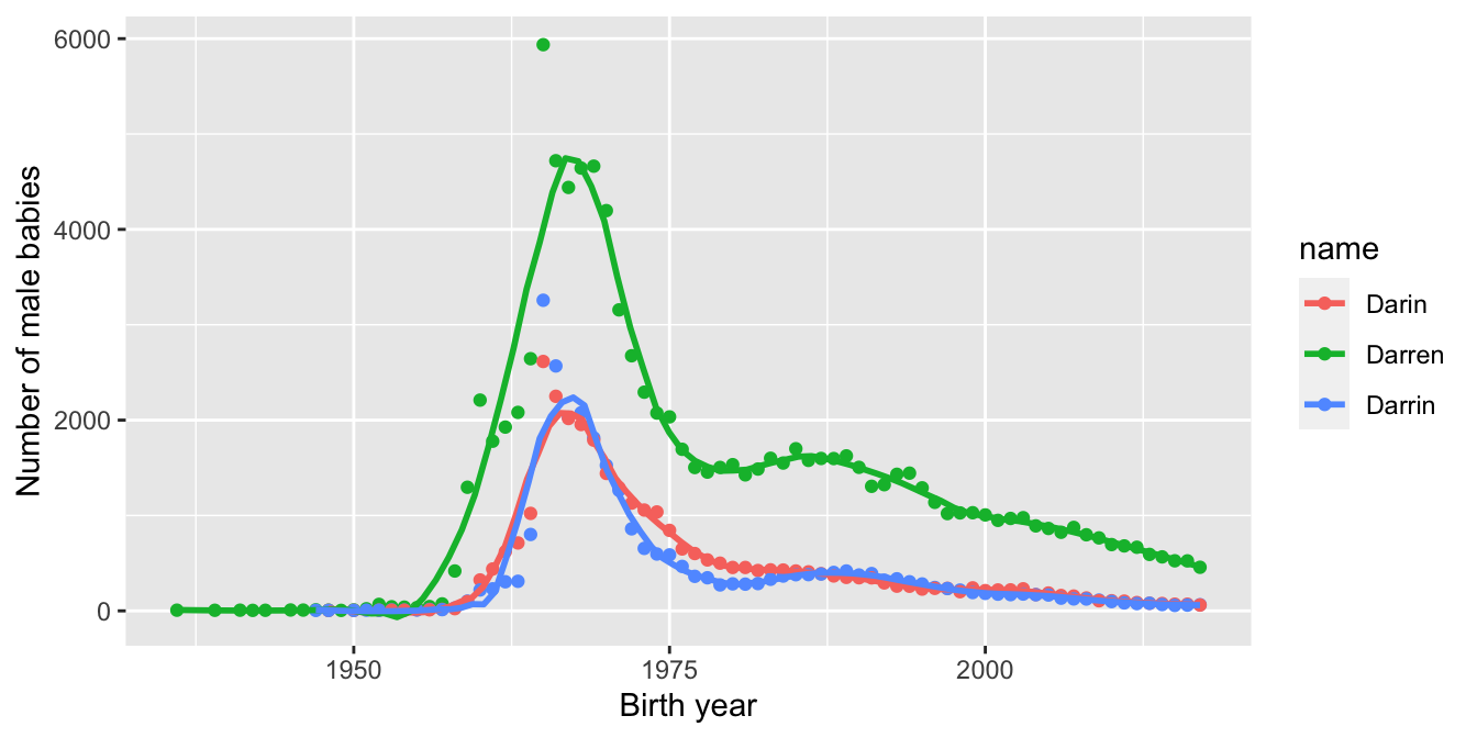
7.3.3 Faceting
An alternative way to add a categorical variable to a visualization is to facet on the categorical variable. Faceting packages many small, complete plots inside one larger visualization.
The ggplot2 package provides facet_wrap and facet_grid, which create plots for each level of the faceted variables. facet_wrap places the
multiple plots into a square grid, starting in the upper left and filling across and then down. It chooses the size of the grid based on the number of plots.
facet_grid defines rows and columns from additional variables.
Does the usage pattern for electric car charging depend on the type of facility where the charging station is located?
We use the ecars data from fosdata, and remove the one outlier with a multi-day charge time.
We plot total KWH as a function of charging time in four scatterplots, one for each of the four facility types.
Notice that all four plots end up with the same \(x\)- and \(y\)-scales to make visual comparison valid.
fosdata::ecars %>%
  filter(chargeTimeHrs < 24) %>%
  ggplot(aes(x = chargeTimeHrs, y = kwhTotal)) +
  geom_point() +
  facet_wrap(vars(facilityType))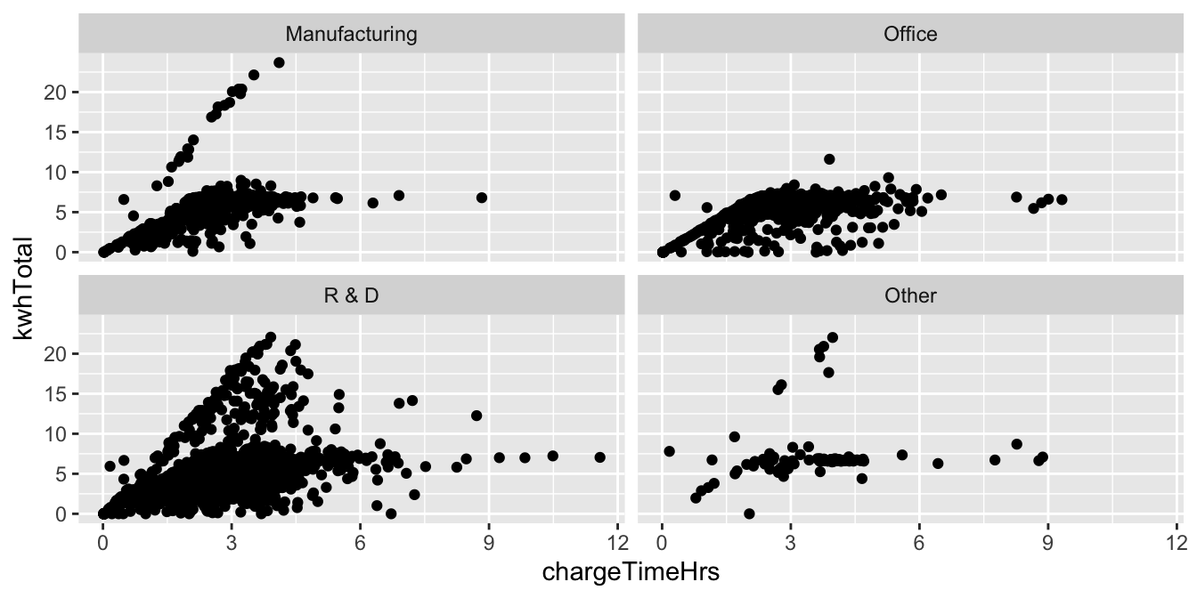
Looking at the plots, the steep line of cars that charge quickly is missing from the Office type of facility. This suggests that unlike Manufacturing and R&D facilities, the Office facilities in this study lacked high speed charging stations.
Create stacked histograms that compare the number of words per sentence
in the novels Emma and Pride and Prejudice.
Here we use facet_grid, which takes as input a formula y ~ x, giving variables to use on the \(y\)- and \(x\)-axes respectively.
Since we are not choosing to use an \(x\) variable, we supply a . for x.
fosdata::austen %>%
  group_by(novel, sentence) %>%
  summarize(sentence_length = n()) %>%
  ggplot(aes(x = sentence_length)) +
  geom_histogram() +
  facet_grid(novel ~ .)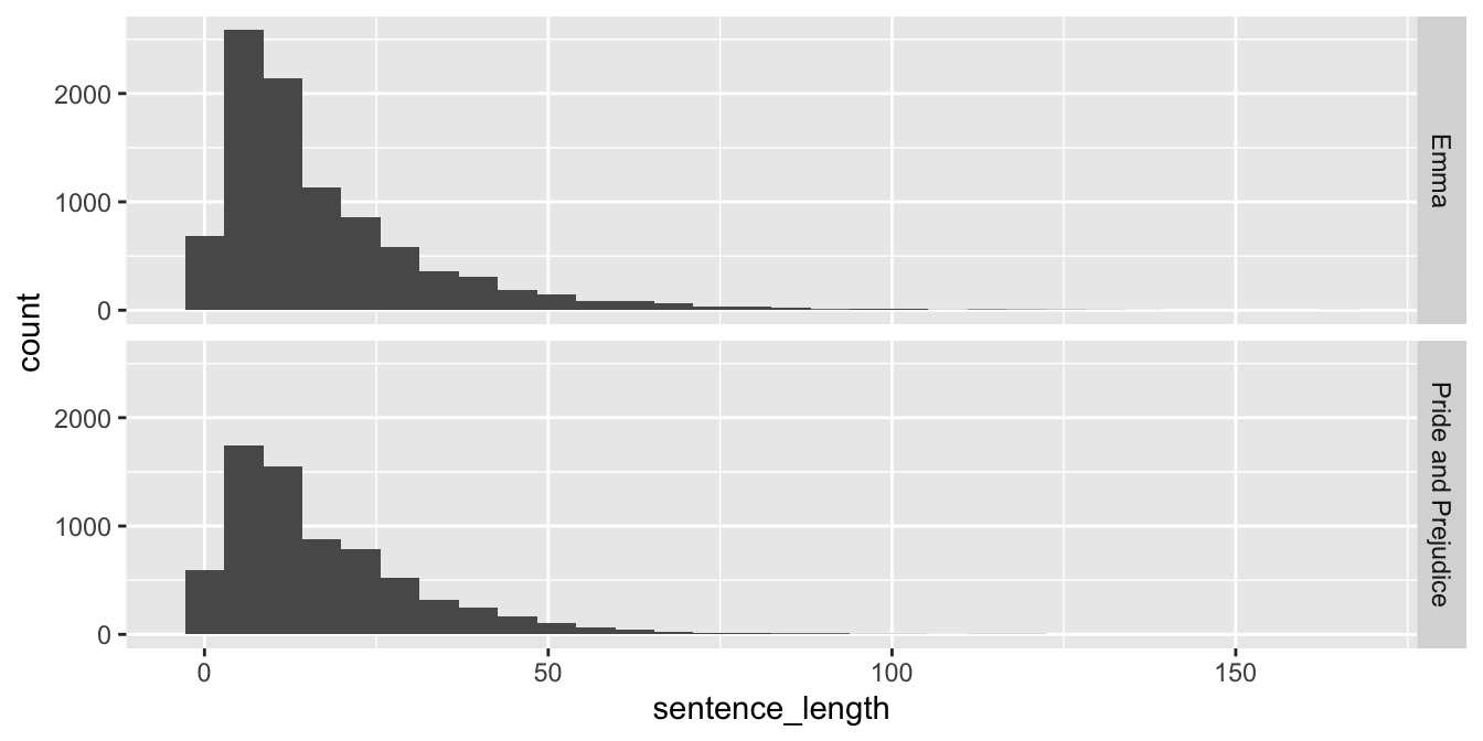
Since we probably wish to compare proportions of sentences of various lengths in the two novels, it might be a good idea to allow the \(y\)-axis to change for the various plots. This can be accomplished by adding scales = "free_y" inside of facet_grid. Other options include scales = "free" or scales = "free_x".
We chose a histogram because there were so many different sentence lengths. Recreate the above plot
with geom_bar and see which one you like better.
7.4 Customizing
While ggplot2 has good defaults for many types of plots, inevitably you will end up wanting to tweak things. In this section, we discuss customizing colors, adding themes, and adding annotations. For further customizations, we recommend consulting Wickham.47
7.4.1 Color
When you have two or especially when you have more than two variables that you want to visualize, then often it makes sense to use color as an aesthetic for one of the variables. Some ggplot geometries have two aesthetics, color and fill, that may be independently set to different colors. For example, the bars in a histogram have an outline set by color and the inside set by fill. Adjusting aesthetics is done through scales, which are added to the plot with +.
The collection of colors used for a variable is called a palette.
For example, scale_color_manual sets the palette for the color aesthetic manually.
Figure 7.1 in Section 7.1.2 demonstrated manual colors.
R has 657 built-in color names. List them all with the colors() command.
For continuous variables, a simple approach is to use a gradient color palette, which smoothly interpolates between two colors.
The ecars electric cars data set contains a dollars variable, which gives the price paid for charging.
We can add this variable to our plot of power used and charging time. Using the default color scale (black to blue) it is hard to see
the most interesting feature of the dollars variable (try it!). However, changing the color gradient reveals that the price of a charge depends
(for the most part) on charging time only, and also that any charging session under four hours is free.
fosdata::ecars %>%
  filter(chargeTimeHrs < 24) %>%
  ggplot(aes(x = chargeTimeHrs, y = kwhTotal, color = (dollars))) +
  geom_point() +
  scale_color_gradient(low = "white", high = "red") +
  labs(title = "Cost of a charge depends only on charging time")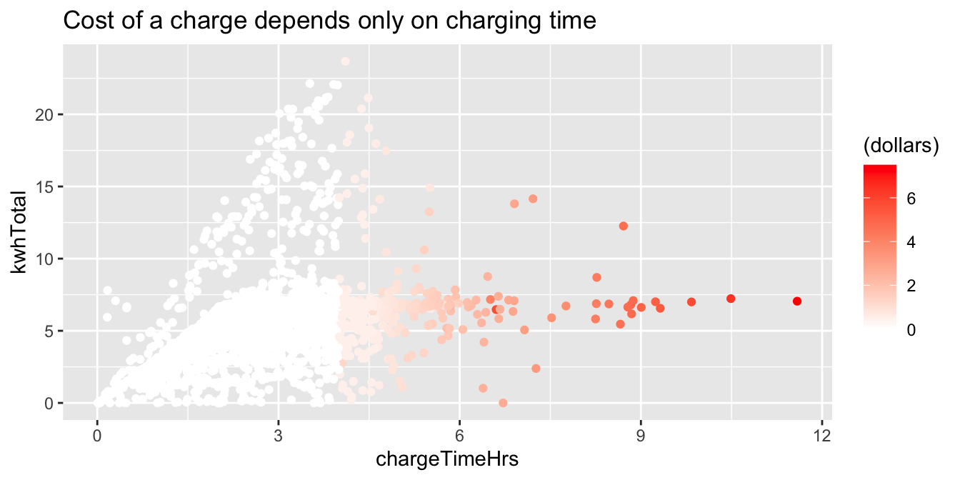
For better looking visualizations, it helps to choose colors from well-designed palettes.
It is also good practice to choose colors that work well for people that have some form of colorblindness.
Unless you are well versed in color design, you’ll want a tool that can assist. The rest of this section will focus on the
RColorBrewer package.
You might also want to check out the colorspace package.
See what color palettes are available in RColorBrewer by typing RColorBrewer::display.brewer.all().
To see just the colorblind friendly palettes, try display.brewer.all(colorblindFriendly = T)
The palette you choose should help to emphasize the important features of the variable mapped to the color aesthetic. Color palettes are often categorized into three types: categorical, sequential, or divergent.
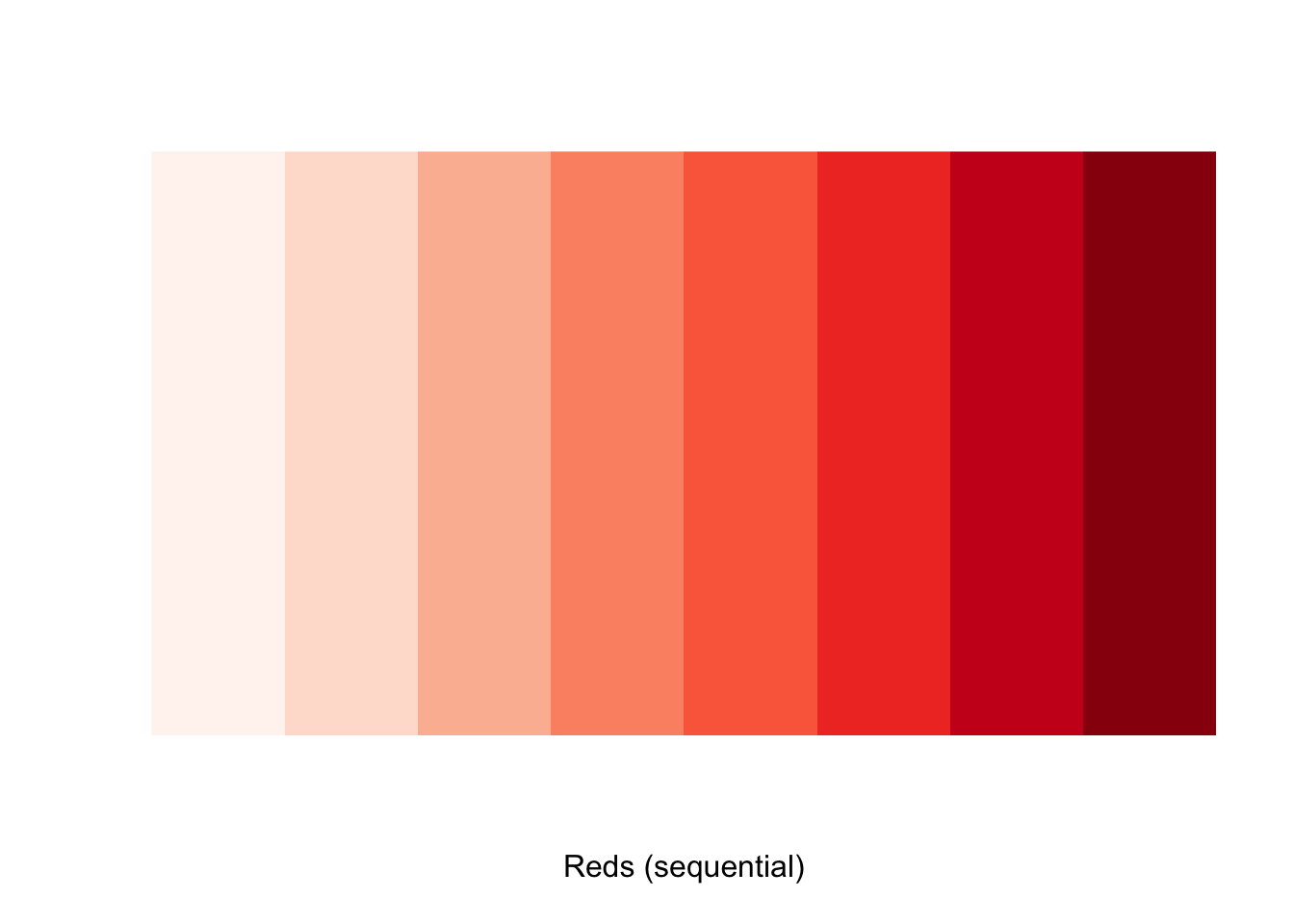
| Type | Categorical | Sequential | Divergent |
|---|---|---|---|
| Use case | Distinguish between the levels of the variable. | Show the progression of the variable from small to large. | Neutral middle, stronger colors for extreme values of the variable. |
| RColorBrewer | Set2 |
Blues |
PiYG |


The remainder of this section is a case study using the Bechdel data. Our goal is to visualize how the categorization of movies has evolved over time. A similar visualization was given in the FiveThirtyEight article, “The Dollar-And-Cents Case Against Hollywood’s Exclusion of Women.”48
The variable clean_test describes how a film is rated by the Bechdel test. It has levels ok and dubious for films that pass the test.
Levels nowomen, notalk, and men describe how films fail the test: by having no women, no women who talk to each other, or women who talk only about men.
As a first step, Figure 7.8 shows a barplot colored by the clean_test variable.
bechdel %>%
  ggplot(aes(x = "", fill = clean_test)) +
  geom_bar()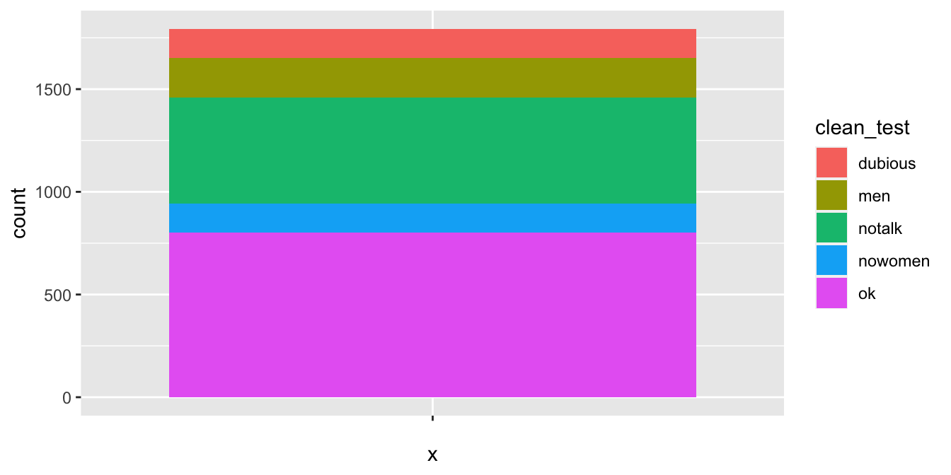
Figure 7.8: Basic barplot colored by Bechdel test results.
We would prefer ok and dubious to be next to each other, so we need to reorder the levels of the factor, as shown in Figure 7.9.
test_levels <- c("ok", "dubious", "men", "notalk", "nowomen")
bechdel$clean_test <- factor(bechdel$clean_test, levels = test_levels)
bechdel %>%
  ggplot(aes(x = "", fill = clean_test)) +
  geom_bar()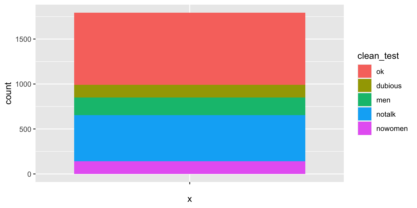
Figure 7.9: Bechdel test barplot with levels in correct order.
We want to assign a darkish blue to ok, a lighter blue to dubious, and shades of red to the others.
We will be using scale_fill_manual to create the colors that we want to plot. (Recall: we use scales to tweak the mapping between variables and aesthetics.)
We use fill since we are changing the color of the fill aesthetic. If we were changing the color of the color aesthetic, we would use scale_color_manual. The results are in Figure 7.10.
rbcolors <- c("darkblue", "blue", "red1", "red3", "darkred")
bechdel %>%
  ggplot(aes(x = "", fill = clean_test)) +
  geom_bar() +
  scale_fill_manual(values = rbcolors)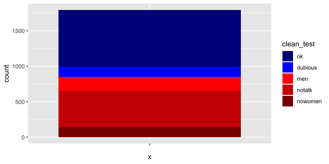
Figure 7.10: Bechdel test barplot with custom colors.
While this is quick and easy, it is difficult to get nice looking colors.
Instead, we use palettes from RColorBrewer. We want to use blues and reds, so the natural palettes to pick from are the Blues palette and the Reds palette.
library(RColorBrewer)
display.brewer.pal(n = 8, name = "Blues")
display.brewer.pal(n = 8, "Reds")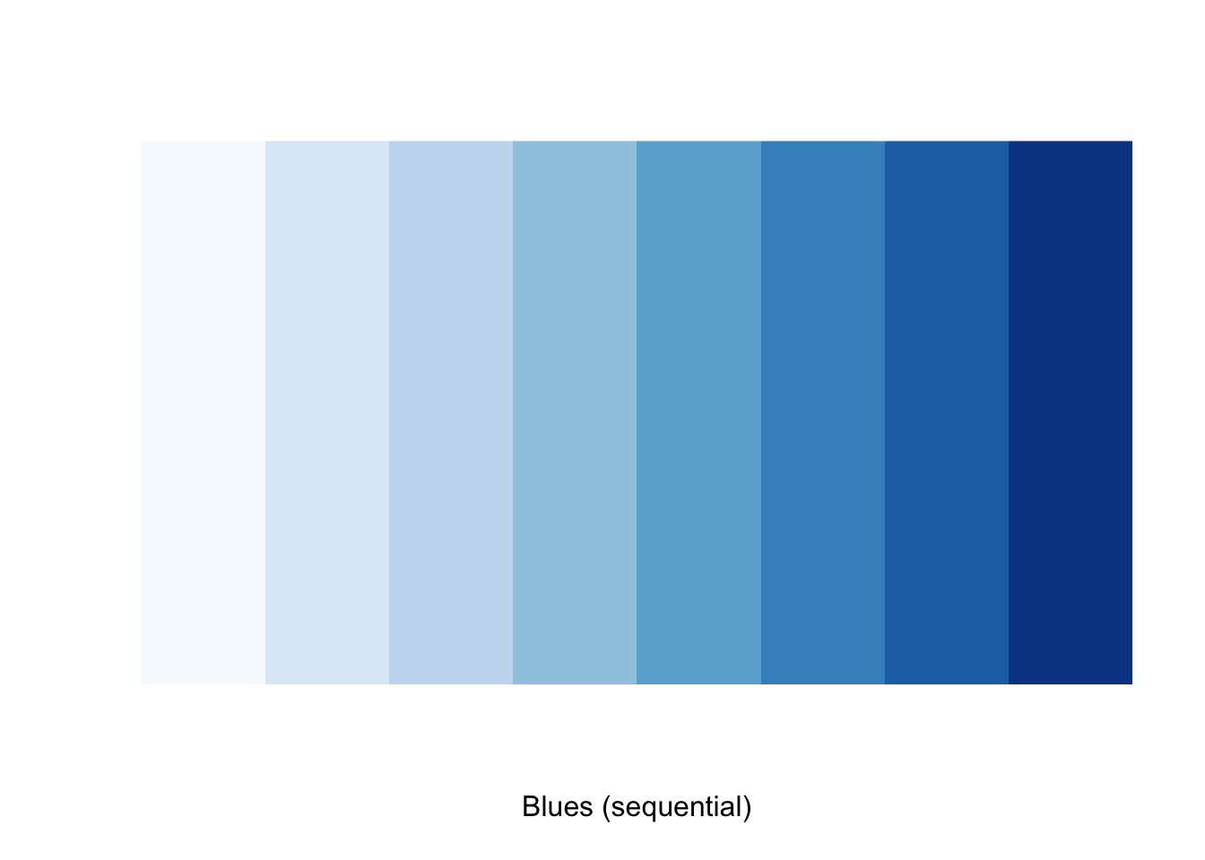
We want to have colors from the blue palette for two variables and colors from the red palette for the other three. A good choice might be colors 5 and 6 from the blues, and colors 4-6 from the reds. We construct our custom list of colors by indexing into the brewer palette vectors:
rbcolors <- c(
  brewer.pal(n = 8, "Blues")[6:5],
  brewer.pal(n = 8, "Reds")[4:6]
)
We can then supply the color codes to the values argument in scale_fill_manual.
bechdel %>%
  ggplot(aes(x = "", fill = clean_test)) +
  geom_bar() +
  scale_fill_manual(values = rbcolors)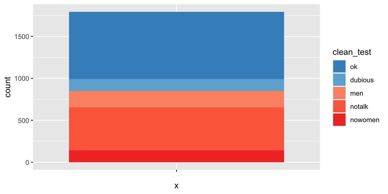
Figure 7.11: Bechdel test barplot with color brewer colors.
This (Figure 7.11) completes the color selection, but to finish the visualization we need to add a time component.
It is possibly best to group the years into bins and create a similar plot as above for each year. The base R function cut will do this.
bechdel$year_discrete <- cut(bechdel$year, breaks = 8)
head(bechdel$year_discrete)
## [1] (2008,2013] (2008,2013] (2008,2013] (2008,2013] (2008,2013]
## [6] (2008,2013]
## 8 Levels: (1970,1975] (1975,1981] (1981,1986] ... (2008,2013]Now, we let the x aesthetic be year_discrete, and produce Figure 7.12
bechdel %>%
  ggplot(aes(x = year_discrete, fill = clean_test)) +
  geom_bar() +
  scale_fill_manual(values = rbcolors)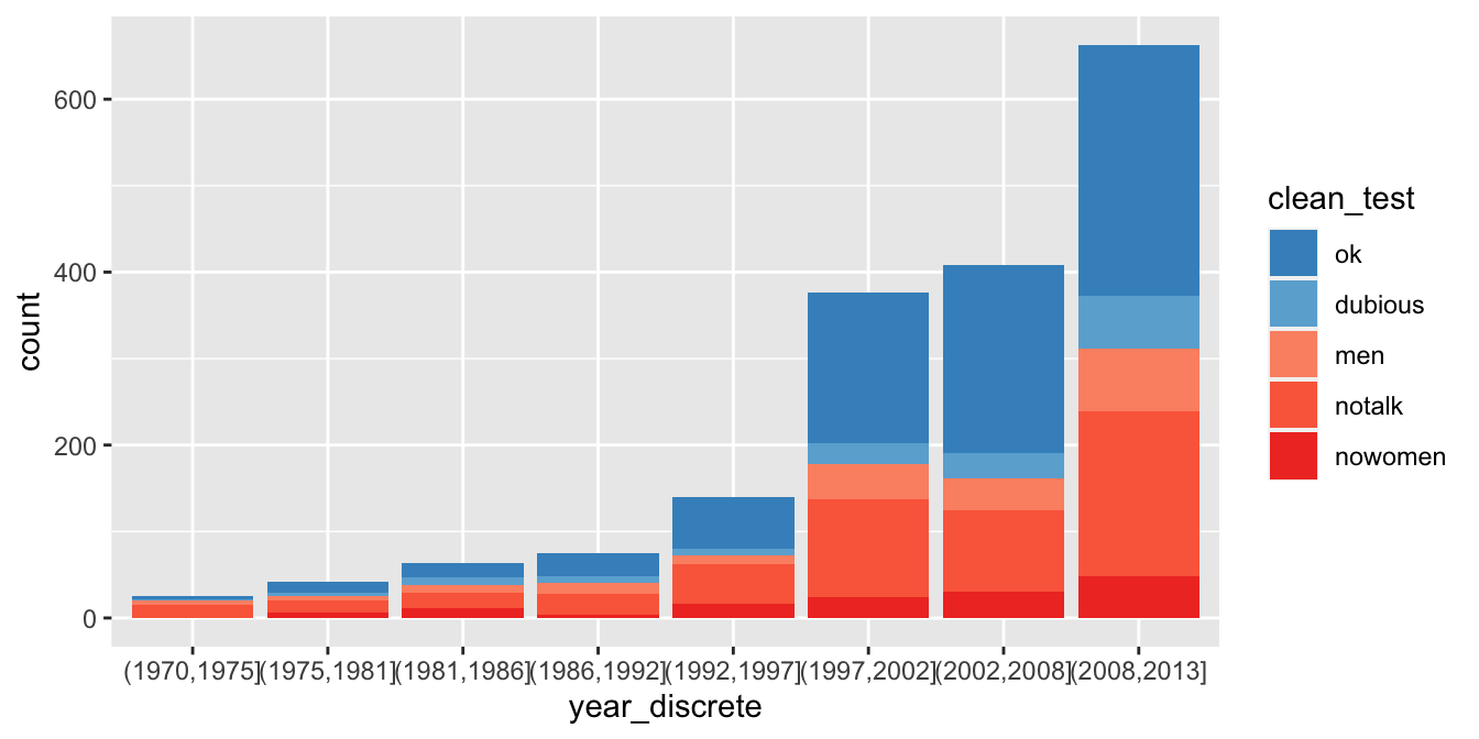
Figure 7.12: Bechdel test barplot broken into year ranges.
Since there are many more movies in recent years, we might prefer to see the proportion of movies in each category. We do that with the position attribute of geom_bar, resulting in Figure 7.13.
bechdel %>%
  ggplot(aes(x = year_discrete, fill = clean_test)) +
  geom_bar(position = "fill") +
  scale_fill_manual(values = rbcolors)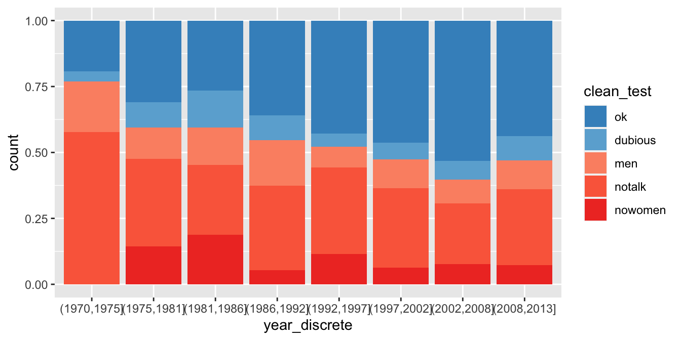
Figure 7.13: Bechdel test barplot with proportions.
In Section 7.4.2, we will make some final changes to this plot by adding appropriate labels, choosing a theme, and fixing the text overlap.
7.4.2 Labels and themes
We start by customizing the labels associated with a plot. We have added labels to a few of the plots above without providing a comprehensive explanation of what to do.
The function for adjusting labels is labs,
which has arguments title, subtitle, caption and further arguments that are aesthetics in the plot.
Let’s return to the Bechdel data set visualization.
We would like to have a meaningful title and possibly a subtitle for the plot.
Some data visualization experts recommend that the title should not be a recap of the plot,
but rather a summary of what the viewer should expect to get out of the plot.
We choose rather to put that information in the subtitle.
We also choose better names for the \(x\)-axis, the \(y\)-axis, and the legend title for the fill.
The \(y\)-axis is shown as a proportion, but would be easier to understand as a percentage. We make this change to the \(y\) aesthetic with a scale.
The \(x\)-axis labels came from the cut command. It would be a nice improvement to change them to say 1970-74, for example. That change would require either typing each label manually or heavy use of string manipulation. Instead, we simply rotate the labels by 20 degrees to make them fit a little better.
Finally, ggplot provides themes that control the overall look and feel of a plot.
The default theme, with a gray background, is called theme_gray.
Other useful themes are theme_bw for black-and-white plots and theme_void which shows nothing but the requested geometry. Add-on packages
such as ggthemes and ggthemr provide more themes,
or you can design your own theme so that your plots have your characteristic style.
We will choose theme_minimal to complete our Bechdel test plot, see Figure 7.14.
bechdel %>%
  ggplot(aes(x = year_discrete, fill = clean_test)) +
  geom_bar(position = "fill") +
  scale_fill_manual(values = rbcolors) +
  scale_y_continuous(labels = scales::percent) +
  labs(
    title = "Percentages of Movies Passing Bechdel Test over Time",
    subtitle = "Not much progress since the 1990's",
    x = "Year",
    y = "Proportion",
    fill = "Result of Test"
  ) +
  theme_minimal() +
  theme(axis.text.x = element_text(angle = 20))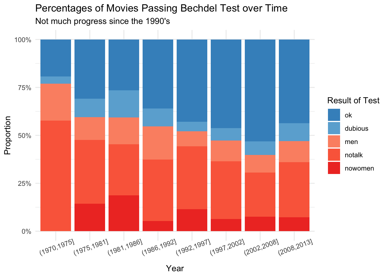
Figure 7.14: The percentage of movies passing the Bechdel test over time has not seen much progress since the 1990’s.
Replace theme_minimal() with theme_dark() in the above code.
Install ggthemes using install.packages("ggthemes") if necessary, and replace theme_minimal() with ggthemes::theme_fivethirtyeight().
7.4.3 Text annotations
Many times, we will want to add text or other information to draw the viewers’ attention to what is interesting about a visualization or to provide additional information. In this example, using the babynames data, we want to plot the number of female babies named Peyton versus the number of male babies named Peyton from 1990 to 2010. In order to make it clear which data point is which, we will add text labels to some of the points.
We begin by filtering the data set so that it only contains information about Peyton from 1990 to 2010.
The babynames data is in long format, with a row for each sex. It would be easier if it were in wide format,
with both sex counts in a single row. So, we use pivot_wider in the tidyr package.
recentPeyton <- babynames::babynames %>%
  filter(year >= 1990, year <= 2010, name == "Peyton") %>%
  tidyr::pivot_wider(
    names_from = sex, values_from = n,
    id_cols = c(name, year)
  )
head(recentPeyton)
## # A tibble: 6 × 4
## name year F M
## <chr> <dbl> <int> <int>
## 1 Peyton 1990 62 121
## 2 Peyton 1991 67 126
## 3 Peyton 1992 399 187
## 4 Peyton 1993 617 242
## 5 Peyton 1994 585 357
## 6 Peyton 1995 588 453A first attempt at the plot gives a sense that the number of male and female Peyton babies are roughly equal, since the dots are mostly near the diagonal line of slope 1. However, from the visualization in Figure 7.15 we cannot tell which year is which.
recentPeyton %>%
  ggplot(aes(x = M, y = F)) +
  geom_point() +
  geom_abline(slope = 1, linetype = "dotted")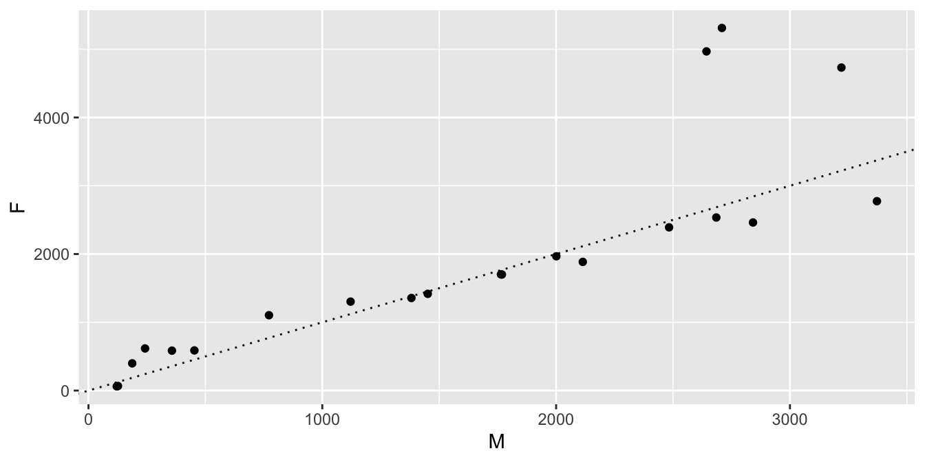
Figure 7.15: Male and female Peyton babies, one point per year.
To add the year information to the plot, we add text labels to each point using geom_text.
Along with x and y aesthetics, the geom_text geometry requires the aesthetic label.
The label aesthetic tells geom_text what text to use on each point. See Figure 7.16.
recentPeyton %>%
  ggplot(aes(x = M, y = F, label = year)) +
  geom_point() +
  geom_abline(slope = 1, linetype = "dotted") +
  geom_text()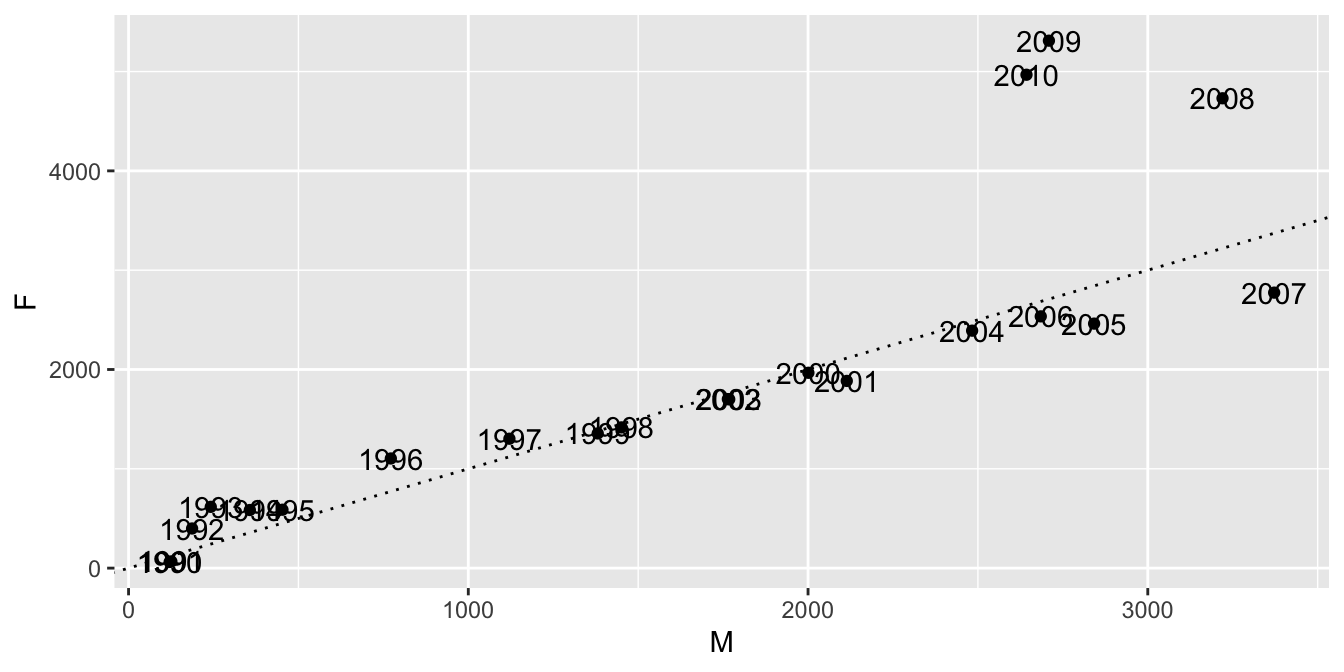
Figure 7.16: Male and female Peyton babies, years labeled.
By default, geom_text puts the text exactly at the \((x, y)\)-coordinate given in the data.
In this case, that is not what we want!
We would like the text to be nudged a little bit so that it doesn’t overlap the scatterplot.
We can do this by hand using nudge_x and nudge_y, but it is easier to use the ggrepel package.
recentPeyton %>%
  ggplot(aes(x = M, y = F, label = year)) +
  geom_point() +
  geom_abline(slope = 1, linetype = "dotted") +
  ggrepel::geom_text_repel() +
  labs(
    x = "Male babies named Peyton",
    y = "Female babies named Peyton",
    title = "Male vs. Female Peytons Through 2010",
    subtitle = "Female Peytons Set to Dominate?"
  )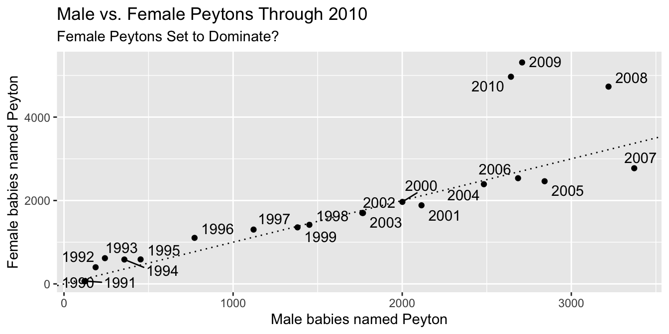
Figure 7.17: Male and female Peyton babies, finished visualization.
Our finished visualization in Figure 7.17 also gets better labels with the labs command.
7.4.4 Highlighting
We present highlighting as one last example of customization out of many possibilities. Highlighting can be useful when the visualization would otherwise be too busy for the viewer to quickly see what is important. It is often combined with adding text to the highlighted part of the visualization.
As an example49, suppose that we wish to observe how the 20 most commonly given names of all-time have evolved over time. We use the babynames data set that was introduced in Example 6.14.
babynames_top20 <- babynames::babynames %>%
  group_by(name, sex) %>%
  summarize(tot = sum(n)) %>%
  ungroup() %>%
  slice_max(n = 20, tot) %>%
  select(name, sex) %>%
  left_join(babynames::babynames)
babynames_top20 %>%
  ggplot(aes(x = year, y = n, group = name)) +
  geom_line()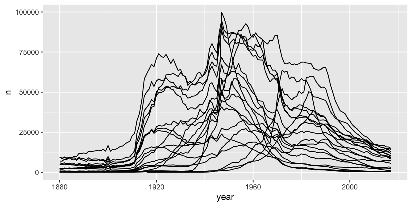
Figure 7.18: The 20 most popular baby names over time.
As you can see, Figure 7.18 is a bit of a mess. It does give us good information about the general patterns that the most commonly given names of all-time have taken, but it is hard to pick up any more information than that.
- Change
group = nametocolor = name. Does that help? - Change
y = ntoy = propto get a feel for how the proportions of babies with the 20 most commonly given names has evolved over time. - Think about why this code doesn’t work.
babynames::babynames %>%
  group_by(name, sex) %>%
  mutate(tot = sum(n)) %>%
  ungroup() %>%
  slice_max(n = 20, tot) %>%
  ggplot(aes(x = year, y = n, group = name)) +
  geom_line()
To customize Figure 7.18, we might decide to illustrate one or more of the names.
The R package gghighlight provides an easy way to highlight one or more data groupings in a plot.
We simply add + gghighlight() with the condition on the variable(s) we want to highlight as an argument.
Figure 7.19 shows the result of highlighting Elizabeth and Mary.
babynames_top20 %>%
  ggplot(aes(x = year, y = prop, color = name)) +
  geom_line() +
  gghighlight::gghighlight(name == "Elizabeth" | name == "Mary") +
  labs(
    title = "Twenty most commonly given names",
    y = "proportion of babies",
    subtitle = "Elizabeth stable over time; Mary decreasing"
  )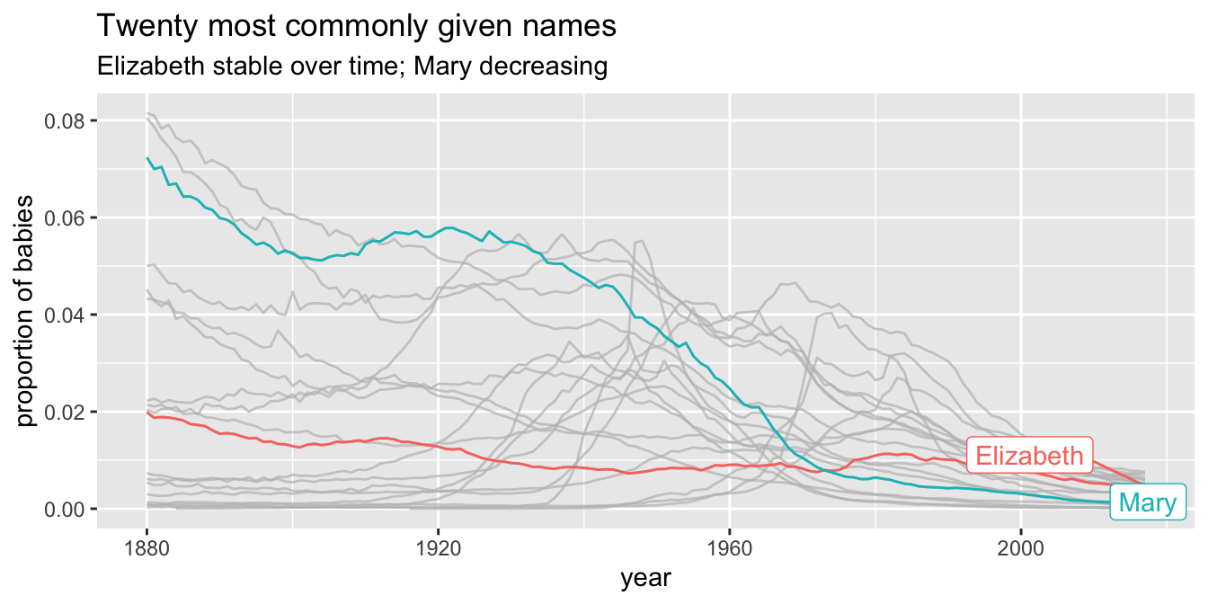
Figure 7.19: Highlighting data groupings with gghighlight.
Vignette: Choropleth maps
There are many ways of visualizing data. One very useful way of visualizing is via choropleth maps. A choropleth map is a type of map where regions on the map are shaded according to some variable that has been observed that is related to that region. One of the most common choropleth maps in the US is the national election map, colored by state. Other examples include weather maps and radar images.
These types of maps can seem intimidating to create. However, R has tools to make basic choropleth maps of the US colored along counties or states easier than it would otherwise be. The hardest part, as usual, is getting the data in the format that is required by the mapping tools.
Let’s look at the 2012 US presidential election results in Alabama, and visualize them. We start by loading the data, and computing the percentage of people who voted for Romney from among those who voted either for Romney or Obama.
pres_election <- fosdata::pres_election
pres_election <- filter(
  pres_election, year == 2012,
  stringr::str_detect(candidate, "Obama|Romney")
)
pres_election <- pres_election %>%
  filter(state == "Alabama") %>%
  arrange(state, county, party) %>%
  group_by(FIPS, state, county) %>%
  summarize(
    percent_romney =
      last(candidatevotes) / sum(candidatevotes, na.rm = T)
  ) %>%
  ungroup()
head(pres_election)
## # A tibble: 6 × 4
## FIPS state county percent_romney
## <int> <chr> <chr> <dbl>
## 1 1001 Alabama Autauga 0.732
## 2 1003 Alabama Baldwin 0.782
## 3 1005 Alabama Barbour 0.484
## 4 1007 Alabama Bibb 0.736
## 5 1009 Alabama Blount 0.875
## 6 1011 Alabama Bullock 0.236To plot this, we need the map data.
library(maps)
alabama_counties <- map_data("county") %>%
  filter(region == "alabama")
head(alabama_counties)
## long lat group order region subregion
## 1 -86.50517 32.34920 1 1 alabama autauga
## 2 -86.53382 32.35493 1 2 alabama autauga
## 3 -86.54527 32.36639 1 3 alabama autauga
## 4 -86.55673 32.37785 1 4 alabama autauga
## 5 -86.57966 32.38357 1 5 alabama autauga
## 6 -86.59111 32.37785 1 6 alabama autaugaNotice that the counties in this data set aren’t capitalized, while in our other data set, they are. There are likely other differences in county names, so we really need to get this map data in terms of FIPS. The map data needs to contain three variables, and their names are important. It will have a variable called id that matches to the id variable from the fill data, a variable x for longitude and y, for latitude.
fips_data <- maps::county.fips
fips_data <- filter(
  fips_data,
  stringr::str_detect(polyname, "alabama")
) %>%
  mutate(county = stringr::str_remove(polyname, "alabama,"))
alabama_counties <- left_join(alabama_counties, fips_data,
  by = c("subregion" = "county")
)
alabama_counties <- rename(alabama_counties, FIPS = fips, x = long, y = lat)
alabama_counties <- select(alabama_counties, FIPS, x, y, group, order) %>%
  rename(id = FIPS)
And this is how we want the data. We want the value that we are plotting percent_romney repeated multiple times with long and lat coordinates. The rest is easy.
ggplot(pres_election, aes(fill = percent_romney)) +
  geom_map(
    mapping = aes(map_id = FIPS),
    map = data.frame(alabama_counties)
  ) +
  expand_limits(alabama_counties) +
  scale_fill_gradient2(
    low = "blue", high = "red",
    mid = "white", midpoint = .50
  ) +
  coord_map()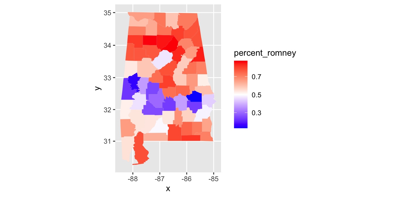
Figure 7.20: Choropleth map for the 2012 presidential election in Alabama.
In Figure 7.20 you can see that Alabama has a belt across its middle that voted in favor of Obama, while the rest of the state voted for Romney.
Vignette: COVID-19
Possibly the most visualized data of all time comes from the COVID-19 pandemic. We apply some of the techniques from this chapter to create the types of visualizations that were commonly used to track the spread of the disease and to compare its prevalence in different geographical regions.
This vignette will use the covid data included the fosdata package. This data was sourced on
September 13, 2021
from the GitHub repository50 run by The New York Times.
We encourage you to download the most recent data set from that site and rework through these examples,
or to download the larger data set that gives information by county.
covid <- fosdata::covidLet’s plot the cumulative number of cases in New York by date.
filter(covid, state == "New York") %>%
  ggplot(aes(x = date, y = cases)) +
  geom_point()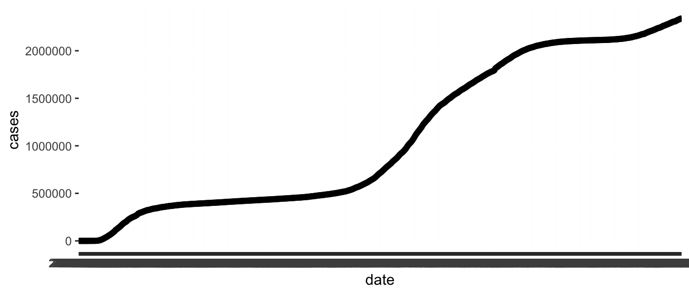
In this plot, the thick black stripe along the \(x\)-axis shows each date, but they are unreadable.
The solution is to change the type of the date variable. It is a chr variable, but it
should be of type Date. Base R can work with dates, but it is much easier with the lubridate package.
In order to convert a character variable into a date, you need to specify the format that the date is in from among ymd, ydm, mdy, myd, dym, or dmy.
If there are times involved, you add an underscore and then the correct combination of h m and s.
The bad dates prevented our first graph from using geom_line (try it!), but now with correct typing geom_line works.
covid <- mutate(covid, date = lubridate::ymd(date))

filter(covid, state == "New York") %>%
  ggplot(aes(x = date, y = cases)) +
  geom_line() +
  labs(title = "Total COVID-19 cases in New York")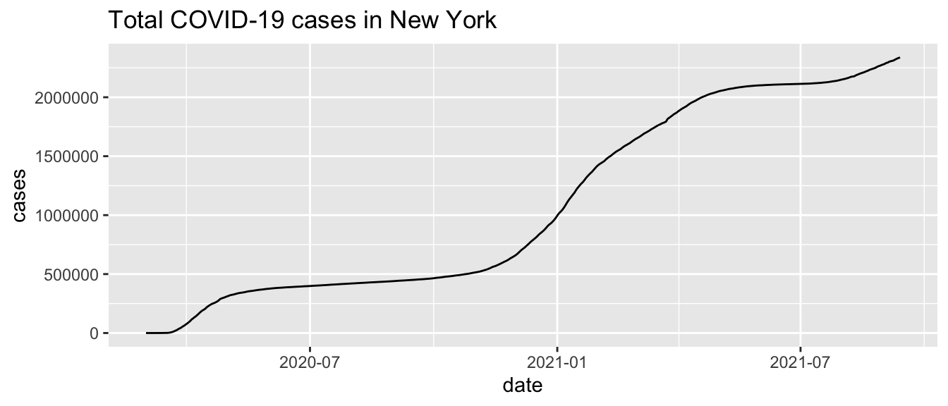
Next, let’s consider the daily new cases. We can compute the number of new cases on a given day by taking the total number of cases on the given day and subtracting the total number of cases on the previous day. The R command for doing this is diff. For example,
diff(c(1, 4, 6, 2))## [1] 3 2 -4Notice that the length of the output of diff is one less than the length of the input, so in our setting we will want to add a leading zero. Let’s see how to do it.
covid <- covid %>%
  group_by(state) %>%
  mutate(daily_cases = diff(c(0, cases))) %>%
  ungroup()
One issue that arises is that states sometimes make mistakes and need to correct them later. For example, if a state is systematically double counting some cases, and they realize it a month later, then they may subtract all of the double counted cases from the total cases on the same day. This can lead to negative daily cases, which does not make sense.
Find the date and state which has the largest (in absolute value) negative value for daily cases.
The best way to handle negative daily cases is not clear, but for data visualization purposes it is better to set all negative values of daily cases to zero.
covid <- covid %>%
  mutate(daily_cases = pmax(daily_cases, 0))
Now, we can plot the daily cases by date in New York as follows.
covid %>%
  filter(state == "New York") %>%
  ggplot(aes(x = date, y = daily_cases)) +
  geom_point()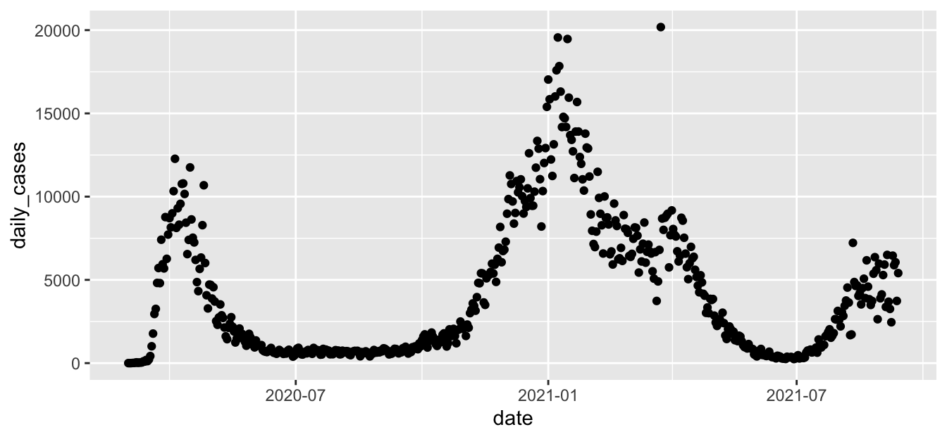
Figure 7.21: Basic plot of daily COVID-19 cases in New York State.
The results, in Figure 7.21, lack visual appeal. For the more finished plot in Figure 7.22 we add a title, resize the points, and add a smoothed line with the span chosen carefully. A larger span gives a smoother curve but no longer follows the peaks of the data well.
covid %>%
  filter(state == "New York") %>%
  ggplot(aes(x = date, y = daily_cases)) +
  geom_point(size = 0.5) +
  geom_smooth(span = 0.1, method = "loess") +
  labs(title = "Daily COVID-19 cases in New York", y = "Daily new cases")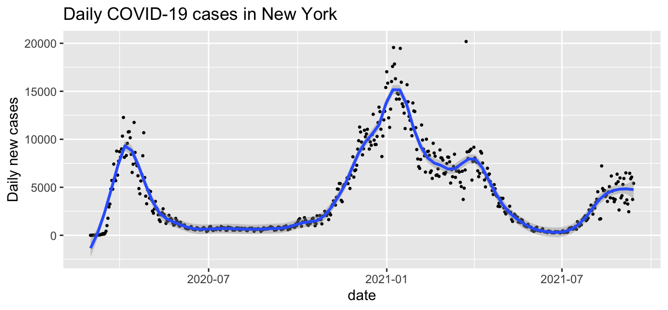
Figure 7.22: Finished plot of daily COVID-19 cases in New York State.
State-by-state comparisons
When comparing states, we want our chart legends to list states in a reasonable order.
Using the forcats package, we convert the state variable to a factor after ordering by number of cases.
This will list the states with the most cases first.
covid <- covid %>%
  arrange(desc(cases)) %>%
  mutate(state = forcats::as_factor(state))
To show multiple states on the same graph, we use the color aesthetic.
bigstates <- c("California", "Florida", "Illinois", "New York", "Texas")
filter(covid, state %in% bigstates) %>%
  ggplot(aes(x = date, y = cases, color = state)) +
  geom_line()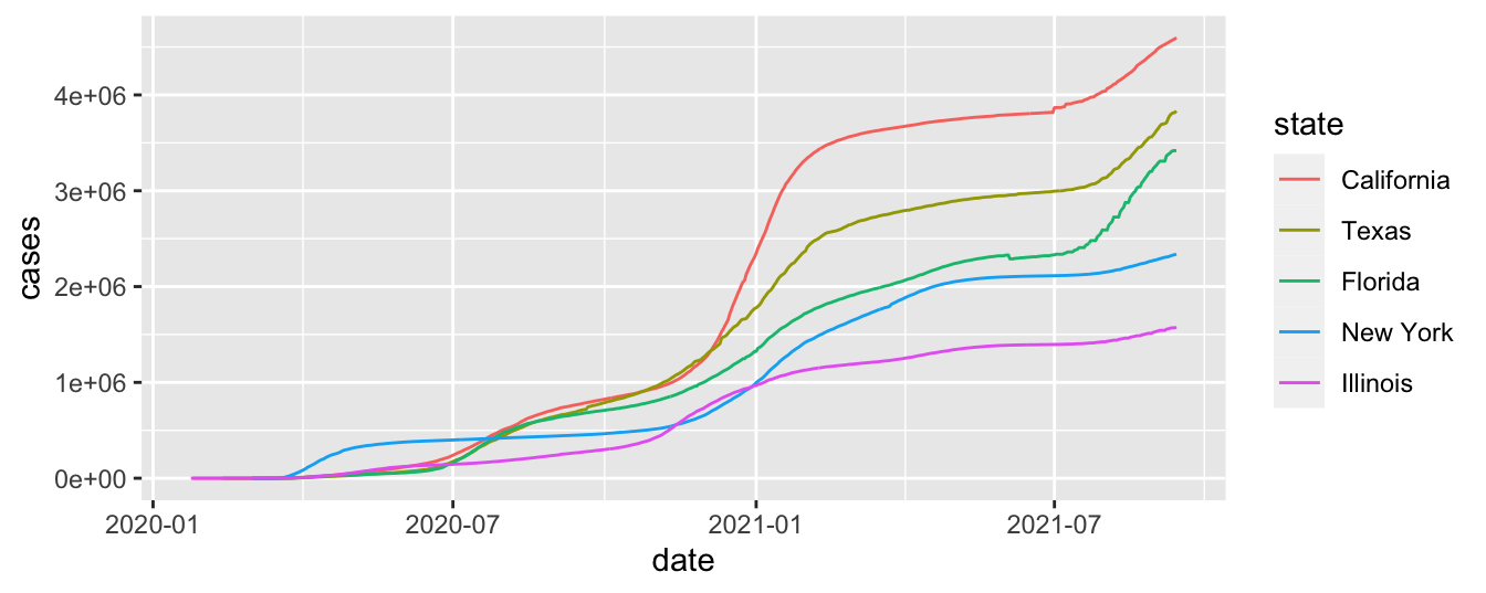
When tracking a disease, the rate of growth is important. It is visible as the slope of the graph when plotted with the \(y\)-axis on a logarithmic scale.
filter(covid, state %in% bigstates) %>%
  ggplot(aes(x = date, y = cases, color = state)) +
  geom_line() +
  scale_y_log10(labels = scales::comma)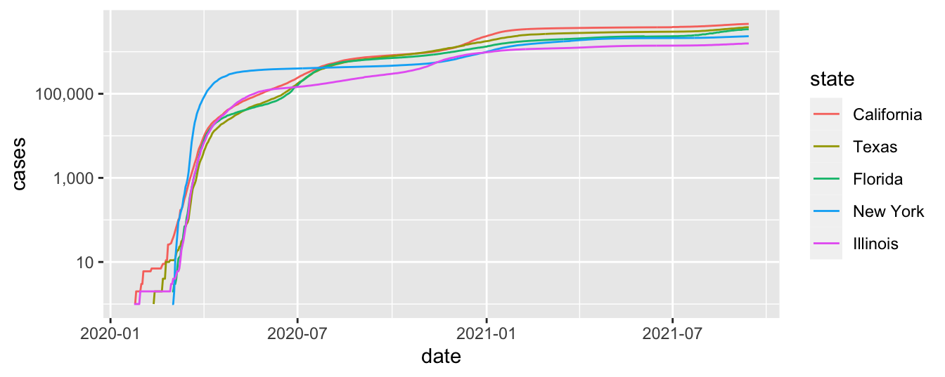
Unless you are used to reading graphs with log scale on the \(y\)-axis, the plot can be misleading. It is not obvious that Texas has had more than twice the total number of cases as Illinois as of September 2021.
Finally, we use highlighting to show the five big states’ daily new cases with the other states shown in gray for comparison. We add custom colors and some theme elements. The finished plot is Figure 7.23.
custom_colors <- RColorBrewer::brewer.pal(5, name = "Set1")
covid %>%
  ggplot(aes(x = date, y = daily_cases, color = state)) +
  geom_smooth(span = 0.11, se = FALSE, size = .6) +
  gghighlight::gghighlight(state %in% bigstates) +
  labs(
    title = "States with most cases",
    subtitle = "compared to other U.S. states",
    x = "Date", y = "Daily new cases"
  ) +
  scale_color_manual(values = custom_colors) +
  theme_minimal() +
  theme(plot.title = element_text(face = "bold"))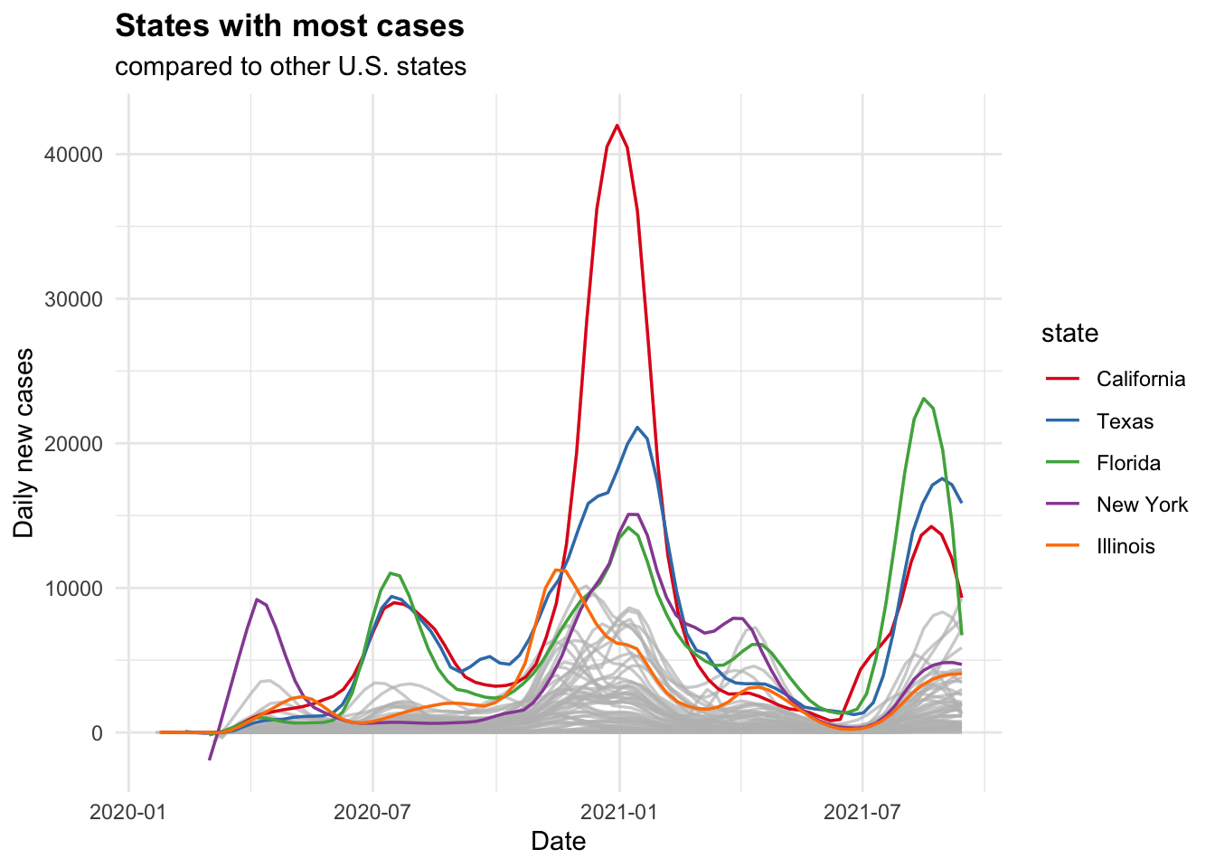
Figure 7.23: Finished visualization of a multiple state comparison.
Why didn’t we use geom_line for the daily cases? Try it and see which plot you prefer.
Exercises
Exercises 7.1 – 7.7 require material in Sections 7.1 and 7.2.
The built-in R data set quakes gives the locations of earthquakes off of Fiji in the 1960’s.
Create a plot of the locations of these earthquakes, showing depth with color and magnitude with size.
Create a boxplot of highway mileage for each different cylinder in mtcars,
and display on one plot with highway mileage on the \(y\)-axis and cylinder on the \(x\)-axis. You will need to change cyl to a factor.
Consider the brake data set in the fosdata package.
The variable p1_p2 gives the total time that it takes a participant to press the “brake,”
realize they have accidentally pressed the accelerator, and release it after seeing a red light.
Create a density plot of the variable p1_p2 and use it to answer the following questions.
- Does the data appear to be symmetric or skewed?
- What appears to be approximately the most likely amount of time to release the accelerator?
Consider the brake data set in the fosdata package.
The variable latency_p1 gives the length of time (in ms) that a participant needed to step on the brake pedal after experiencing a stimulus. Create a qq plot of latency_p1 and comment on whether the variable appears to be normal.
The mpg data from the ggplot2 package contains fuel economy data for popular cars.
Create a scatterplot of highway mileage versus city mileage colored by the number of cylinders. Use geom_jitter so the
points don’t overlap.
The cyl variable in mpg is an integer. Change it to a factor and recreate the plot. Which do you like better?
The data set storms is included in the dplyr package.
It contains information about 425 tropical storms in the Atlantic.
- Produce a histogram of the
windspeeds in this data set. Fill your bars using thecategoryvariable so you can see the bands of color corresponding to the different storm categories. - Repeat part (a) but make a histogram of the
pressurevariable. You should observe that high category storms have low pressure. - Describe the general shape of these two distributions.
- What type is the
categoryvariable in this data set? How did that affect the plots?
Continue using the storms data described in Exercise 7.6.
Produce a plot showing the position track of each storm from 2014 (use long for x and lat for y).
Color your points by the name of the storm so you can distinguish the seven storm tracks.
Which storm in 2014 made it the furthest North?
Exercises 7.8 – 7.27 require material through Section 7.3. Exercises which come from the same data set (such as austen) may not all require Section 7.3, but at least one exercise from that data set will.
Exercises 7.8 – 7.10 use the austen data set from the fosdata package.
This data set contains the full text of Emma and of Pride and Prejudice,
two novels by Jane Austen.
Each observation is a word, together with the sentence, chapter and novel it appears in, as well as the word length and sentiment score of the word.
Create a barplot of the word lengths of the words in the data set, faceted by novel.
In Emma, restrict to words that have non-zero sentiment score. Create a scatterplot of the percentage of words that have a positive sentiment score versus chapter. Add a line using geom_line or geom_smooth and explain your choice.
Use geom_col() to create a barplot of the mean sentiment score per chapter for Emma.
Consider the juul data set in the ISwR package.
This data set is 1339 observations of, among other things, the igf1 (insulin-like growth factor) levels in micrograms/liter, the age in years, and the tanner puberty level of participants.
- Create a scatterplot of
igf1level versusage. - Add categorical coloring based on
tanner. - Is
geom_smooth,geom_lineor neither appropriate here?
Consider the combined_data presidential election data set
that was created in Section 6.6.2.
For the 2000 election, create a scatterplot of the percent of votes cast for George W. Bush versus the unemployment rate,
where each point represents the results of one county.
Consider the Bechdel test data, fosdata::bechdel.
- Create a scatterplot of the percentage of movies that pass the Bechdel test in a given year versus the year that the movie was released.
- The cost to earnings ratio is the earnings divided by the budget. Create boxplots of the cost to earnings ratio (in 2013 dollars) of movies made in 2000 or later, split by whether they pass the Bechdel test.
- Re-do part (b), except make the boxplot of the log of the cost to earnings ratio. Explain the pros and cons of making this transformation.
Make a scatterplot showing uptake as a function of concentration level for the built-in data set CO2.
Include a smoothed fit line and color by Type.
Facet your plot to one plot for each Plant.
The fosdata::pres_election data set gives voting results from the 2000-2016 U.S. presidential elections.
Produce five bar charts, one for each election, that show the total number of votes received by each political party.
Use facet_wrap to put all five charts into the same visualization.
The ecars data set from fosdata was introduced in this chapter.
Create a visualization showing scatterplots with the chargeTimeHrs variable on the \(x\)-axis and the
kwhTotal variable on the \(y\)-axis. Facet your visualization with one plot per day of week and platform.
Remove the web platform cars, so you have 14 facets in two rows and seven columns. Be sure your weekdays display in a reasonable order.
Exercises 7.17 – 7.19 all use the Batting data set
from the Lahman package.
This gives the batting statistics of every player who has played baseball from 1871 through the present day.
- Create a scatterplot of the number of doubles hit in each year of baseball history.
- Create a scatterplot of the number of doubles hit in each year, in each league. Show only the leagues ‘NL’ and ‘AL’, and color the NL blue and the AL red.
Create boxplots for total runs scored per year in the AL and the NL from 1969 to the present.
- Create a histogram of lifetime batting averages (H/AB) for all players who have at least 1000 career AB’s.
- In your histogram from (d), color the NL blue and the AL red. (If a player played in both the AL and NL, count their batting average in each league if they had more than 1000 AB’s in that league.)
Use the People data set from the Lahman package.
- Create a barplot of the birth months of all players. (Hint:
geom_bar()) - Create a barplot of the birth months of the players born in the USA after 1970.
Exercises 7.21 – 7.27 use the babynames data set
from the babynames package, which was introduced in Section 6.6.1.
Make a line graph of the total number of babies of each sex versus year.
Make a line graph of the number of different names used for each sex versus year.
Make a line graph of the total number of babies with your name versus year. If your name doesn’t appear in the data, use the name “Alexa.”
Make a line graph comparing the number of boys named “Bryan” and the number of boys named “Brian” from 1920 to the present.
I wish that I had Jessie’s girl, or maybe Jessie’s guy? On one graph, plot the number of male and female babies named “Jessie” over time.
Three time periods show up in the history of Jessie:
- More male than female Jessie.
- More female than male Jessie.
- About the same male and female Jessie.
Approximately what range of years does each time period span?
Using the data from fosdata::movies, create a scatterplot of the ratings of Twister (1996)
versus the date of review, and add a trend line using geom_smooth. It may be useful to use lubridate::as_datetime(timestamp).
Consider the frogs data set in the fosdata package.
This data was used to argue that a new species of frog had been found in a densely populated area of Bangladesh.
Create a scatterplot of head length distance from tip of snout to back of mandible versus forearm length distance from corner of elbow to proximal end of outer palmar metacarpal tubercle, colored by species.
Explain whether this plot is visual evidence that the physical characteristics of the dhaka frog are different than the other frogs.
Exercises 7.28 – 7.33 require material through Section 7.4.
Consider the scotland_births data set in the fosdata package.
This data set contains the number of births in Scotland by age of the mother for each year from 1945-2019.
In Exercise 7.28, you converted this data set into long format.
- Create a line plot of births by year from 1945-2019 for each age group represented in the data.
- Highlight and color ages 20 and 30, and provide meaningful labels and titles.
The data set Arbuthnot from the HistData library gives information about birth and death in London from 1629-1710.
- Make a plot of Mortality showing a point for each Year. Set the size and color of your points to the
Plaguevariable. - Hide the legend for size. Adjust the color to be a gradient from black to red. Add text annotations to show the years of the major plague events.
In a paper51 by Hallmann et al., a plot similar to Figure 7.24 was created to visualize the change in biomass over time with the following explanation: “Seasonal distribution of insect biomass showing that highest insect biomass catches in mid summer show most severe declines. Color gradient … ranges from 1989 (blue) to 2016 (orange).”
Use the data in fosdata::biomass to recreate the plot.
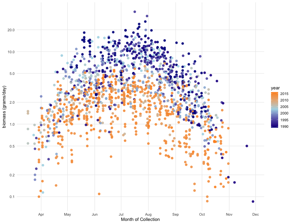
Figure 7.24: Visualization of seasonal insect biomass.
The msleep data set is part of the ggplot2 package. It contains information
about the sleep patterns of 83 mammal species.
Make a plot showing the log of brain weight on the \(x\)-axis, total sleep on the \(y\)-axis, and color by vore. Label points with the names of the animals, but only
label the species with brain weight bigger than 1 or that sleep more than 17 hours a day.
The data flint from fosdata gives the results of tap water lead testing during the Flint, Michigan water crisis in 2015. Figure 7.25 is a graph showing lead levels at first draw (Pb1) for Flint’s eight geographical areas, called “Wards.” The red horizontal line represents the EPA’s “action level” for lead in water, at 15 ppb.
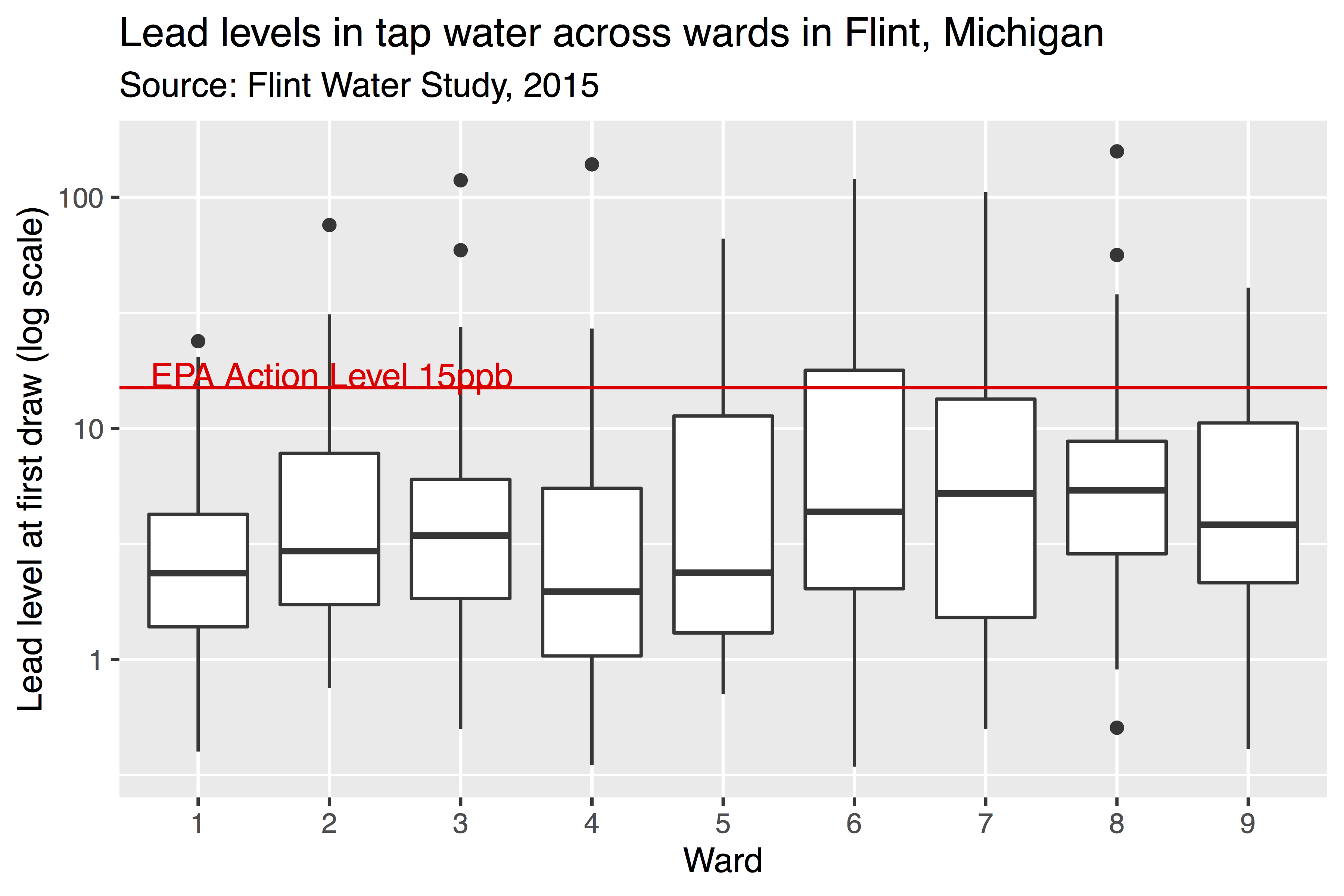
Figure 7.25: Visualization of lead levels in Flint, Michigan.
Reproduce this graph as well as you can.
The \(y\)-axis scale is logarithmic, which you can accomplish with scale_y_log10().
Note that there is no Ward 0 in Flint.
Data scientist Kieran Healy created a widely circulated figure similar to the one shown in Figure 7.26.
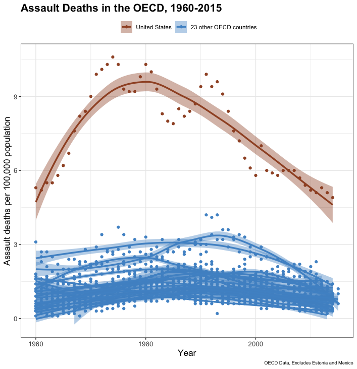
Figure 7.26: Visualization of gun violence in the United States.
Recreate this plot as well as you can, using Healy’s GitHub data. Read Healy’s blog post and his follow-up post. Do you think this figure is a reasonable representation of gun violence in the United States?
L Wilkinson et al., The Grammar of Graphics, Statistics and Computing (Springer New York, 2005).↩︎
The workhorse function in the
ggplot2package isggplotwithout the 2.↩︎ggplot2will also allow you to make simple computations inside the aesthetic mapping, but we choose not to do so in order to illustrate thedplyrtechnique.↩︎There is some dispute in the world about whether the calendar week should begin on Sunday or Monday, but we all agree the days come in order.↩︎
W Hickey, “The Dollar-and-Cents Case Against Hollywood’s Exclusion of Women,” FiveThirtyEight, April 1, 2014, http://fivethirtyeight.com/features/the-dollar-and-cents-case-against-hollywoods-exclusion-of-women/.↩︎
The geometry
geom_smoothgives a helpful message as to how the line was fit to the scatterplot, which we will hide in the rest of the book.↩︎H Wickham, ggplot2: Elegant Graphics for Data Analysis, Use R! (Springer New York, 2009), https://books.google.com/books?id=bes-AAAAQBAJ.↩︎
Hickey, “The Dollar-and-Cents Case Against Hollywood’s Exclusion of Women.”↩︎
This example is similar to one found at the R Graph Gallery, https://www.r-graph-gallery.com/, which is maintained by Yan Holtz. That site has many interesting data visualization techniques and tricks.↩︎
Caspar A Hallmann et al., “More Than 75 Percent Decline over 27 Years in Total Flying Insect Biomass in Protected Areas,” PLOS One 12, no. 10 (October 2017): 1–21, https://doi.org/10.1371/journal.pone.0185809.↩︎